Ever walked into a space and instantly felt a wave of tranquility wash over you? There’s a science behind that, and a big part of it is color. In the world of med spas, where the goal is deep relaxation and rejuvenation, the hues you choose aren’t just decorative—they’re foundational to the entire client experience. Let’s explore how the psychology of color can transform a med spa from a simple service provider into a sanctuary of serenity.
Think about your favorite relaxing place. What colors come to mind? Chances are, they’re soft, soothing, and natural. This isn’t accidental. Color has a powerful, often subconscious, effect on our emotions and our bodies. In a med spa, where individuals seek respite from stress and a chance to recharge, the deliberate selection and application of color is absolutely crucial. It’s about creating an atmosphere that not only looks good but feels good, guiding clients into a state of deep calm from the moment they step inside.
The Calming Embrace of Blues and Greens
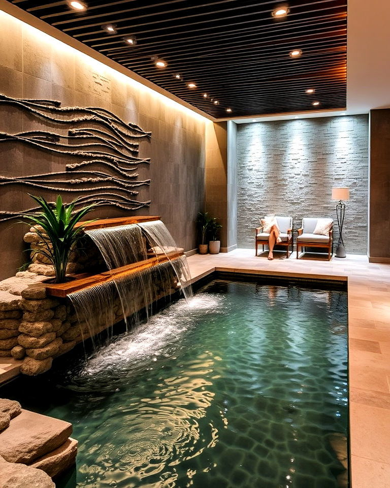
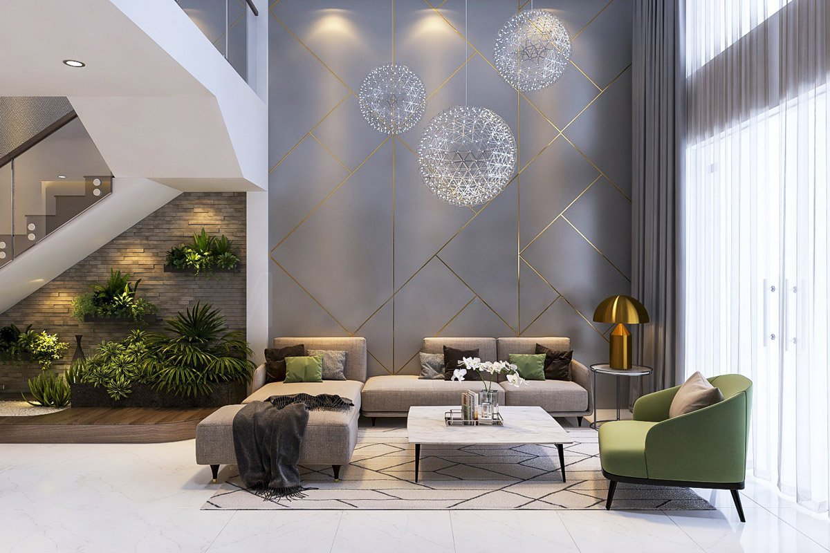
When we talk about relaxation, blues and greens are often the first colors that spring to mind, and for good reason. These colors are deeply connected to nature—think serene skies, tranquil oceans, and lush, verdant landscapes. Scientifically, blues have been shown to lower heart rate and blood pressure, promoting a sense of calm and stability. They can create an atmosphere of trust and peacefulness, which is vital in a med spa setting. Greens, on the other hand, are associated with balance and harmony. They can evoke feelings of renewal and growth, mirroring the rejuvenating treatments offered. Imagine a treatment room painted in a soft, muted sage green or accented with gentle sky blue. These shades don’t demand attention; they invite you to release it, fostering an environment where stress simply melts away.
The Warm Whisper of Neutrals and Earth Tones
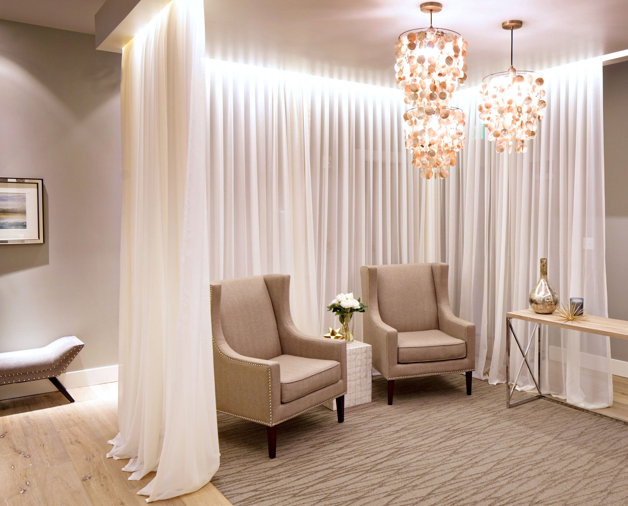
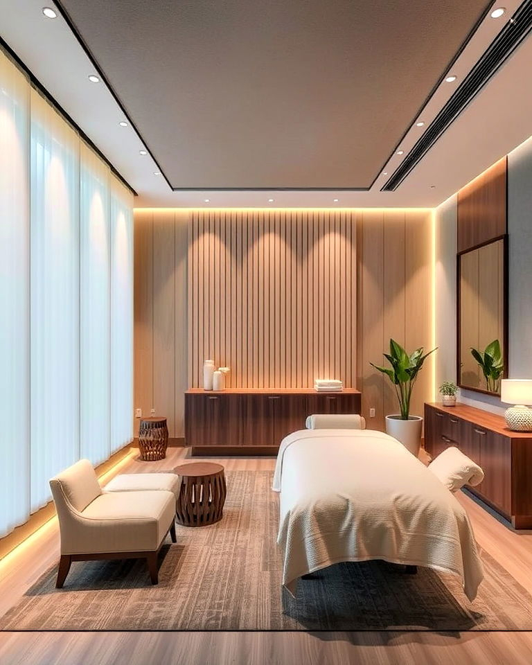
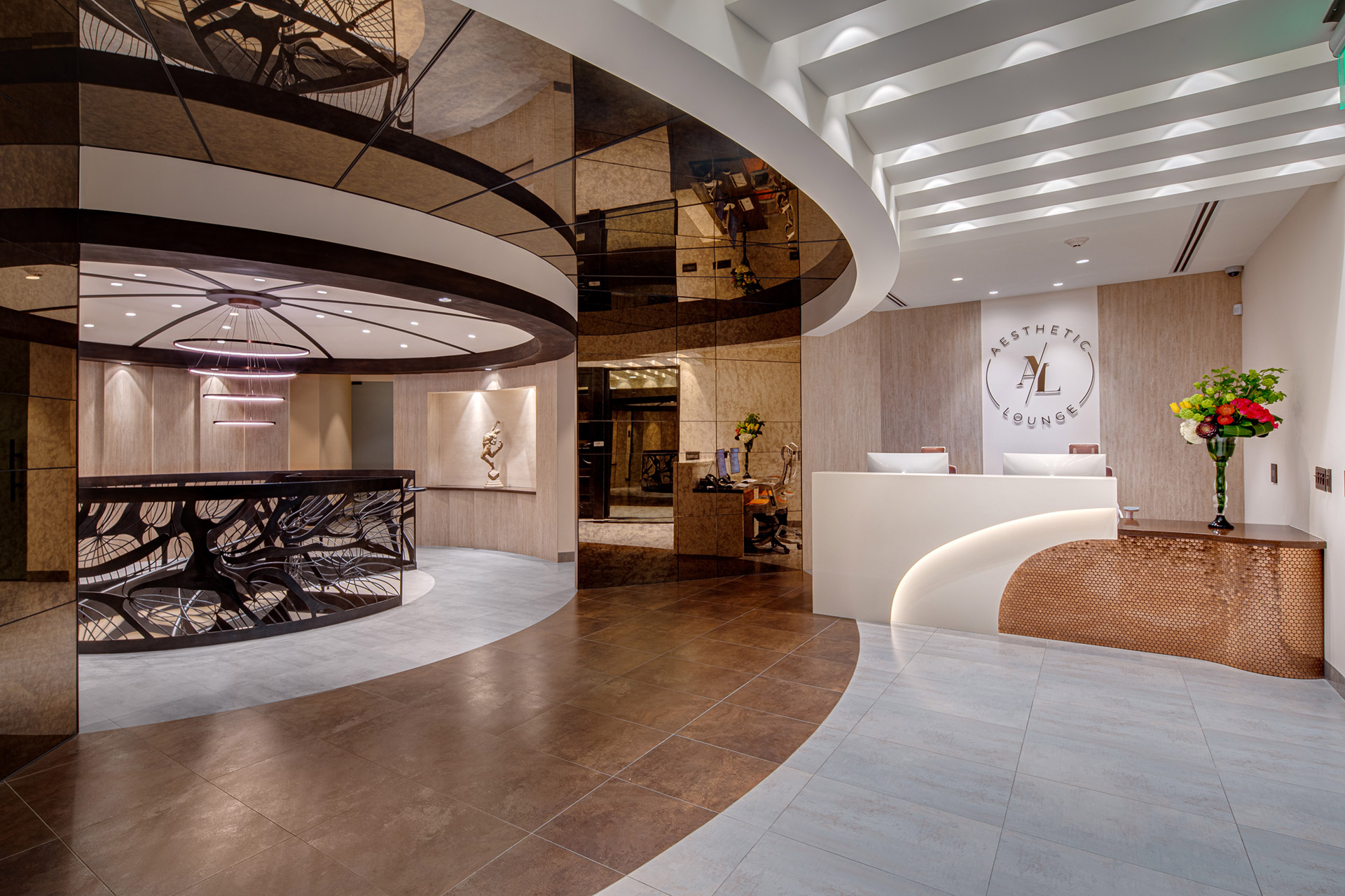
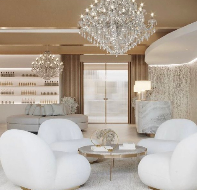
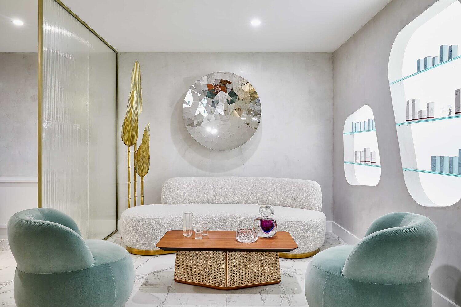
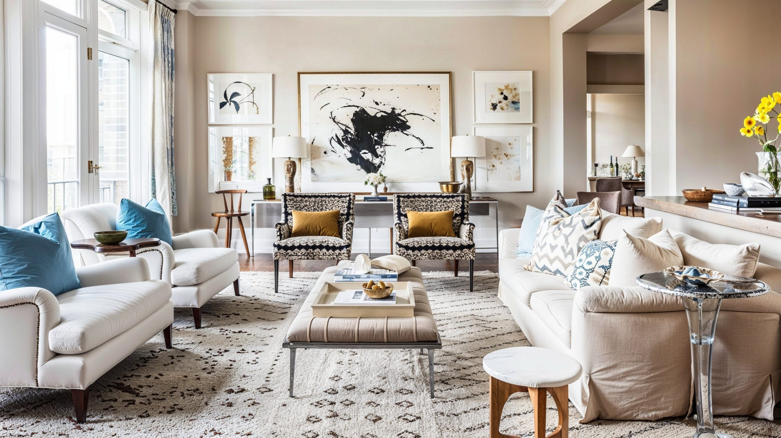
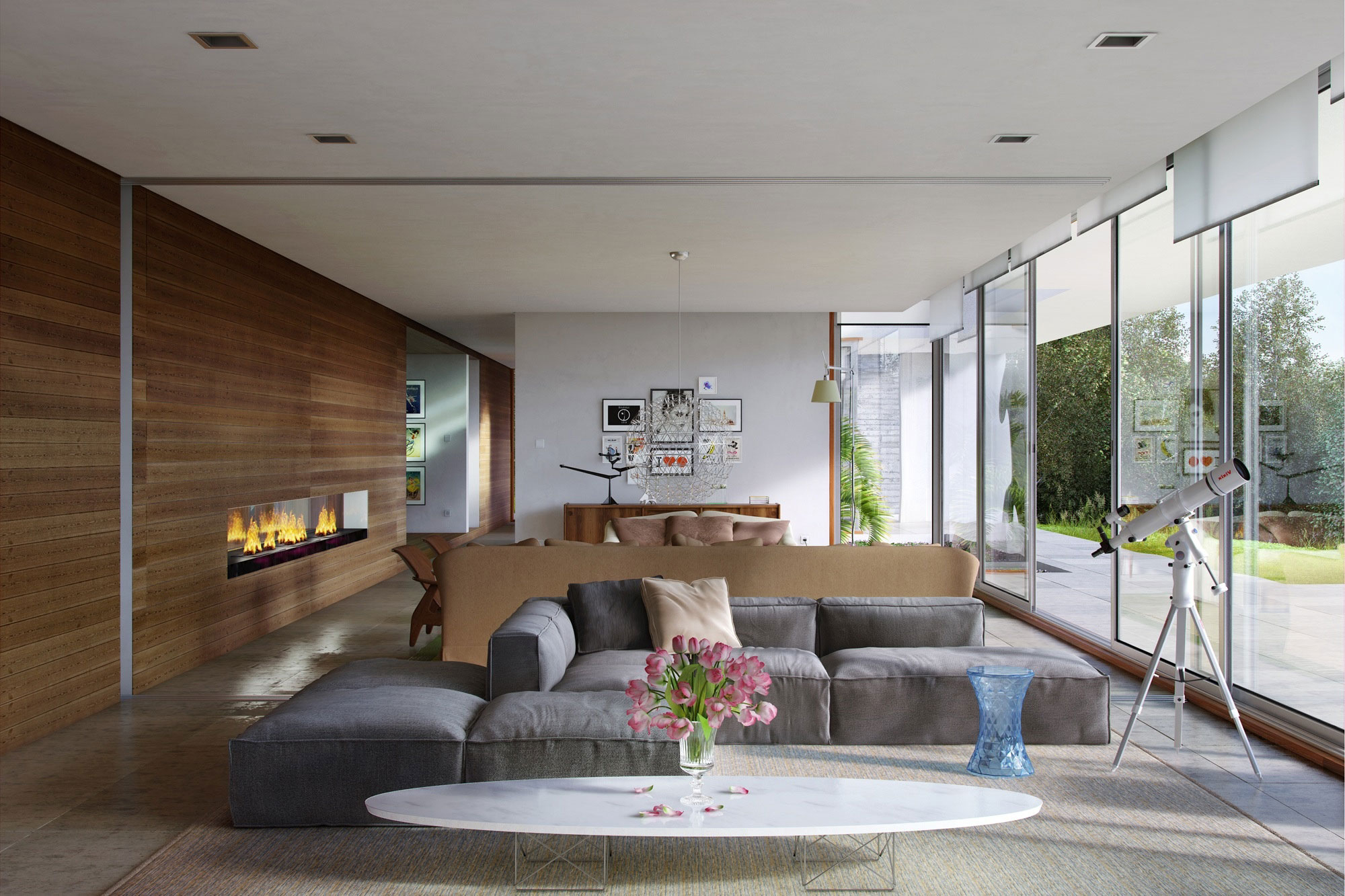
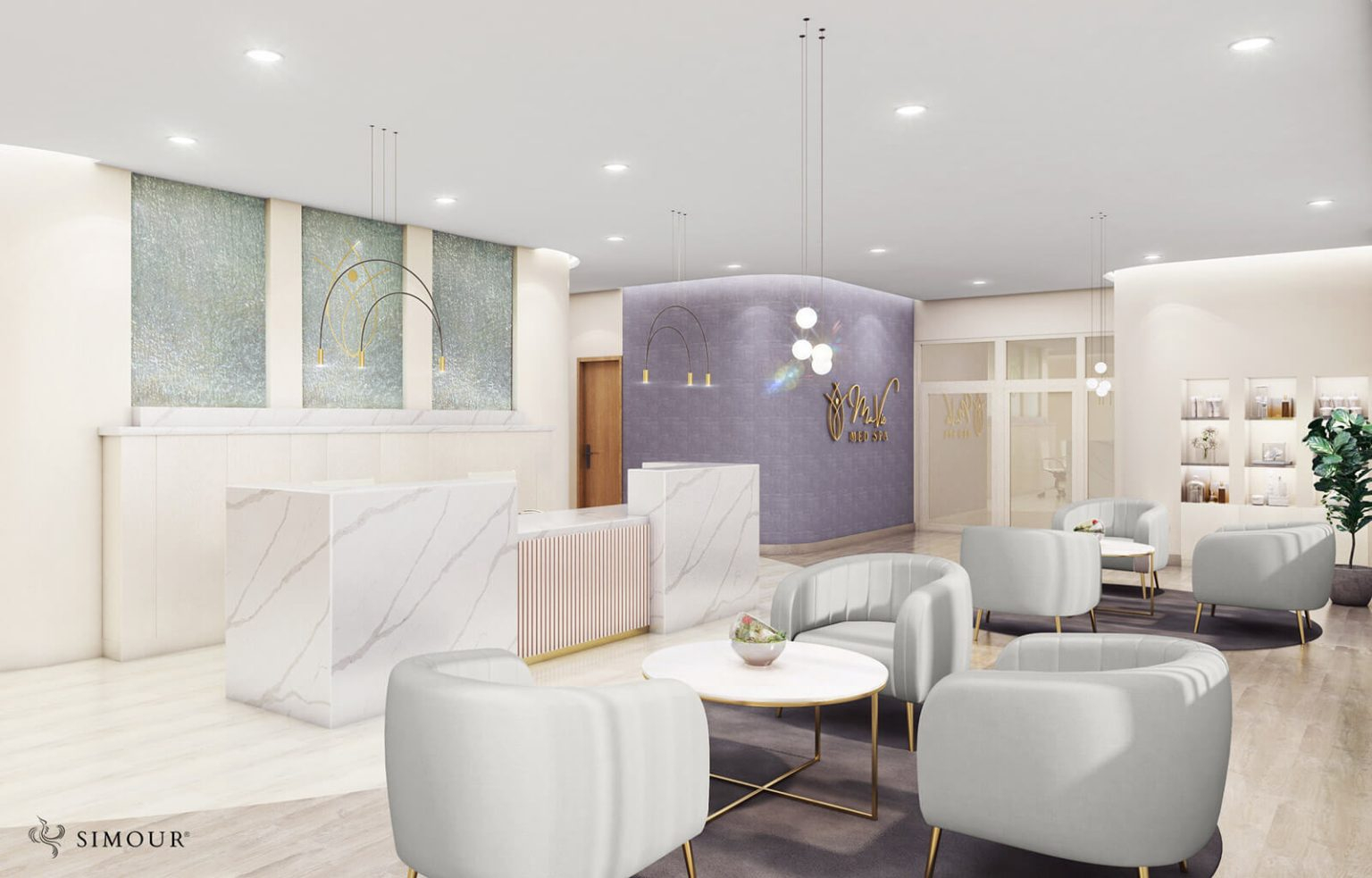
While blues and greens are the classic relaxation colors, don’t underestimate the power of a well-chosen neutral palette. Think soft beiges, warm ivories, gentle grays, and creamy off-whites. These colors provide a sophisticated and grounding backdrop, allowing other elements of the spa—like natural textures or subtle artwork—to shine without overwhelming the senses. Earth tones, such as terracotta, muted browns, and sandy hues, can bring a sense of warmth and comfort, reminiscent of natural materials like wood and stone. These colors create a feeling of being connected to the earth, which can be incredibly soothing and stabilizing. A reception area with warm wood accents and a soft taupe wall can feel instantly welcoming and secure, setting a relaxed tone for the entire visit.
Subtle Accents: The Art of Restraint
While it’s tempting to go all-out with calming colors, sometimes the most effective approach involves subtle accents. Overuse of any color, even calming ones, can sometimes feel monotonous or even overwhelming. The key is balance. Consider using a dominant calming color, like a pale blue or a soft green, and then introducing gentle, muted accent colors to add depth and interest without disrupting the overall sense of peace. A touch of soft lavender, for instance, can add a hint of luxury and tranquility. Even a very pale, almost-white pink can evoke feelings of gentleness and care. These accents should be used sparingly, perhaps in artwork, decorative elements, or even a single accent wall, providing visual interest that enhances, rather than detracts from, the relaxation experience.
The Impact of Lighting on Color Perception
It’s not just the paint on the walls; lighting plays a massive role in how colors are perceived and how they make us feel. Harsh, bright lighting can completely negate the soothing effects of even the most carefully chosen colors. For ultimate relaxation, opt for soft, diffused lighting. Think warm LED bulbs, dimmable fixtures, and perhaps even natural light, filtered through sheer curtains. When colors are bathed in soft, warm light, their calming properties are amplified. A cool blue can feel even more serene, and a warm neutral can become even more inviting. Consider how different treatment rooms might require slightly different lighting scenarios—a massage room might benefit from dimmer, warmer light than a consultation area, for example. This attention to detail ensures the color palette works in harmony with the lighting to create the intended mood.
Avoiding Overstimulation: What Colors to Use Sparingly
In a space dedicated to relaxation, certain colors should be used with extreme caution, if at all. Bright, saturated reds, oranges, and yellows, while energetic and stimulating, can actually increase heart rate and evoke feelings of anxiety or agitation—the very opposite of what a med spa aims to achieve. Even vibrant purples or intense fuchsias can be too stimulating for a purely relaxation-focused environment. If you do want to incorporate these colors, do so in incredibly small doses, perhaps as a tiny detail in a piece of art, or not at all. The goal is to create a sanctuary, and that means avoiding anything that might jolt the client out of their tranquil state. Think of it as creating a visual lullaby, not a visual siren.
Creating Cohesion: A Unified Color Story
Finally, the most effective med spa designs don’t just pick a few nice colors; they weave a cohesive color story throughout the entire space. This means considering how colors flow from the reception area to the treatment rooms, to the relaxation lounge, and even to the restrooms. The palette should feel intentional and consistent. For instance, if you’ve chosen a base of soft grays and ivories, you might introduce calming blues and greens in one area and warmer earth tones in another, but ensure these elements complement each other. This creates a unified and harmonious experience, reinforcing the message of calm and care at every touchpoint. It’s about building a complete sensory experience that supports the client’s journey toward deep relaxation and renewal.
The colors chosen for a med spa are far more than aesthetic choices; they are powerful tools that shape the client’s emotional and physiological response. By thoughtfully integrating blues, greens, and soothing neutrals, complemented by soft lighting and strategic accents, med spas can create environments that truly foster deep relaxation and well-being. It’s about crafting a visual language that speaks of peace, rejuvenation, and care, ensuring that every client leaves feeling not just treated, but truly restored. So next time you’re designing or choosing a med spa, pay attention to the colors—they’re working hard to help you unwind.