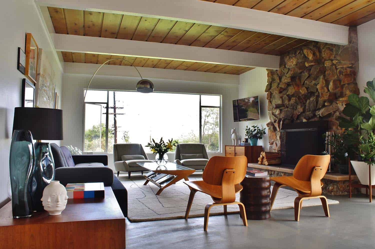
Mid Century Modern design is more than just furniture; it’s an aesthetic, a feeling, and a way of life. At its heart lies a distinctive approach to color. Think of those classic Eames chairs, the warm wood tones, and the pops of vibrant, yet grounded, shades. It’s a look that has endured for a reason – it feels both familiar and fresh. But how do you actually bring this celebrated color story into your own space without it feeling like a museum piece? Let’s dive in and unlock the secrets to creating truly captivating Mid Century Modern color palettes.
When we talk about Mid Century Modern design, color is a huge part of the conversation. It’s not just about picking pretty shades; it’s about how those colors interact, how they make you feel, and how they contribute to the overall atmosphere of a room. This era, roughly spanning from the mid-1940s to the late 1960s, saw a departure from darker, more traditional interiors. Designers embraced optimism and a connection to nature, and color was their primary tool. They used it to define spaces, to add warmth, and to create visual interest. Getting the palette right is key to capturing that authentic Mid Century Modern vibe. It’s about finding that perfect balance between bold statements and subtle sophistication. Ready to paint your way to a stylish home?
The Foundation: Earthy Neutrals and Warm Woods
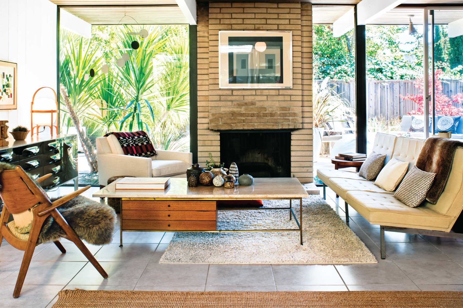
Every great Mid Century Modern space starts with a solid foundation, and for color, that means leaning into the natural and the warm. Think of the materials that defined the era: teak, walnut, and other rich wood tones. These aren’t just furniture materials; they’re color inspirations.
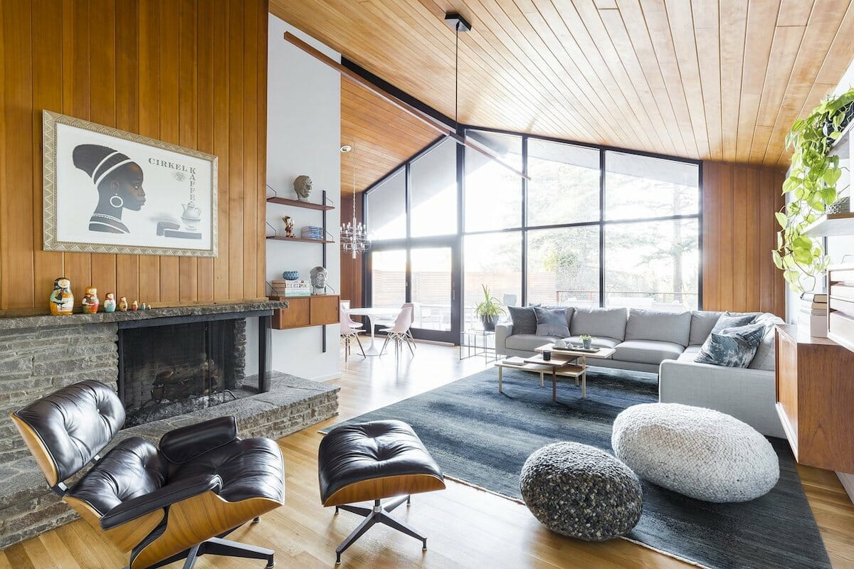
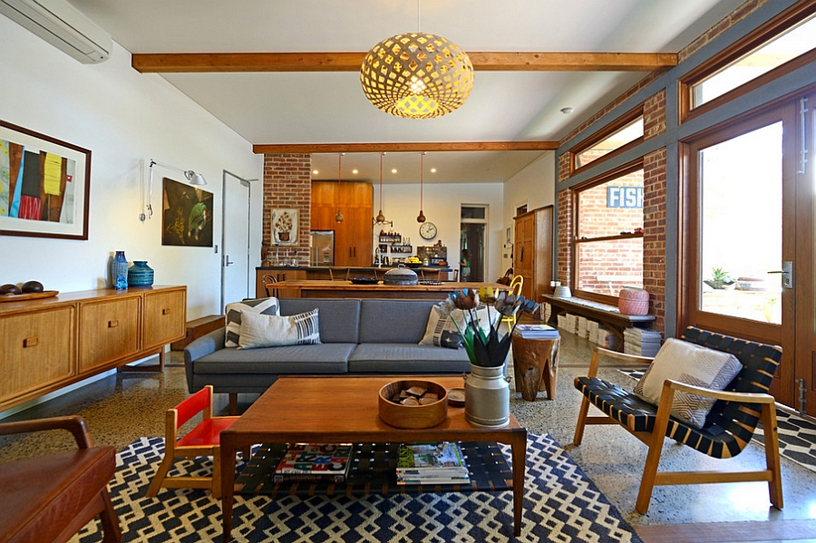
- Wood Tones: Embrace the natural beauty of wood. Whether it’s a statement wall of wood paneling, a sleek credenza, or smaller decorative accents, warm wood hues like walnut, teak, and mahogany provide an instant connection to the Mid Century aesthetic. They act as a sophisticated neutral, grounding your space.
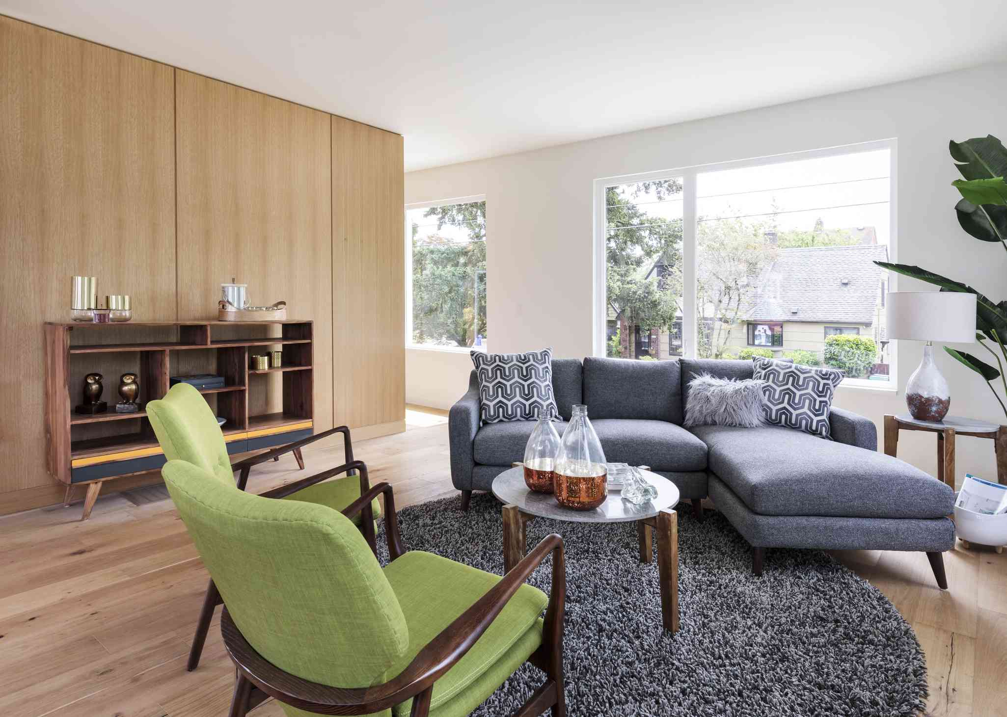
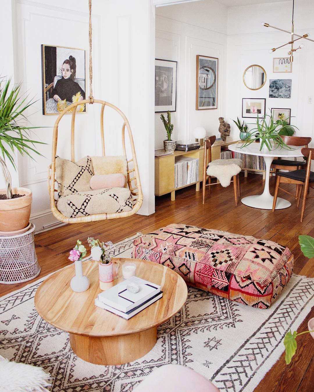
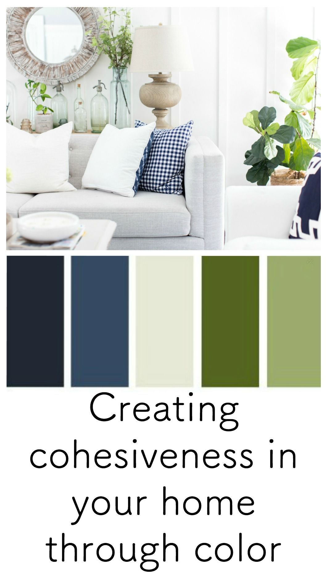
- Earthy Neutrals: Beyond wood, consider a palette of warm neutrals. Think creamy off-whites, soft beiges, sandy tans, and muted greys. These colors create a calming backdrop, allowing your accent colors to truly shine. They also evoke a sense of naturalism, a core tenet of Mid Century design. Imagine a living room with creamy walls, a walnut credenza, and a plush, textured rug in a warm grey. It’s inviting and effortlessly chic.
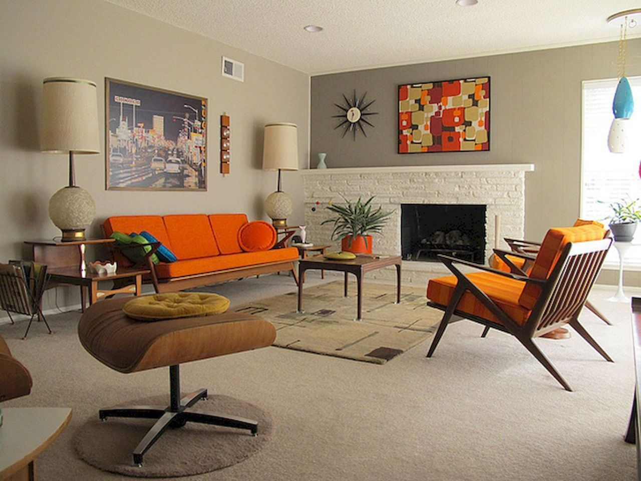
- Terracotta and Ochre: Don’t shy away from warmer neutrals like terracotta, muted oranges, and ochre. These shades bring in a touch of earthy warmth and can be used on walls, upholstery, or even smaller decor items. They feel grounded and organic, perfectly complementing the wood elements.
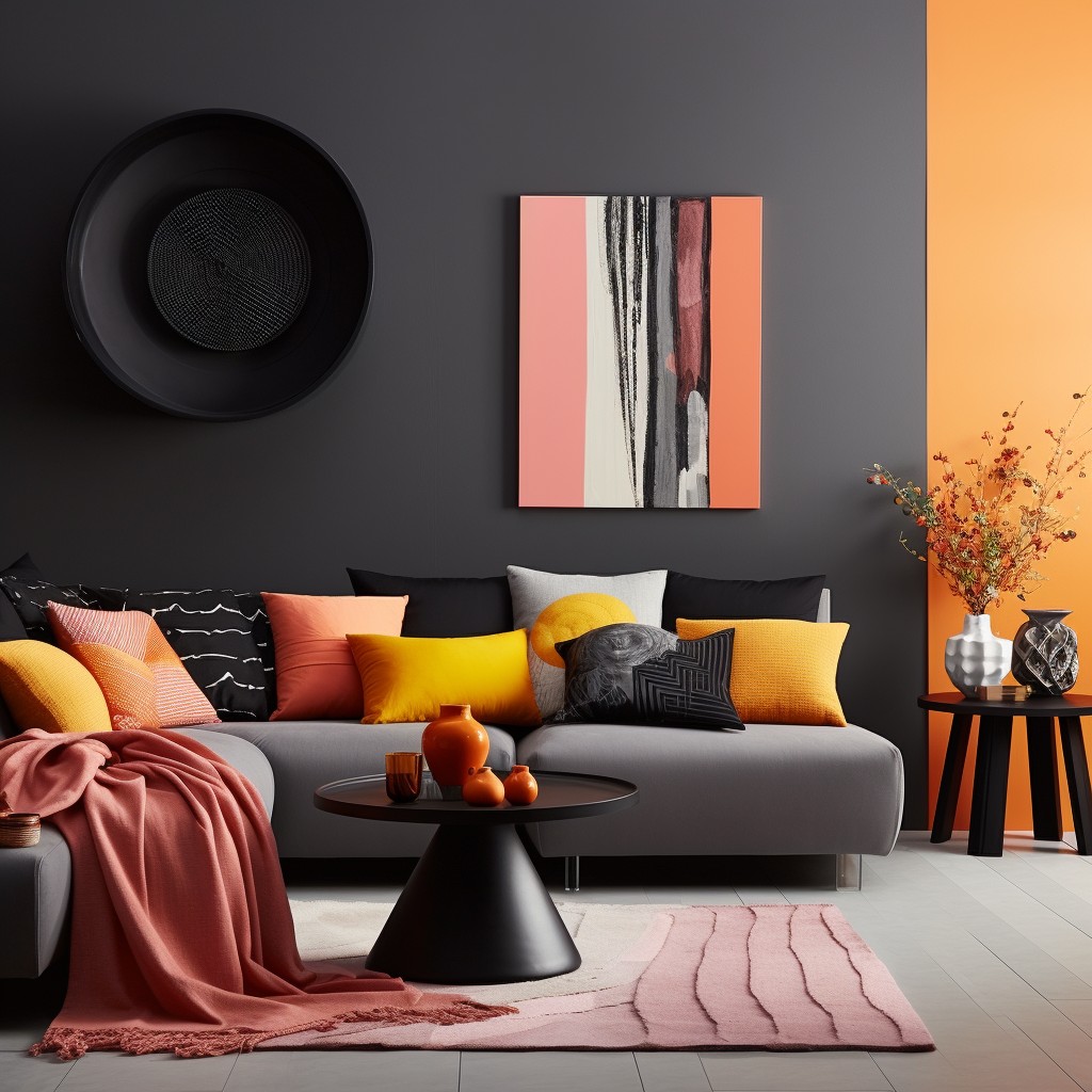
The Pop: Vibrant and Bold Accent Colors
While neutrals provide the calm, it’s the accent colors that truly bring the Mid Century Modern energy. The designers of this era weren’t afraid of color, but they used it strategically, often with a sophisticated, slightly muted quality.
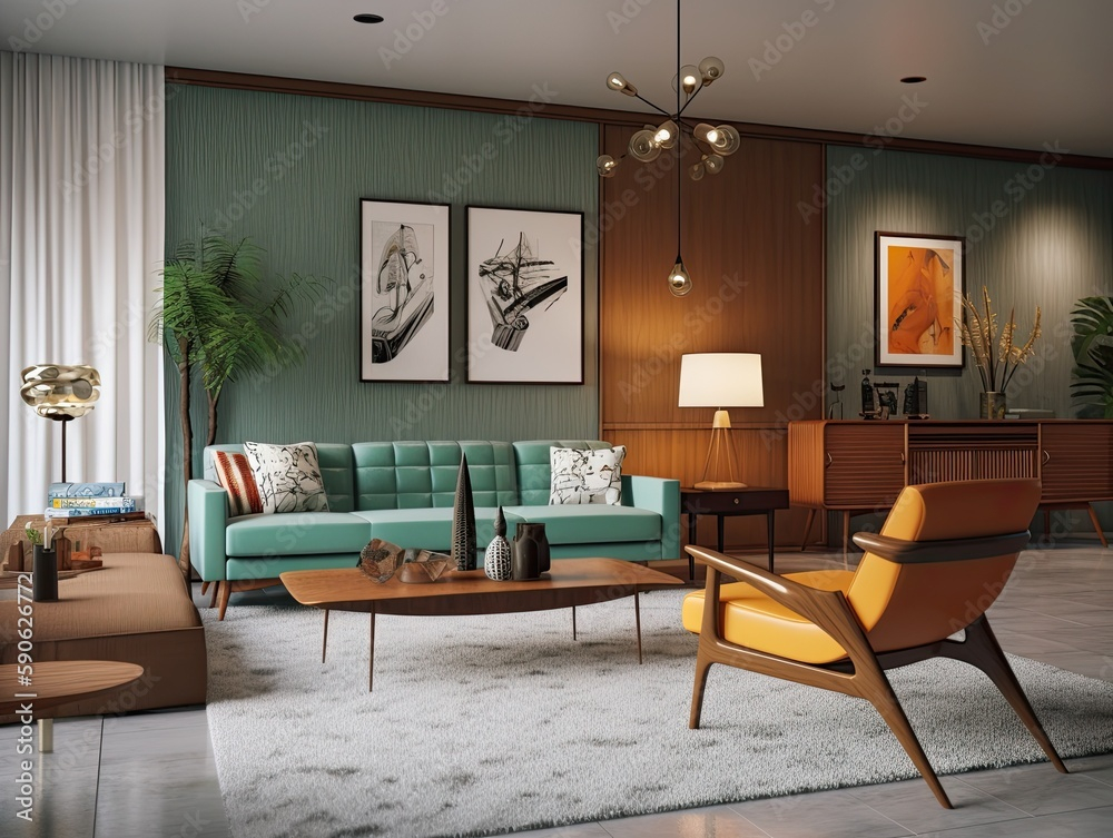
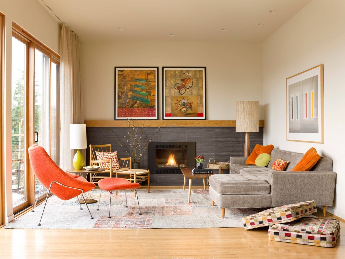
- Teal and Aqua: These cool, watery tones are absolute classics. They offer a refreshing contrast to warmer wood and earth tones. A teal sofa, aqua throw pillows, or even a statement accent wall in a deep teal can instantly elevate your Mid Century look. They feel both retro and remarkably modern.
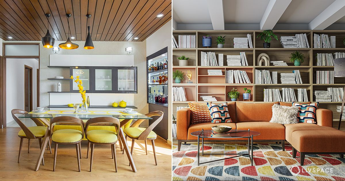
- Mustard Yellow and Avocado Green: These colors might sound bold, but when used thoughtfully, they are incredibly effective. Mustard yellow adds a cheerful, sunny disposition, while avocado green lends a touch of organic depth. Picture a mustard yellow armchair against a backdrop of creamy walls and wood accents, or a subtle pattern in avocado green on cushions. They’re playful yet sophisticated.
- Burnt Orange and Olive Green: Think of the colors found in nature, but with a warm, slightly desaturated twist. Burnt orange brings a cozy, inviting feel, and olive green offers a sophisticated, earthy vibe. These hues work wonderfully in textiles, artwork, and even smaller decorative objects. They create a sense of depth and richness without being overwhelming.
Balancing the Palette: Less is Often More
The key to a successful Mid Century Modern color scheme isn’t about overwhelming your space with every iconic color. It’s about thoughtful curation and balance. Think of it like a well-composed piece of music – each note has its place and contributes to the overall harmony.
- The 60-30-10 Rule: A good starting point is the 60-30-10 rule. Use your dominant neutral color for about 60% of the room (think walls, large furniture pieces). Then, use a secondary color for about 30% (like your sofa, curtains, or rugs). Finally, use your accent color for the remaining 10% (through accessories, artwork, and smaller decor items). This creates a visually pleasing hierarchy.
- Consider the Mood: What feeling do you want to evoke? Warmer tones like burnt orange and mustard yellow tend to create a cozier, more intimate atmosphere. Cooler tones like teal and aqua can feel more refreshing and airy. Mix and match thoughtfully to achieve the desired mood. For instance, a living room might feature a dominant neutral, a teal sofa, and pops of mustard yellow in cushions and art. It feels balanced and inviting.
- Don’t Forget Texture: Color isn’t just about hue; it’s also about how light interacts with surfaces. Incorporating different textures – smooth wood, nubby wool rugs, polished metal, and matte paint finishes – adds depth and visual interest, making your color palette feel richer and more dynamic.
Bringing it Together: Practical Application
So, how do you actually put these ideas into practice? It’s all about starting small and building up.
- Start with a Piece: Do you have a favorite Mid Century Modern chair or a rug with a great pattern? Use that as your jumping-off point. Identify the colors within that piece and build your room’s palette around them. This ensures a cohesive starting point.
- Wall Color is Key: Your wall color sets the stage. A warm off-white or a soft, muted grey can be a versatile backdrop. If you’re feeling bolder, consider a muted teal or a warm, earthy tone for an accent wall. Remember to test paint samples in your space, as light significantly affects color.
- Textiles and Accessories: This is where you can really play with your accent colors. Think throw pillows, blankets, curtains, rugs, and artwork. A few well-chosen pieces in vibrant teal, mustard yellow, or burnt orange can make a huge difference without overwhelming the space. Don’t forget pottery and decorative objects – these were integral to Mid Century interiors.
- Mix and Match Patterns: Mid Century Modern design often incorporates geometric patterns, abstract prints, and organic motifs. Don’t be afraid to mix patterns, but try to keep them within a similar color family or ensure at least one color from a pattern is repeated elsewhere in the room. This creates visual cohesion.
Modern Twists on Mid Century Palettes
While staying true to the spirit of Mid Century Modern design is important, there’s no rule against a little modern interpretation. You can update the look for today’s homes while retaining that timeless appeal.
- Softer Hues: You can soften the classic palette by opting for slightly lighter or more muted versions of the iconic colors. Instead of a deep avocado green, consider a sage green. Instead of a bright mustard, try a softer, goldenrod hue. This can make the colors feel more contemporary and less overtly retro.
- Unexpected Combinations: While teal and wood are classic, try pairing a dusty rose with a deep olive green, or a soft coral with a warm grey. These combinations can offer a fresh perspective while still nodding to the Mid Century sensibility.
- Focus on Finish: The finish of your paint matters too. Matte finishes tend to feel more modern and sophisticated than high gloss, especially for larger surfaces. Consider a satin finish for furniture or trim for a subtle sheen.
- Natural Light is Your Friend: Maximize natural light as much as possible. The airy, open feel of Mid Century Modern spaces is enhanced by bright, natural light. This also helps to make bolder colors feel less imposing.
Common Pitfalls to Avoid
Even with the best intentions, it’s easy to get a few things wrong when creating your Mid Century Modern color palette. Being aware of these common mistakes can save you a lot of repainting.
- Too Much of a Good Thing: Overdoing the bright accent colors can make a space feel jarring and chaotic, rather than stylish and balanced. Remember that 60-30-10 rule. Let your neutrals breathe.
- Ignoring Undertones: Some colors, especially greys and beiges, can have strong undertones (like pink, green, or blue) that can clash with your wood tones or other chosen colors. Always test paint samples in your actual room light.
- Forgetting About Flow: If you have an open-concept home, your color choices need to flow from one space to another. While each room can have its own personality, there should be a unifying element, often a dominant neutral or a recurring accent color.
- Sticking to Only the ‘Obvious’ Colors: While teal, mustard, and avocado are iconic, don’t feel limited. Explore other colors that fit the era’s sensibility, like deep blues, earthy browns, and even muted purples. The goal is the feeling of Mid Century Modern, not just a checklist of colors.
Crafting the perfect Mid Century Modern color palette is a rewarding journey. It’s about understanding the era’s love for nature, optimism, and functional beauty, and translating that into a space that feels uniquely yours. By grounding your design with warm neutrals and natural wood tones, and then thoughtfully layering in those iconic pops of vibrant color, you can create a home that is both timelessly stylish and incredibly inviting. Don’t be afraid to experiment, trust your instincts, and most importantly, have fun with it. Your Mid Century Modern haven awaits. What colors will you choose to bring your vision to life?