Every time you walk into a room, you’re experiencing a symphony of sensations. But what if we told you that the colors on your walls aren’t just decorative? What if they were actively shaping your emotions, influencing your energy levels, and even affecting your sleep patterns? The science behind color psychology in home design isn’t just fascinating—it’s practically magical.
Imagine stepping into a room and immediately feeling calm, energized, or cozy. That’s not just wishful thinking. It’s the power of color working its magic on our subconscious minds. When we talk about color psychology in home design, we’re diving deep into how different hues and tones affect our moods, behaviors, and overall well-being. This isn’t about following rigid rules or forcing you to paint your entire house in one particular shade. Instead, it’s about understanding how to strategically use color to create spaces that feel exactly right for you. Whether you’re designing a new home or refreshing your existing space, knowing how to harness color’s influence can completely transform your daily experience.
Understanding the Basics of Color Psychology
Color psychology isn’t some mysterious art form—it’s grounded in scientific research and centuries of observation. Every color carries its own emotional weight and psychological impact. Red, for instance, isn’t just red; it’s passionate, energetic, and stimulating. Blue isn’t just blue; it’s calming, trustworthy, and peaceful. These associations come from cultural experiences, biological responses, and evolutionary adaptations. Think about it—when you see a bright red apple, your mouth waters. When you see a clear blue sky, you feel free and open. That’s the foundation of how we connect with color. In home design, this translates to creating intentional atmospheres. Want a room that sparks creativity? Consider warm yellows and oranges. Need a space for relaxation? Cool blues and greens work beautifully. Understanding these basics gives you the keys to unlock your home’s full emotional potential.
The Science Behind Color and Emotions
Let’s get a little deeper into what happens when we see certain colors. Our brains process visual information through two main pathways. One goes directly to the visual cortex, where we recognize shapes and forms. The other travels to the limbic system—the part of our brain responsible for emotions, memory, and instinctual reactions. This is why color affects us so instantly and profoundly. Research shows that different colors can impact our heart rate, blood pressure, and even our decision-making abilities. Green, for example, has been proven to reduce stress and improve concentration. Purple can stimulate creativity and inspire luxury feelings. Orange tends to boost energy and encourage social interaction. Yellow brings joy and mental clarity. These aren’t just theories—they’re measurable effects that your body responds to every single day. When you choose a color for your bedroom, kitchen, or living area, you’re essentially choosing a daily emotional experience for yourself and your family.
Hue vs. Tone: What’s the Difference?
Before diving into specific color choices, it’s important to understand the difference between hue and tone. Hue refers to the pure color itself—red, blue, yellow, green, etc. It’s the basic color name that everyone recognizes. Tone, on the other hand, describes how light or dark a color appears. A light blue is a different tone than a dark blue, even though both are blue hues. Understanding this distinction helps you create more nuanced and effective color schemes. For instance, a light blue wall might promote tranquility, while a dark blue creates intimacy and sophistication. You can also create depth and dimension by mixing various tones within the same hue. A bedroom painted in varying tones of blue—from soft sky blue to deep navy—can create a calming atmosphere that changes subtly throughout the day. This is where the real magic happens in interior design. You’re not just painting walls—you’re sculpting moods and experiences.
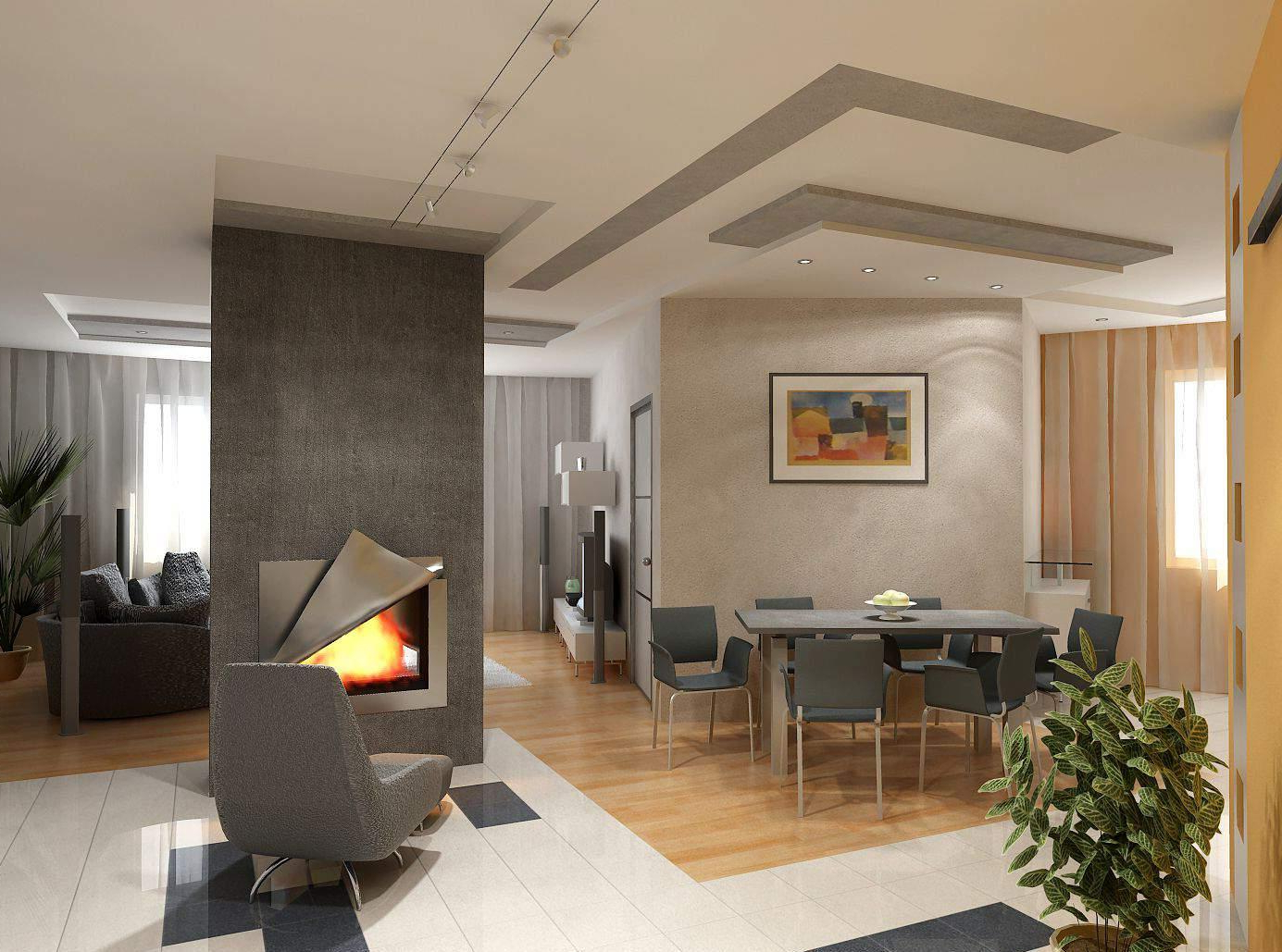
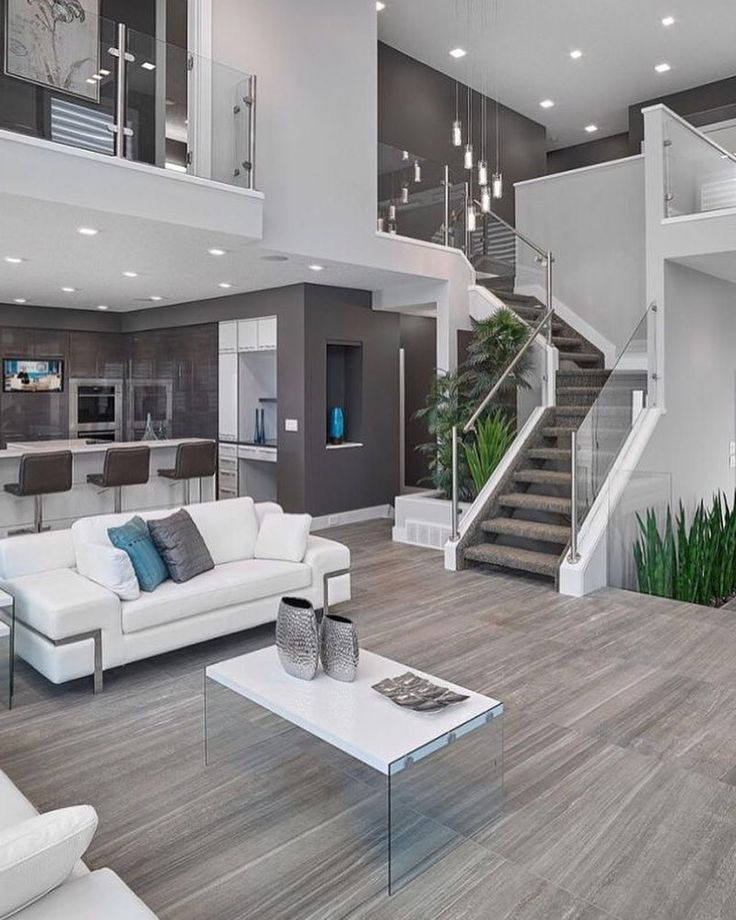
Creating Different Moods with Color
Every room in your home deserves its own personality, and color is the best way to express that. Let’s explore how to create specific atmospheres:
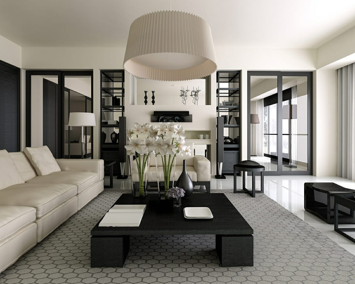
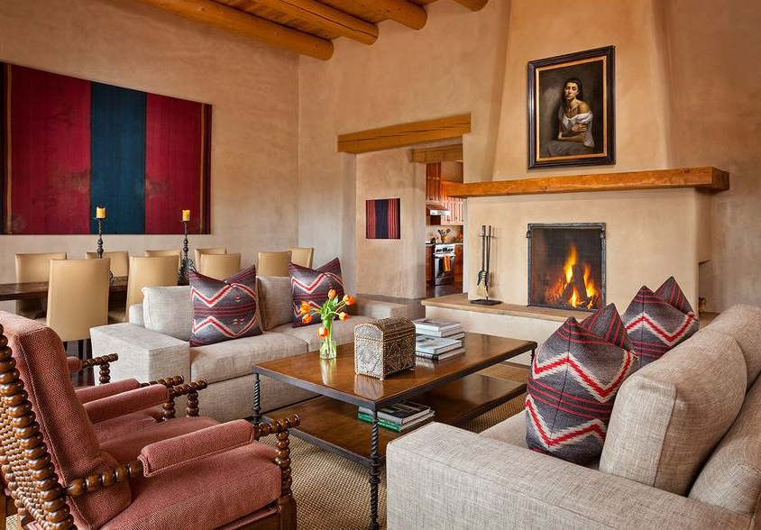
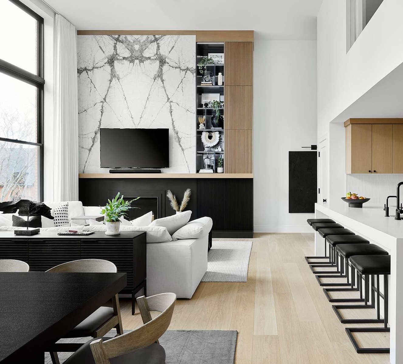
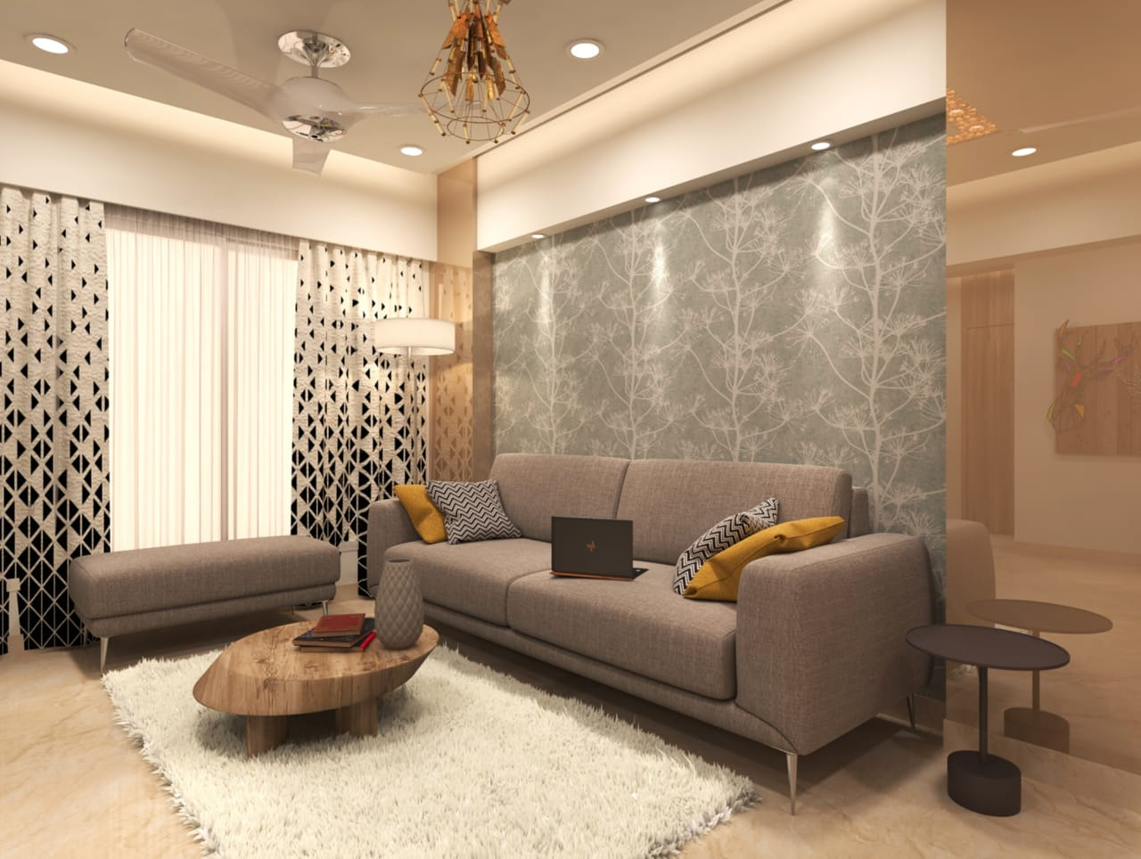
• Living Rooms: These spaces benefit from warm, inviting colors like soft oranges, warm yellows, or earthy browns. They encourage conversation and create a welcoming environment.
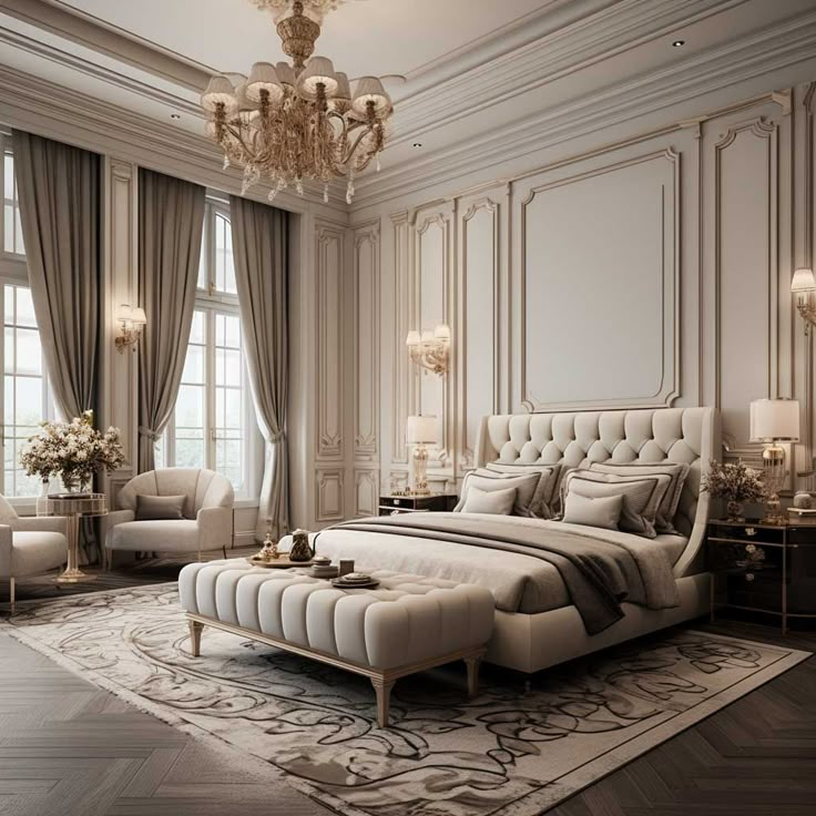
• Bedrooms: Cool colors such as pale blues, soft lavenders, or muted greens are ideal for promoting restful sleep and relaxation.
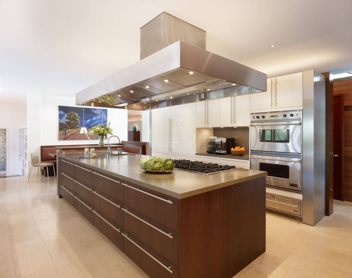
• Kitchens: Bright, cheerful colors like sunny yellow or crisp white can make cooking feel more enjoyable and uplifting.
• Home Offices: Calming blues and greens support focus and productivity, while warm grays provide a professional yet comfortable backdrop.
• Bathrooms: Light blues and whites create a clean, spa-like atmosphere that feels refreshing and airy.
Each room’s function should guide your color choices. But remember, personal preference matters too. If you love vibrant reds, don’t avoid them entirely—just consider where and how you incorporate them.
Practical Tips for Implementing Color Psychology
Here are some actionable strategies to start applying color psychology in your home:
• Start small: Try adding colored accents through pillows, artwork, or rugs before committing to full wall coverage.
• Test samples: Paint small sections of walls and observe how they look in different lighting conditions throughout the day.
• Consider the room size: Lighter tones make small spaces appear larger, while darker tones can make large rooms feel cozier.
• Balance your palette: Use the 60-30-10 rule—60% dominant color, 30% secondary color, 10% accent color.
• Think about natural light: North-facing rooms often benefit from warmer tones, while south-facing rooms can handle cooler shades.
These tips aren’t just tricks—they’re based on decades of design research and practical experience. They give you a framework for making informed decisions without overwhelming you with complexity.
Common Mistakes to Avoid in Color Selection
Even experienced designers sometimes stumble when choosing colors for their homes. Here are some frequent pitfalls to watch out for:
• Overpowering a space with too much of one color: This can make a room feel monotonous or even claustrophobic.
• Ignoring lighting conditions: A color that looks amazing in daylight might appear muddy or overly dark indoors.
• Not considering the room’s purpose: Using high-energy colors in a bedroom can interfere with sleep quality.
• Neglecting personal taste: Following trends blindly can leave you unhappy with your choices long-term.
• Skipping the small details: Sometimes a single accent color in a throw blanket or lamp can completely change a room’s vibe.
Avoiding these mistakes means creating spaces that truly serve you rather than just looking good on paper. Your home should feel like a reflection of who you are and what you need.
Real-Life Examples of Successful Color Applications
Let’s look at some inspiring examples of how color psychology has transformed homes:
• A family room painted in warm terracotta and golden yellow created an inviting space that naturally encourages conversation and connection.
• A master bedroom featuring soft sage green walls helped a client reduce stress levels significantly and improved sleep quality.
• An office space using cool blues and whites resulted in increased productivity and fewer distractions during work hours.
• A kitchen painted in bright coral brought joy and energy to a space that previously felt sterile and lifeless.
These transformations show that thoughtful color choices can have measurable impacts on daily life. They don’t require expensive renovations or major overhauls—just smart planning and a willingness to experiment.
Making Color Choices Work for Your Lifestyle
Your home should reflect your lifestyle, not just your preferences. Consider these factors when selecting colors:
• Family dynamics: If you have young children, consider easy-to-clean surfaces and cheerful colors that boost energy.
• Work-from-home needs: Choose colors that enhance focus and minimize distractions.
• Seasonal changes: Some people thrive with seasonal color shifts, while others prefer consistent calming tones.
• Personal history: Colors that hold special memories can add emotional depth to your space.
• Future plans: Think about whether you’ll want to stay in the space long-term or if it’s temporary.
This isn’t about making permanent decisions—it’s about finding the right balance between personal expression and practicality. Your home should evolve with you, not constrain you.
Final Thoughts on Color Psychology in Design
Color psychology in home design isn’t about controlling your emotions or forcing artificial feelings. It’s about creating environments that naturally support your wellbeing and enhance your daily experiences. When you understand how different colors influence mood and behavior, you gain the power to shape your living space intentionally. Whether you’re starting fresh or updating existing rooms, remember that there are no wrong choices—only opportunities to create something uniquely yours. The most important thing isn’t perfection, but intentionality. Choose colors that make you feel good, that align with your values, and that help you live better every single day. After all, your home should be more than just a place to live—it should be a place to thrive.
Color psychology in home design offers a powerful toolkit for transforming your living spaces into environments that truly serve your needs and desires. By understanding the emotional impact of different hues and tones, you can create rooms that not only look beautiful but also feel right for your lifestyle. Whether you’re aiming for serenity, energy, creativity, or comfort, there’s a color strategy that fits your vision. The key lies in balancing scientific principles with personal preference, testing ideas in real spaces, and remaining open to the subtle ways colors can shift your mood and enhance your daily routine. Your home is your sanctuary, and with thoughtful color choices, it can become an even more powerful space for rest, creativity, and connection. The journey to a more emotionally intelligent home starts with a single color choice—and that’s a beautiful place to begin.