Every morning when you open your curtains, you’re not just letting in daylight. You’re inviting in feelings, moods, and emotions that can completely shift your day. Think about it – how does your living room make you feel? Is it cozy and warm, or bright and energizing? These feelings aren’t just random. They’re the result of carefully chosen elements working together. Natural light and color psychology are two powerful forces that shape our home experiences in ways we might not even realize. This isn’t just about aesthetics. It’s about creating spaces that nurture us, support our well-being, and make us want to stay put.
The way your living room looks and feels can profoundly impact your daily routine, emotional state, and overall happiness. While many people focus on furniture placement or decorative accents, there’s a deeper layer at play that often goes unnoticed. Natural light and the colors within our spaces work together like invisible conductors, orchestrating our moods and energy levels. What if you could optimize your home environment simply by understanding how these elements interact? That’s exactly what we’re diving into today. We’ll explore how sunlight behaves in different rooms, why certain colors make us feel specific ways, and how combining both elements creates truly transformative living spaces.
Understanding the Power of Natural Light
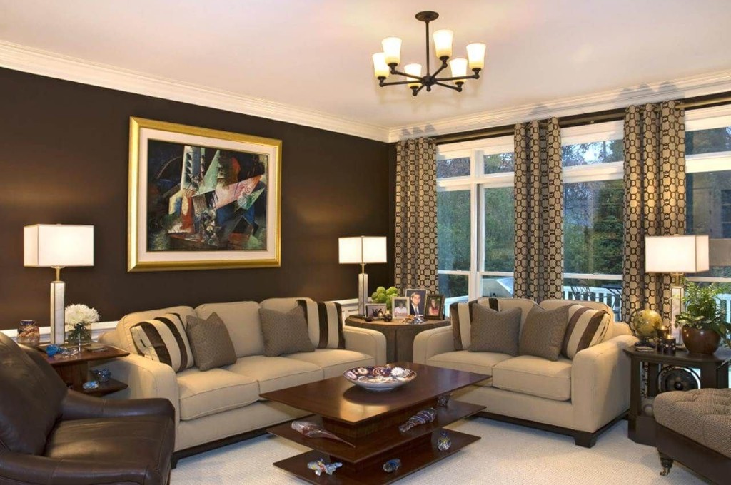
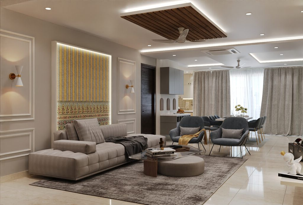
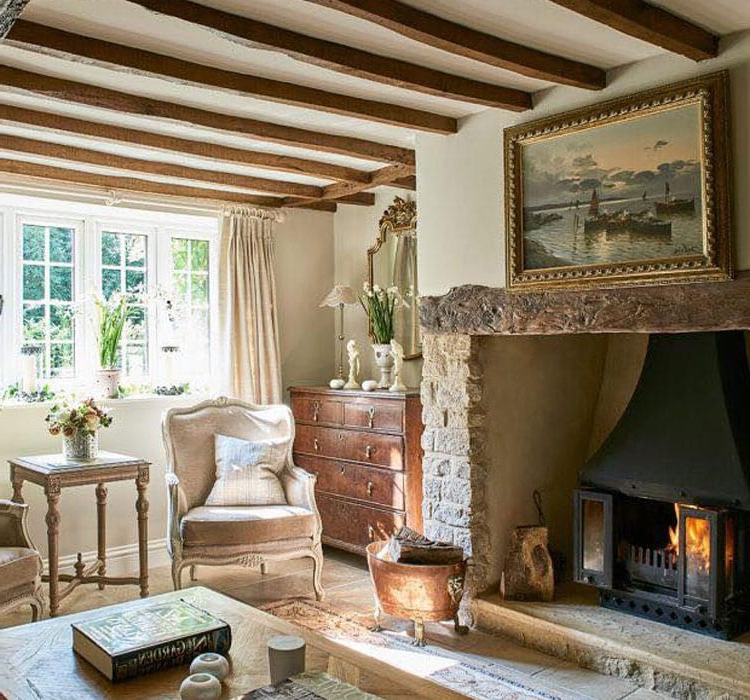
Natural light isn’t just about brightness – it’s about quality, timing, and direction. When sunlight hits a room, it changes throughout the day, casting different shadows and altering the entire atmosphere. Morning light tends to be soft and golden, creating warmth and optimism. Midday sun brings clarity and energy, while evening light takes on a warmer, more intimate hue. Consider how your living room receives sunlight. Does it get morning rays that brighten your space early? Or perhaps afternoon light that streams through large windows? Understanding your light patterns helps you plan accordingly. For instance, if you have a north-facing room that gets little direct sun, you might choose lighter colors to reflect what little light you do have. Conversely, a south-facing room with abundant sunshine might benefit from some neutral tones to prevent overwhelming brightness. The goal isn’t to eliminate shadows or overexpose everything – it’s to embrace natural rhythms that support your lifestyle and well-being.
Color Psychology Basics for Home Spaces
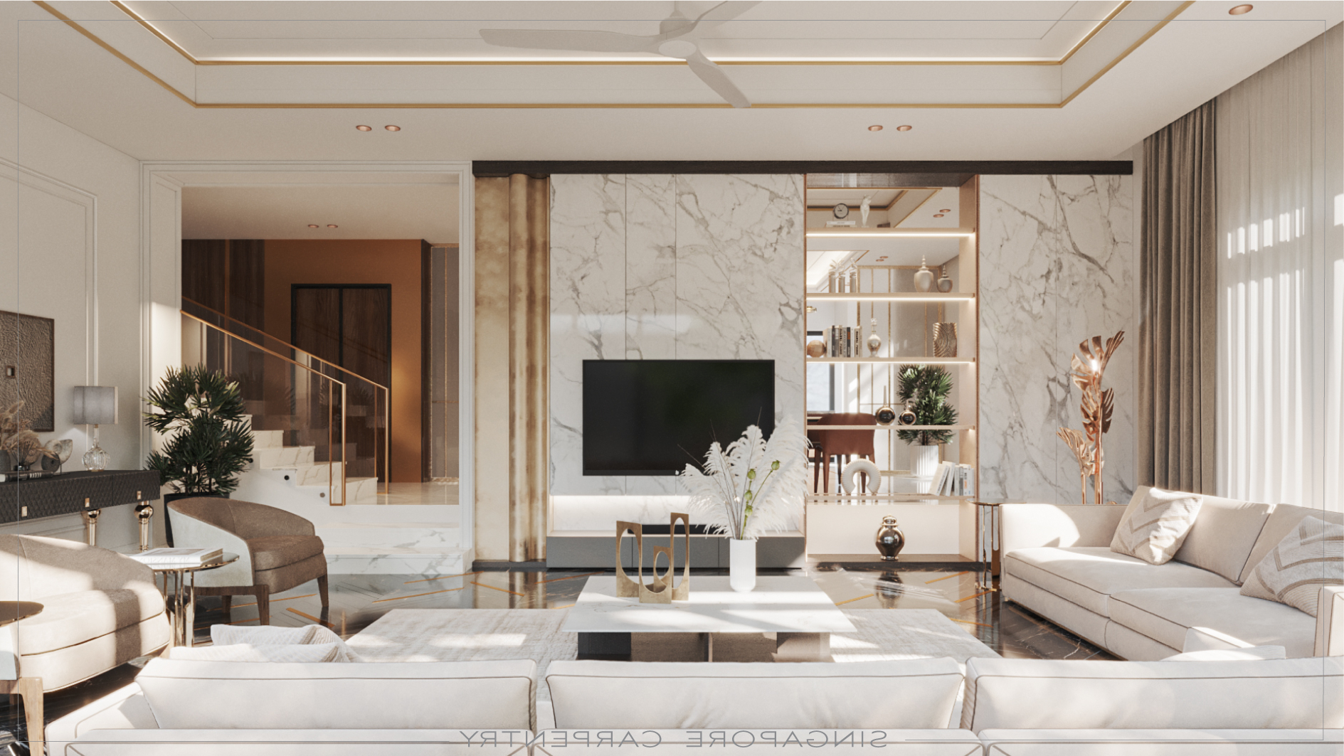
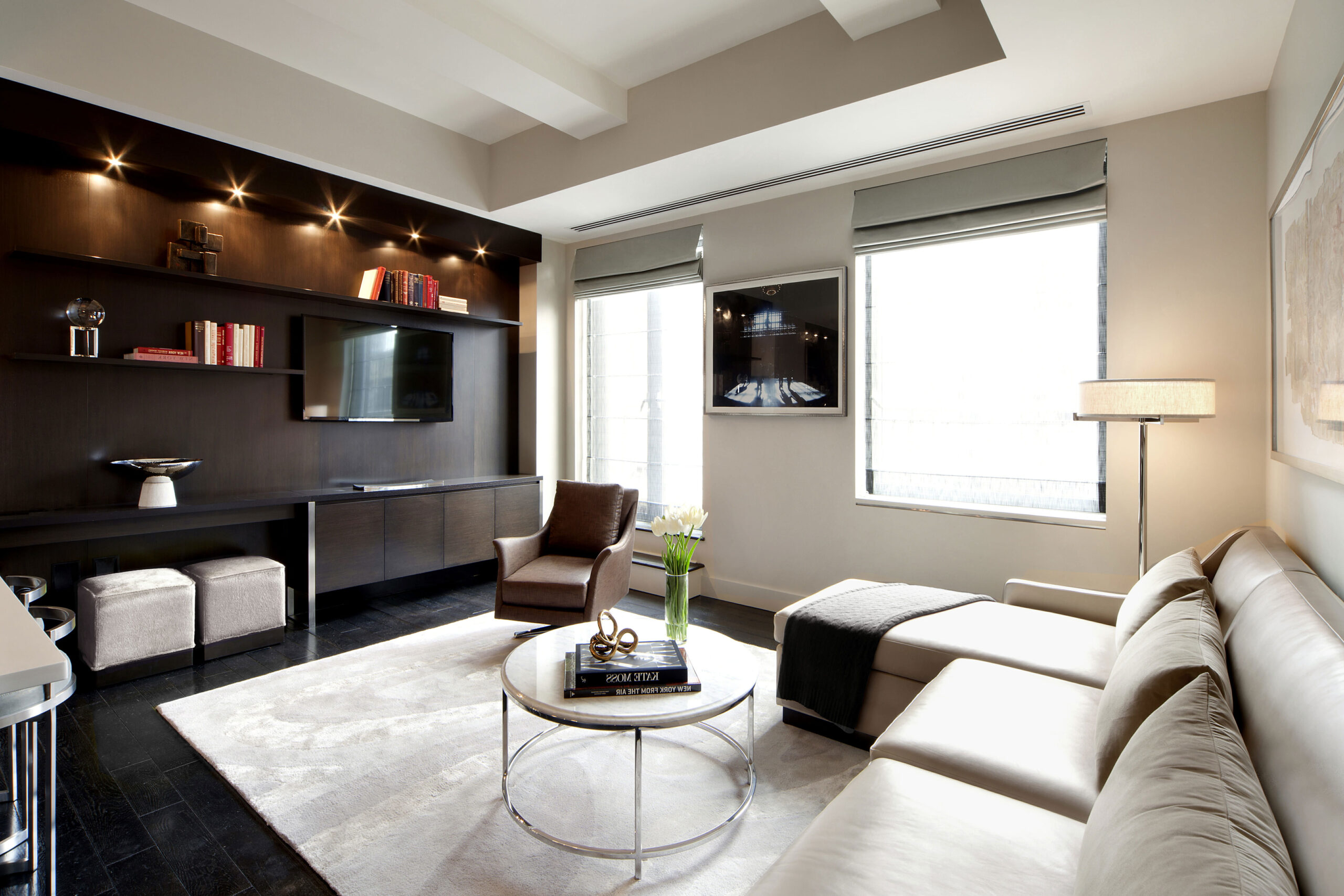
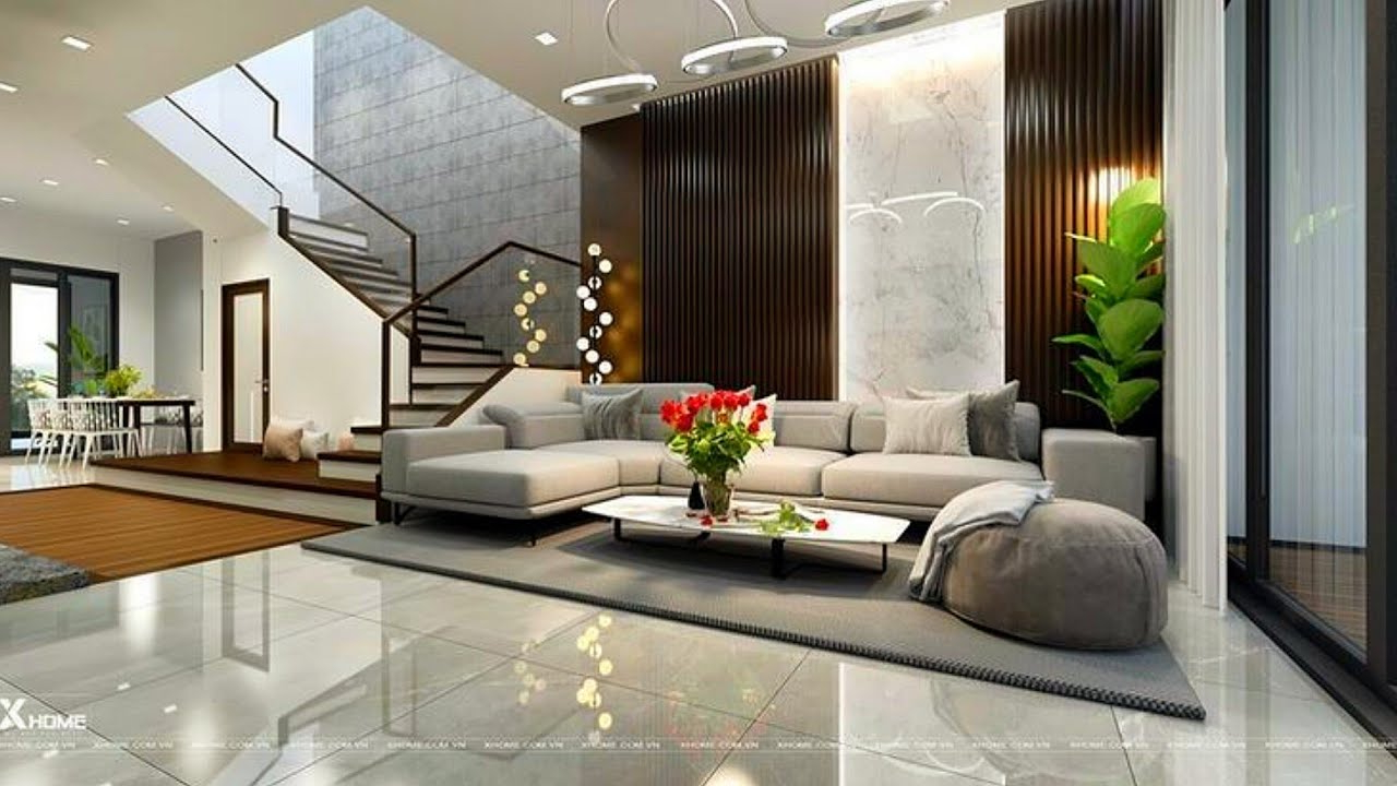
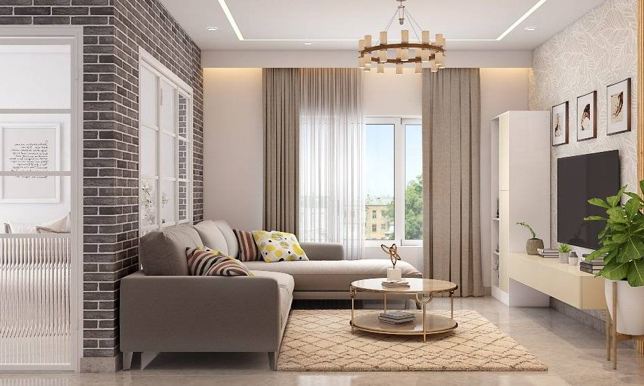
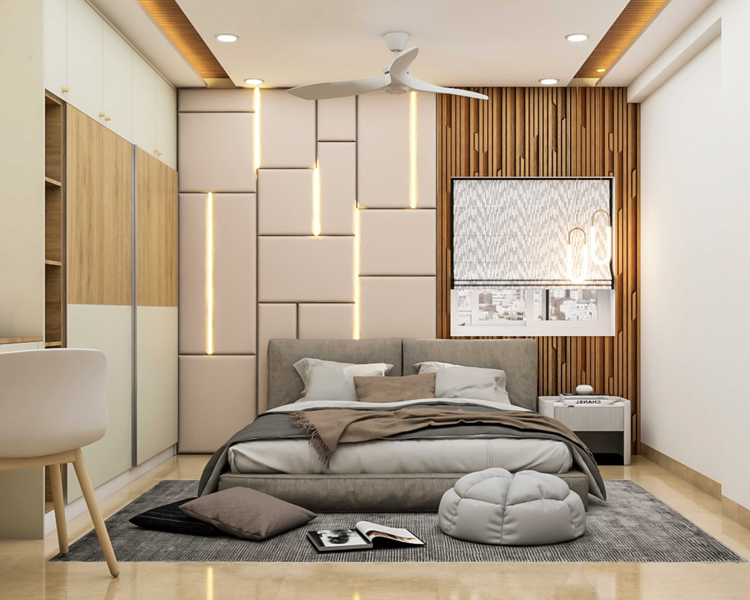
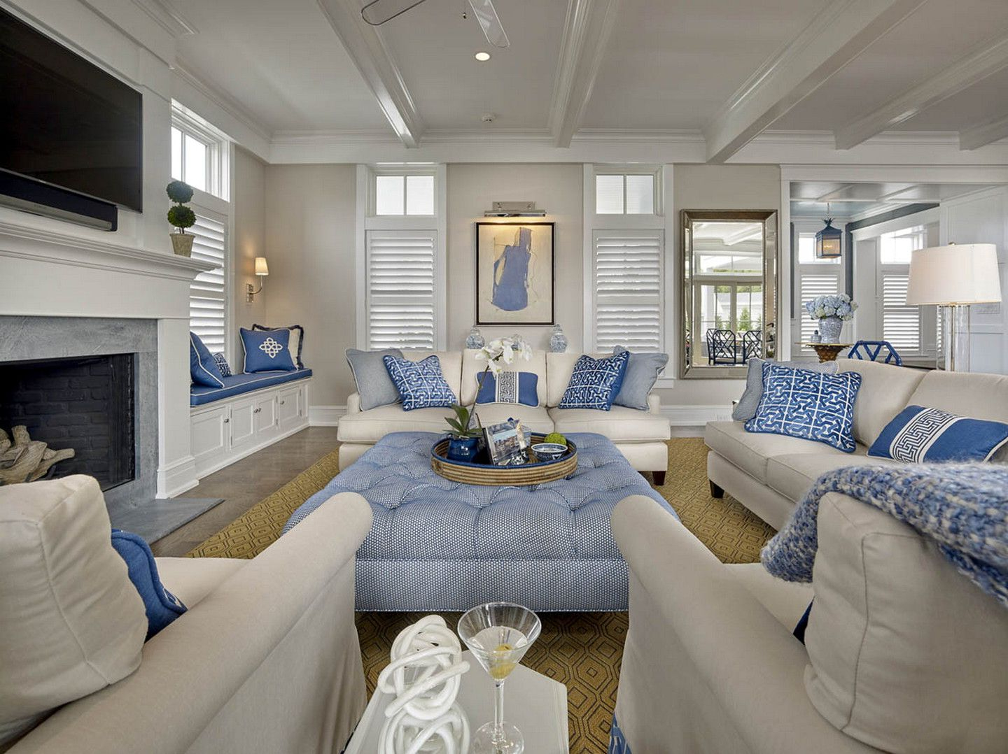
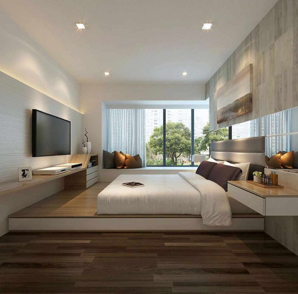
Colors don’t just decorate walls – they communicate. Every shade carries psychological weight and emotional associations. Warm colors like reds, oranges, and yellows tend to stimulate energy and conversation. They make spaces feel cozy and inviting, almost like a warm hug. Cool colors such as blues, greens, and purples promote calmness and relaxation. These hues can make a room feel spacious and peaceful, especially in smaller areas. Neutral tones like whites, creams, and grays provide balance and versatility. They let other colors pop while maintaining a sense of tranquility. But here’s something interesting: color perception changes based on lighting conditions. A blue wall might look completely different under harsh fluorescent lights compared to gentle afternoon sunlight. This is why understanding how natural light affects color is crucial for achieving your desired atmosphere. Consider your daily routine and what moods you want to encourage during different times of day.
Creating Harmony Between Light and Color
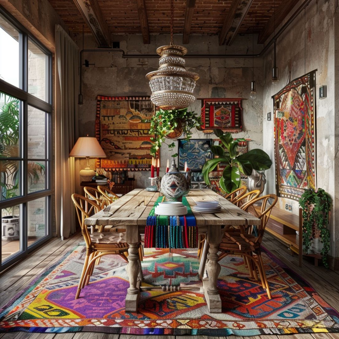
When natural light and color work in harmony, they create something magical. Imagine a living room with light wood floors and soft beige walls that catch morning sunlight beautifully. The result? A space that feels welcoming and energizing without being harsh. This synergy happens because the colors reflect and amplify the natural light. In contrast, dark walls in a poorly lit room can make everything feel heavy and closed-in, regardless of how much natural light enters. The key is to match your color choices with your light conditions. If you have a room with lots of natural light, you can experiment with bolder colors without worrying about making it feel cramped. But if your space relies heavily on artificial lighting, softer, lighter colors will help maintain a bright, airy feeling. Think about how you spend time in your living room. Do you prefer quiet reading moments? Or lively social gatherings? Your light and color choices should support those activities naturally.
Practical Tips for Optimizing Your Space
Let’s talk real-world applications. Start by observing your living room at different times of day. Notice how shadows fall, how the light changes intensity, and what colors seem to respond best. Then consider these strategies:
• Use mirrors strategically to bounce natural light around the room
• Choose light-colored fabrics for curtains to allow maximum light penetration
• Select paint colors that complement your room’s natural light patterns
• Add plants to bring life and soften harsh light reflections
• Incorporate adjustable lighting options for flexibility throughout the day
These aren’t just tricks – they’re thoughtful approaches to creating a space that works with your natural rhythms rather than against them. Sometimes, the most impactful change comes from simply opening your blinds wider or rearranging your furniture to better capture available light.
Seasonal Considerations in Light and Color Design
Your living room shouldn’t feel static year-round. As seasons change, so should your approach to light and color. During darker winter months, you might want to enhance warm, inviting tones to combat the lack of natural brightness. Think rich browns, deep oranges, and creamy yellows. These colors help create a cocoon-like feeling when daylight is scarce. In summer, lighter, cooler colors can help maintain a fresh, breezy atmosphere. But remember, you don’t have to completely overhaul your space. Small adjustments like swapping out throw pillows or changing artwork can signal seasonal shifts without major renovations. Consider how your room feels in each season and what subtle modifications could improve comfort and mood. The goal is to maintain visual interest while supporting your body’s natural circadian rhythms.
Common Mistakes to Avoid in Light and Color Planning
Even experienced designers sometimes fall into traps when combining natural light and color. One common error is assuming that all rooms should look the same regardless of their light exposure. A bedroom with minimal natural light needs different treatment than a bright kitchen. Another mistake is choosing colors that ignore the actual behavior of light in your space. A color that looks perfect in a showroom might appear completely different when placed in your home. Also, don’t overlook the impact of window treatments. Heavy drapes can block too much light, while sheer curtains might let in more than you’d like. Finally, avoid using too many competing colors. Sometimes less is more – especially when trying to create a cohesive atmosphere. Remember, your living room should feel intentional, not chaotic.
Designing a living room that truly supports your well-being requires understanding the dance between natural light and color psychology. It’s not about following rigid rules – it’s about paying attention to how your space makes you feel and adjusting accordingly. Whether you’re starting fresh or looking to refresh an existing room, consider how sunlight flows through your space and which colors align with your desired moods. The right combination of light and color doesn’t require expensive changes or major renovations. Sometimes it’s as simple as moving a chair to catch better light or adding a few carefully selected accent colors. By taking time to observe, experiment, and adapt, you can create a living space that genuinely enhances your quality of life. After all, your home should be more than just a place to live – it should be a place that nurtures you.