Ever walk into a room and just feel… different? Maybe it’s the light, the furniture, or perhaps it’s something deeper, something tied to the very hues that surround you. That feeling is real, and it’s especially potent in our bedrooms. This is our sanctuary, our place of rest and rejuvenation. So, why wouldn’t we want the colors in it to work for us, rather than against us? Let’s explore how the shades we choose can profoundly impact our sleep, our stress levels, and even our relationships. It’s time to look beyond the predictable and embrace the power of paint.
We spend a significant portion of our lives in our bedrooms, yet often, the color choices are made on a whim, or perhaps settling for what feels safe – think endless shades of beige and off-white. But what if I told you that the color of your walls could be actively helping you sleep better, feel calmer, or even boost your intimacy? It sounds a bit wild, doesn’t it? Yet, the science behind color psychology is fascinating and surprisingly practical. It’s not just about aesthetics; it’s about creating an environment that nurtures your mental and emotional state. Let’s unpack how different colors can transform your sleeping space into a true haven.
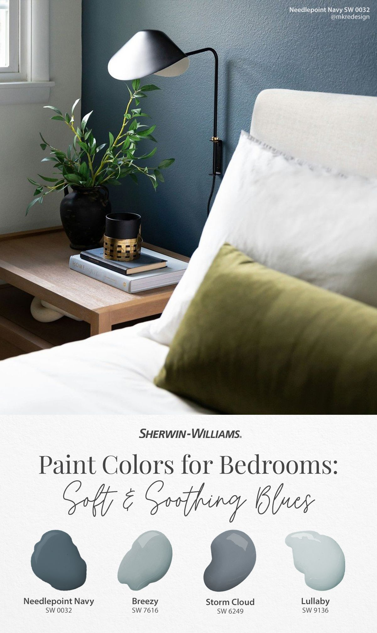
The Soothing Power of Blues and Greens
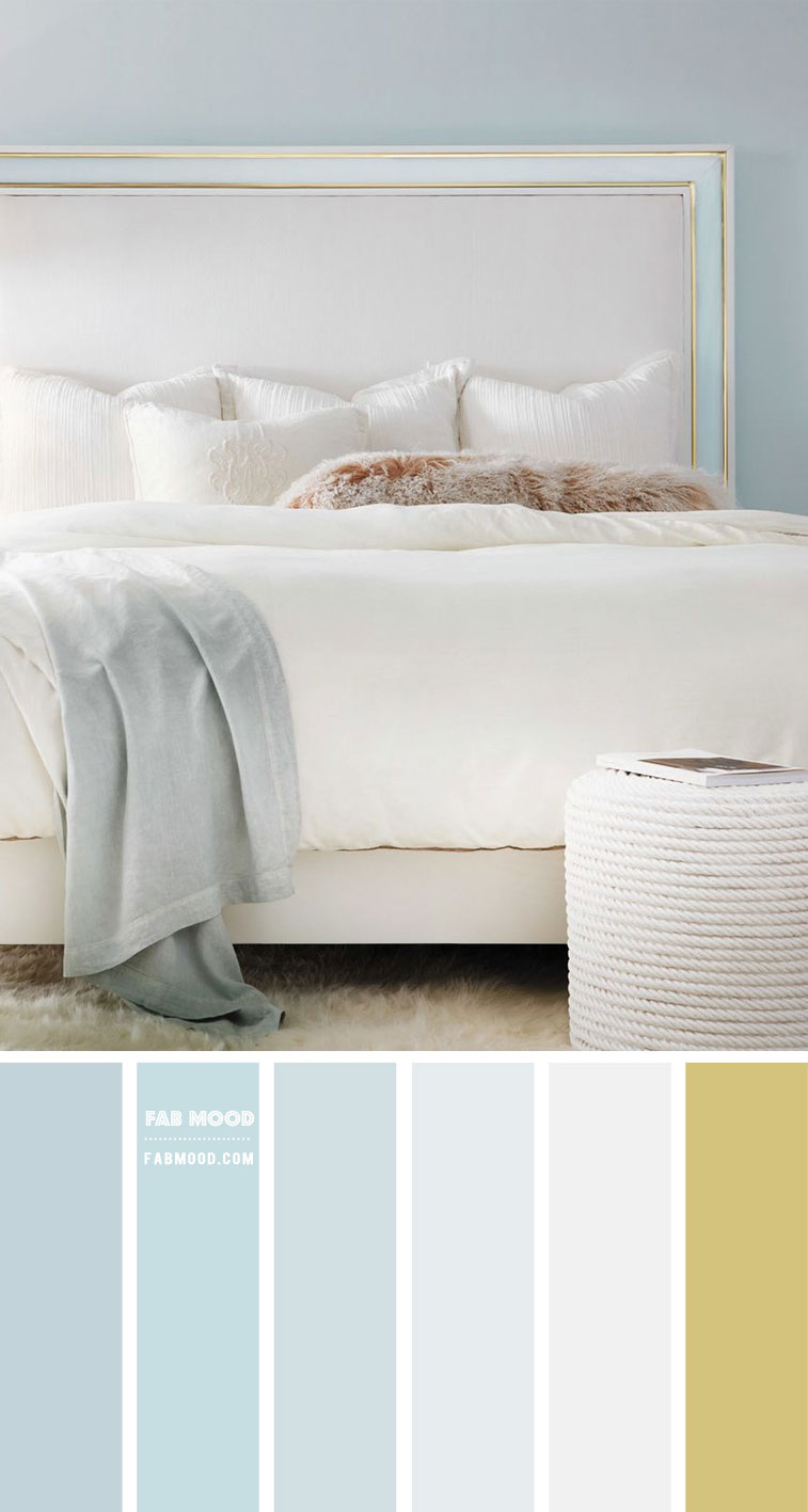
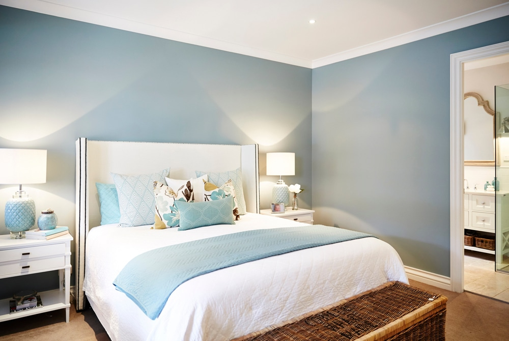
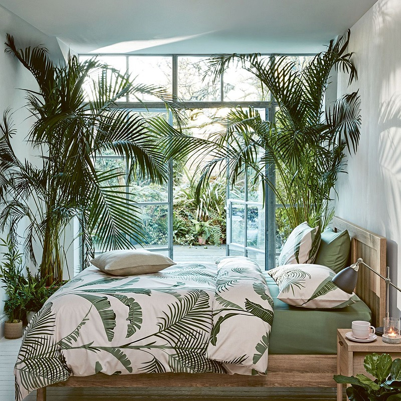
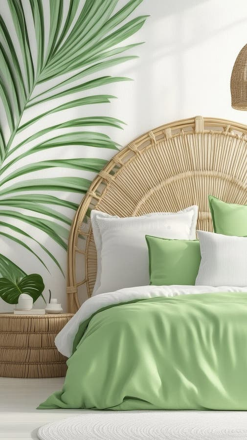
When we think of relaxation, what often comes to mind? Nature, right? That’s why blues and greens are perennial favorites for bedrooms. Blues, particularly softer, muted tones like sky blue or dusty blue, are associated with calmness and serenity. They can actually lower your heart rate and blood pressure, mimicking the tranquil effect of gazing at a clear sky or a peaceful ocean. Think of it as a visual lullaby. Similarly, greens, especially those reminiscent of nature like sage or mint, evoke feelings of balance and harmony. They’re grounding colors that can help melt away the day’s anxieties. Imagine a soft, mossy green on your walls – it’s like bringing a bit of the forest indoors, creating a naturally calming atmosphere. These shades are fantastic for anyone struggling with stress or finding it hard to wind down at night. They create a sense of spaciousness, too, making even smaller rooms feel more open and airy.
Warm Tones: Comfort and Connection
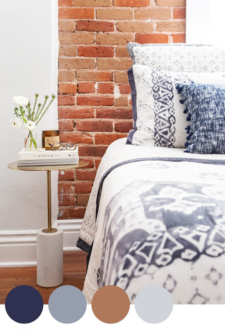
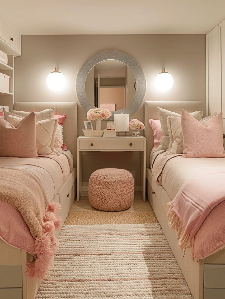
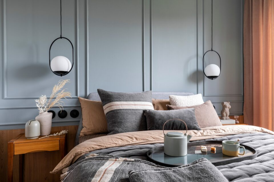
While cool colors often dominate discussions about sleep, warm tones can also play a significant role, though their impact is a bit more nuanced. Think about colors like soft terracotta, warm peaches, or gentle lavenders. These hues can evoke feelings of comfort, warmth, and intimacy. A soft, muted coral or a dusty rose can create a cozy and inviting atmosphere, fostering a sense of connection. However, it’s crucial to be mindful of intensity. Overly bright or saturated warm colors, like a vibrant red or a fiery orange, can be stimulating and may not be conducive to sleep. Opt for softer, desaturated versions to harness their comforting qualities without triggering alertness. These colors can make a large room feel more intimate and snug, perfect for creating a romantic or comforting retreat. They’re also great for adding a personal touch and making the space feel truly yours.
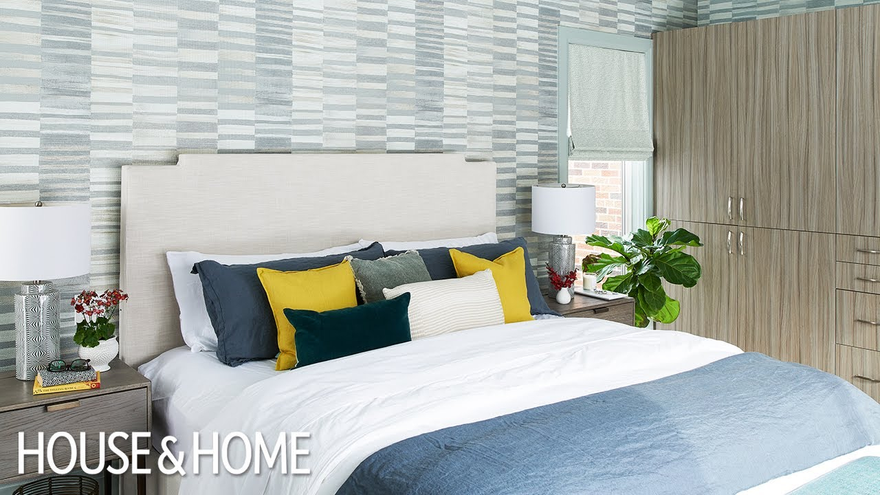
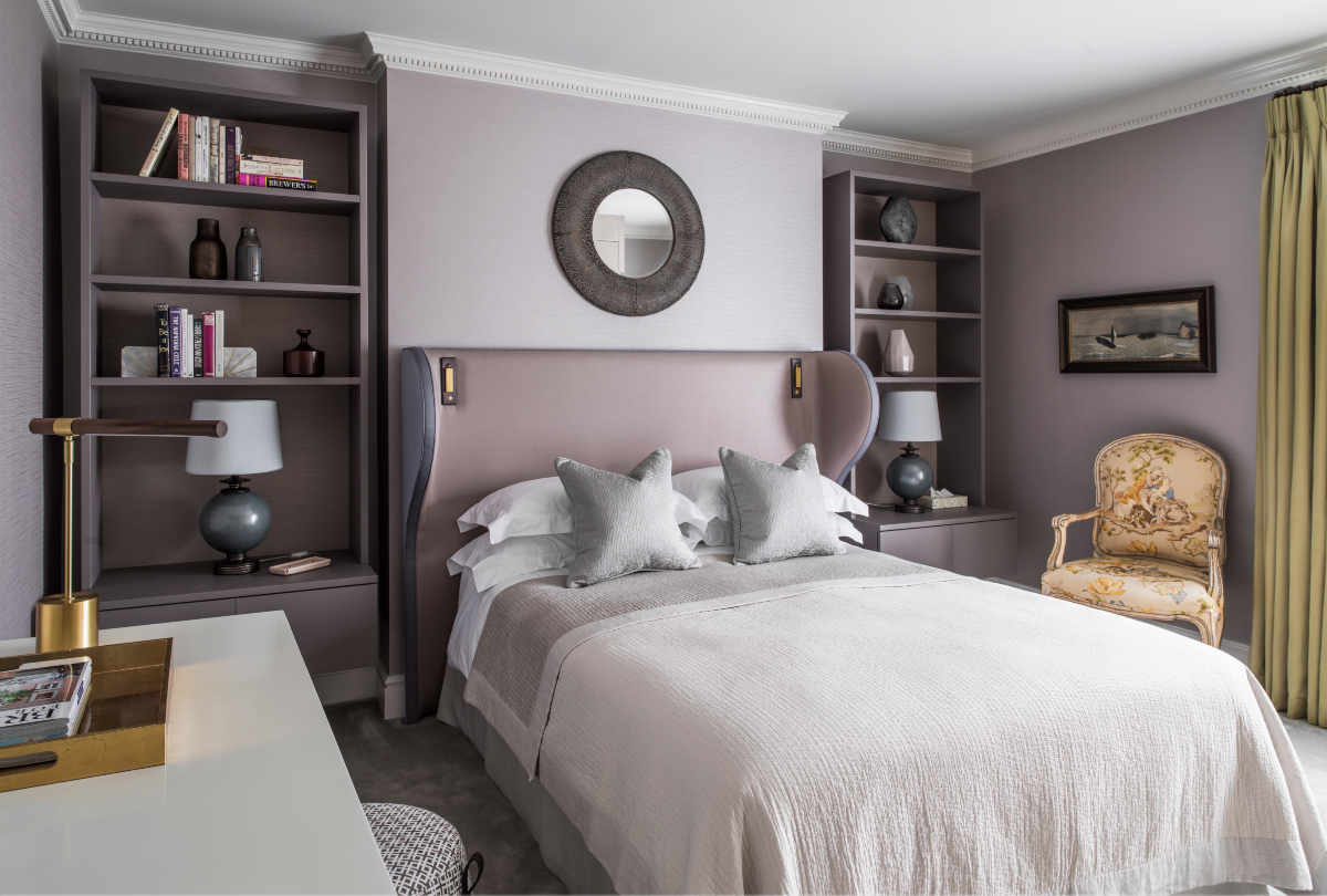
The Neutral Territory: Sophistication and Simplicity
Neutrals like grays, creams, and yes, even sophisticated beiges, offer a timeless appeal. They provide a blank canvas, allowing other elements in the room – like artwork, textiles, or furniture – to take center stage. The key here is to choose the right neutrals. A cool-toned gray can feel serene and modern, while a warm beige or greige can offer a cozy, earthy vibe. These colors are excellent for creating a sense of order and calm, which is beneficial for sleep. They’re also incredibly versatile, making it easy to update your decor over time without needing to repaint. However, a word of caution: too much of a stark, cool neutral without any warmth can sometimes feel a bit sterile or unwelcoming. Balancing them with natural textures like wood or plants can really bring these spaces to life and add that much-needed touch of comfort. Think about adding a chunky knit throw or a rustic wooden nightstand to warm up a cooler neutral palette.
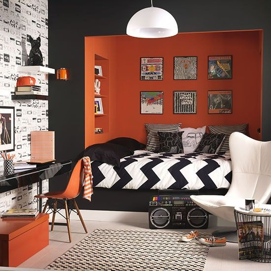
Bold Choices: Energy and Personality
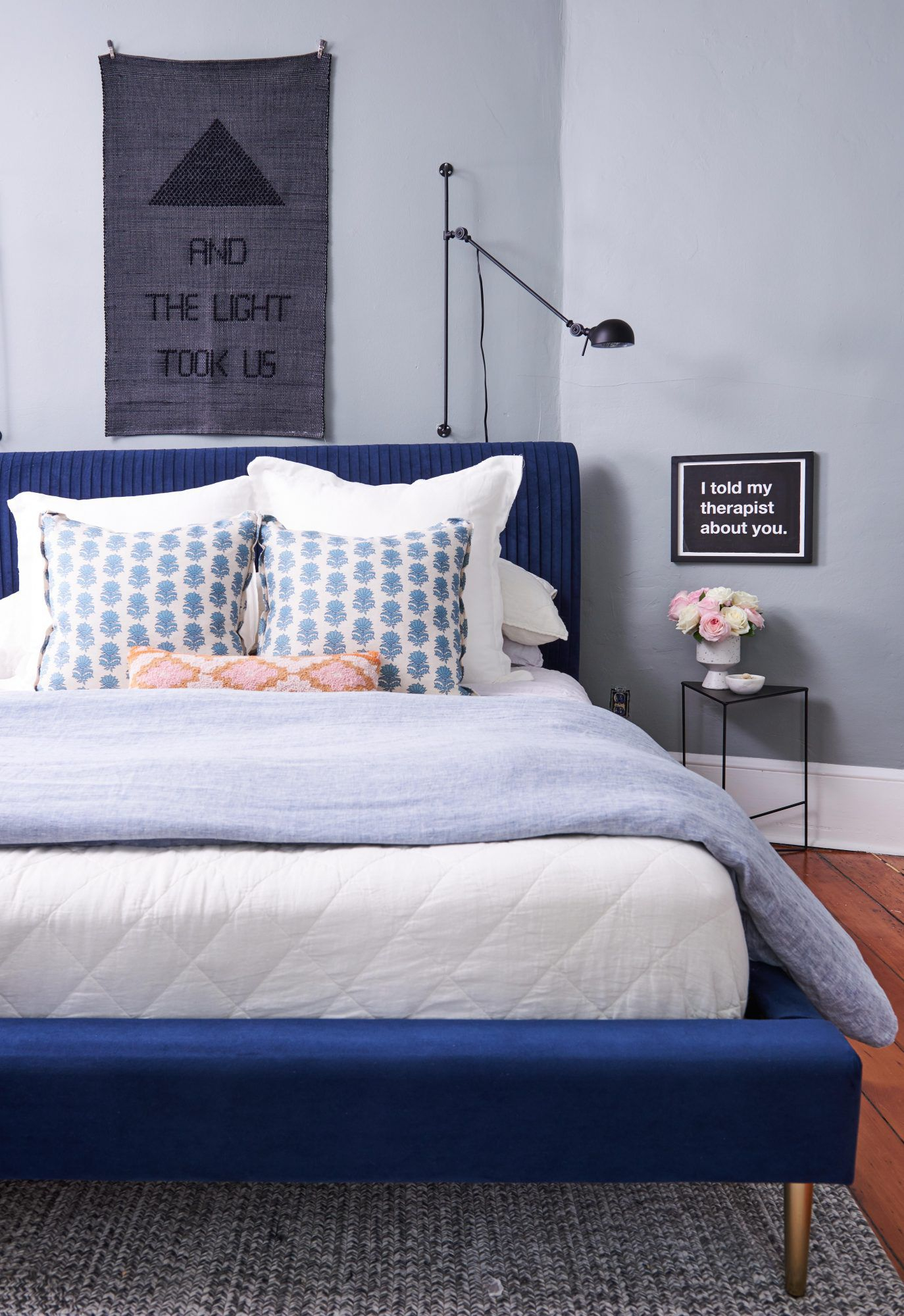
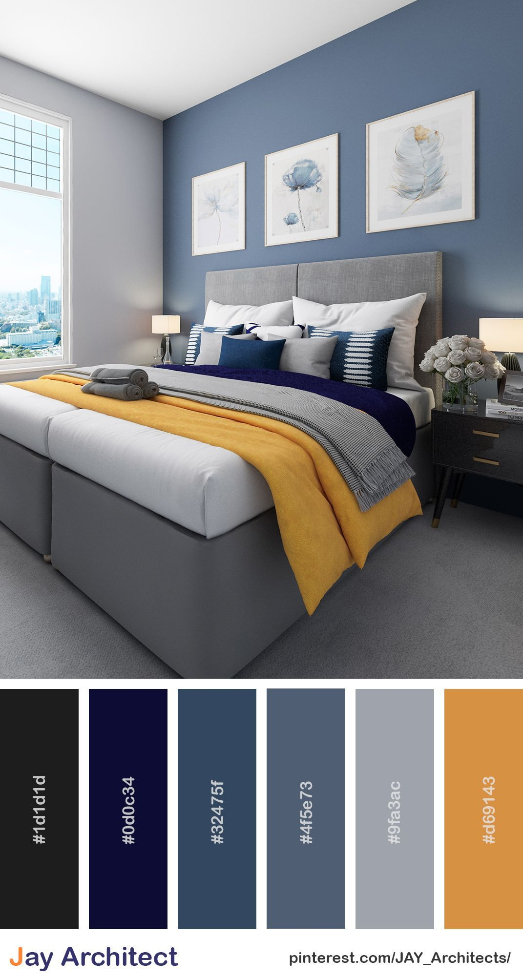
While not typically recommended for the primary walls if sleep is your main goal, bolder colors can certainly have a place in the bedroom for those who crave personality and energy. Deep jewel tones like emerald green or sapphire blue, when used thoughtfully, can create a luxurious and enveloping atmosphere. A deep navy can actually be quite conducive to sleep, offering a sense of depth and calm, much like the night sky. If you love vibrant colors, consider using them as accents – perhaps through a statement wall, bedding, or decorative items. A splash of mustard yellow in a throw pillow or a rich burgundy in a piece of art can add warmth and character without overwhelming the senses. The trick is to balance these bolder hues with plenty of softer, calming elements and ensure they don’t disrupt your ability to relax and drift off to sleep.
The Impact of Light and Shade
It’s not just the color itself, but also its shade and how it interacts with light that truly matters. A color that looks serene in a well-lit showroom might appear dramatically different in your bedroom, especially with varying natural and artificial light throughout the day and night. For instance, a light, airy blue can feel calming and spacious in daylight but might feel a bit cool or even melancholic in the evening if only artificial light is present. Conversely, a warmer, muted tone can provide a comforting glow as the day winds down. Consider the direction your bedroom faces. North-facing rooms tend to get cooler, indirect light, so warmer colors or softer, desaturated tones can help create a cozier feel. South-facing rooms get more direct sunlight, so cooler or more muted shades can help balance the warmth and prevent the room from feeling too bright or overstimulating. Always test paint samples on your walls and observe them at different times of the day before committing.
Creating Your Personal Color Sanctuary
Ultimately, the best color for your bedroom is one that makes you feel good and supports your well-being. While color psychology offers valuable insights, personal preference and individual responses to color are paramount. Think about the feelings you want to cultivate in your space: peace, romance, energy, or calm. Consider the overall mood you want to create. Do you want a serene retreat that promotes deep sleep, or a cozy nest that feels warm and inviting? Don’t be afraid to experiment with samples. Look at how the colors change throughout the day and how they make you feel. Combine your chosen wall color with complementary bedding, curtains, and decor to create a cohesive and supportive environment. Remember, your bedroom is your personal space, and its colors should reflect your needs and enhance your quality of life. It’s a journey of discovery, and the perfect palette is waiting to be found.
So, there you have it. The colors we choose for our bedrooms aren’t just decorative decisions; they’re investments in our well-being. From the calming embrace of blues and greens to the comforting warmth of soft earth tones, each hue carries a psychological weight. By understanding the subtle yet powerful influence of color, you can transform your bedroom from a mere functional space into a true sanctuary that supports restful sleep, reduces stress, and enhances your overall quality of life. Take the time to consider what you truly want from your sleeping space, experiment with shades, and don’t be afraid to go beyond beige. Your perfectly colored sanctuary awaits.