Ever walk into a kitchen and just feel… right? There’s a certain magic to it, an energy that makes you want to linger, to cook, to connect. Often, that magic is woven from a carefully considered color story. It’s more than just picking a paint shade; it’s about creating a feeling, a personality for the heart of your home. Let’s dive into how you can make your kitchen’s colors truly sing.
Your kitchen isn’t just a place for preparing meals; it’s where memories are made, conversations flow, and life happens. And the colors you choose play a massive role in setting the mood for all of it. Think about it: a bright, sunny yellow can feel instantly cheerful, while deep blues and greens can offer a sense of calm and sophistication. But how do you go from a blank canvas to a space that feels cohesive and uniquely you? It all starts with understanding and intentionally building your kitchen’s color story. This isn’t about following fleeting trends, but about creating a lasting harmony that resonates with your personal taste and lifestyle.
Discovering Your Kitchen’s Core Palette
Before you even think about paint chips, take a moment to consider what truly makes you feel happy and comfortable. What colors do you gravitate towards in your wardrobe, in nature, or in other spaces you love? Your kitchen’s color story should be an extension of your personal style.
Start by looking at existing elements:
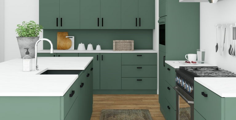
- Cabinetry: Are they white, wood-toned, or a bold color? These are often the largest color elements.
- Countertops and Backsplash: These surfaces can introduce patterns and a range of hues.
- Flooring: The color and material of your floors anchor the entire space.
- Appliances: While often stainless steel, some kitchens feature colored appliances that can influence your choices.
Don’t be afraid to pull inspiration from anywhere. A favorite piece of art, a vacation destination, or even a cherished fabric can provide a fantastic starting point for your core color palette. Think about creating a base of neutral colors, then layering in your accent colors.
The 60-30-10 Rule: A Simple Guideline
A really helpful way to structure your color choices is using the 60-30-10 rule. It’s a classic design principle that brings balance and a pleasing visual hierarchy to a room.
- 60% Dominant Color: This is your main color, usually seen on walls or large cabinetry. It sets the overall tone.
- 30% Secondary Color: This color supports the dominant one and is typically used for secondary cabinetry, furniture, or larger decor items.
- 10% Accent Color: This is where you can have some fun. Use this for pops of interest through accessories, smaller decor pieces, or even a statement appliance. Think colorful dishware, a vibrant rug, or unique hardware.
This rule isn’t set in stone, of course, but it provides a fantastic framework for ensuring your colors work harmoniously without one overpowering the others. It’s about creating a visual rhythm.
Warm vs. Cool: Setting the Mood
The temperature of your colors can dramatically impact the feel of your kitchen. Understanding whether you’re leaning towards warm or cool tones is crucial.
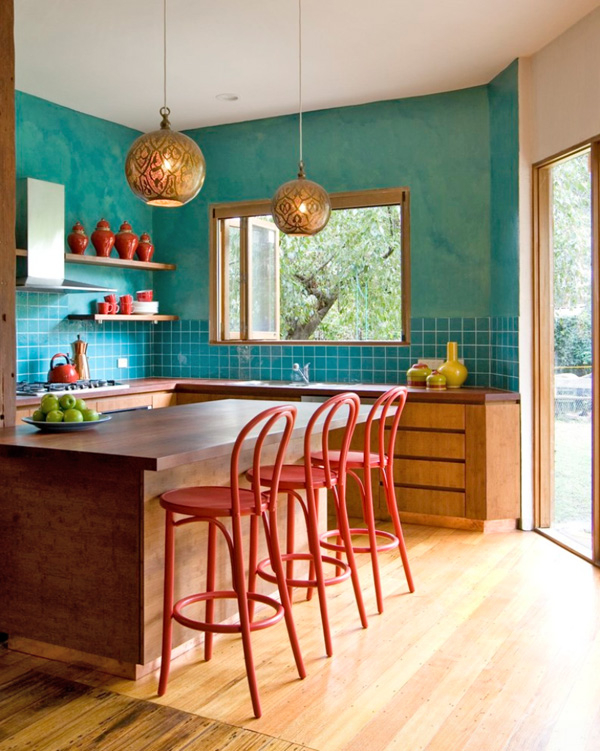
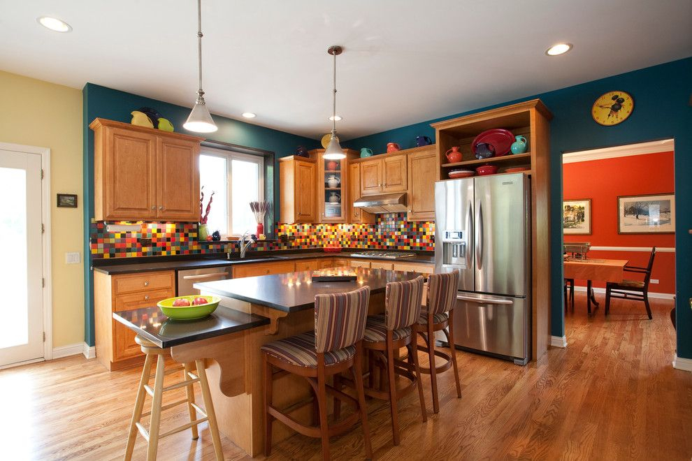
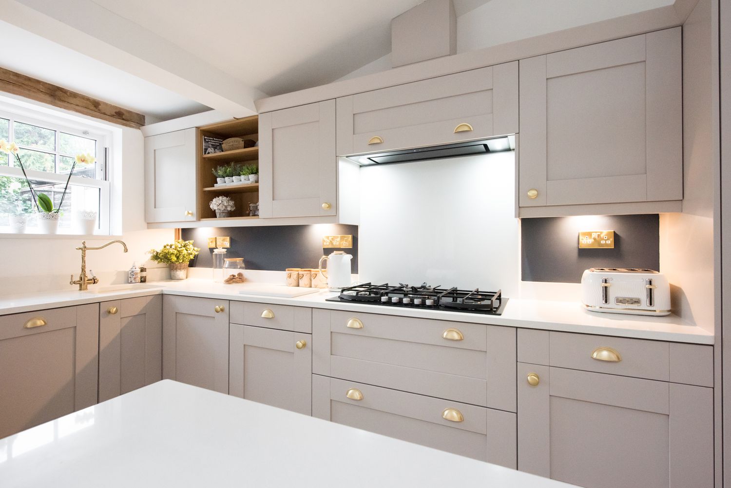
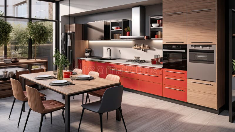
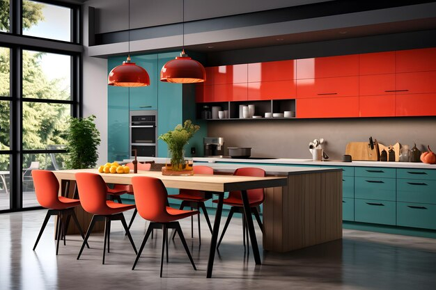
- Warm Colors: Reds, oranges, and yellows tend to make a space feel cozy, inviting, and energetic. They can make a large kitchen feel more intimate or a north-facing kitchen feel brighter. Imagine a kitchen with warm wood cabinets and a terracotta backsplash – it just feels welcoming, doesn’t it?
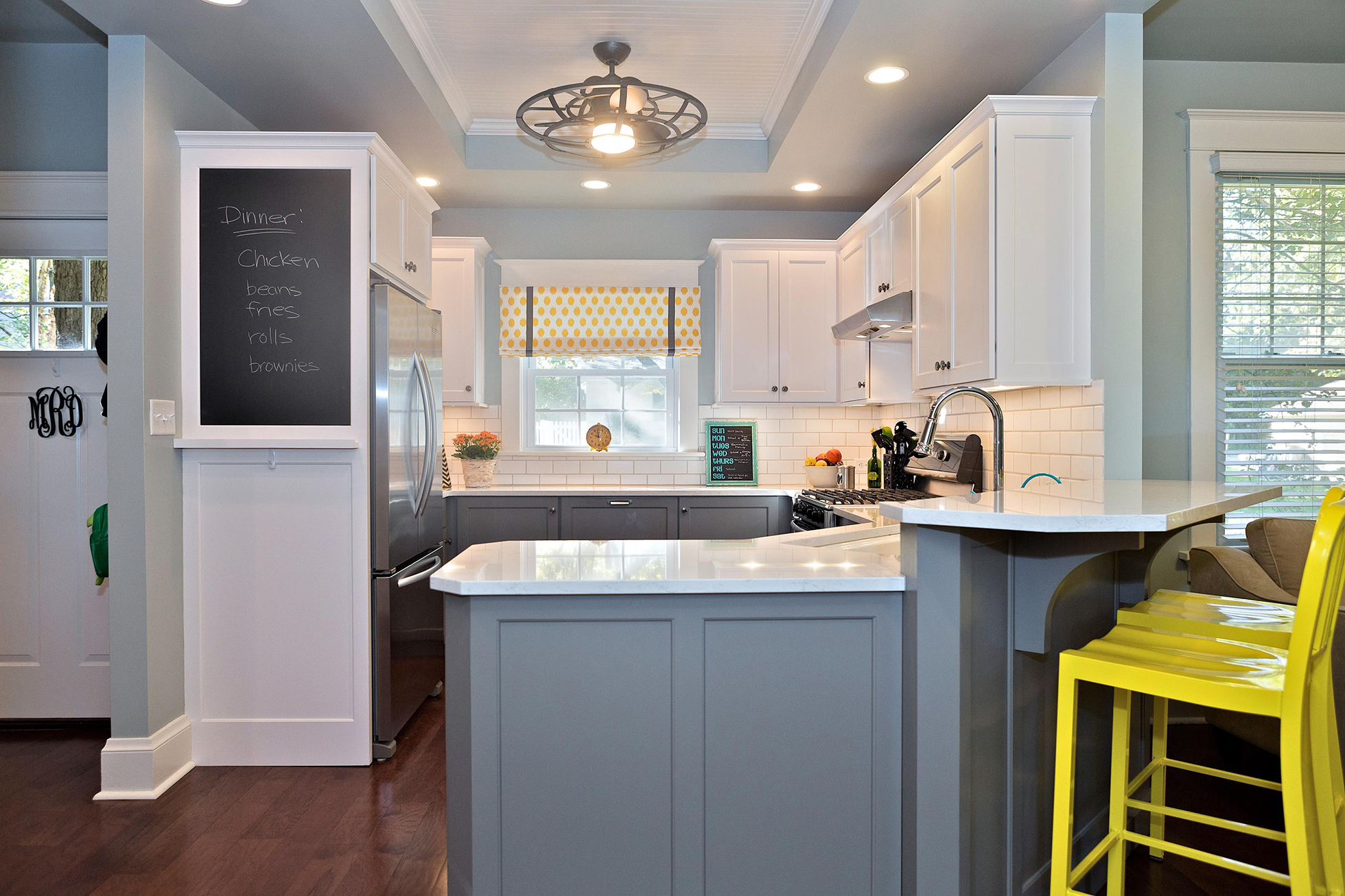
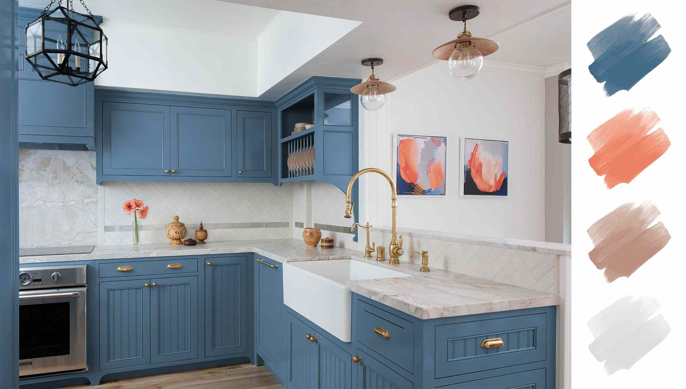
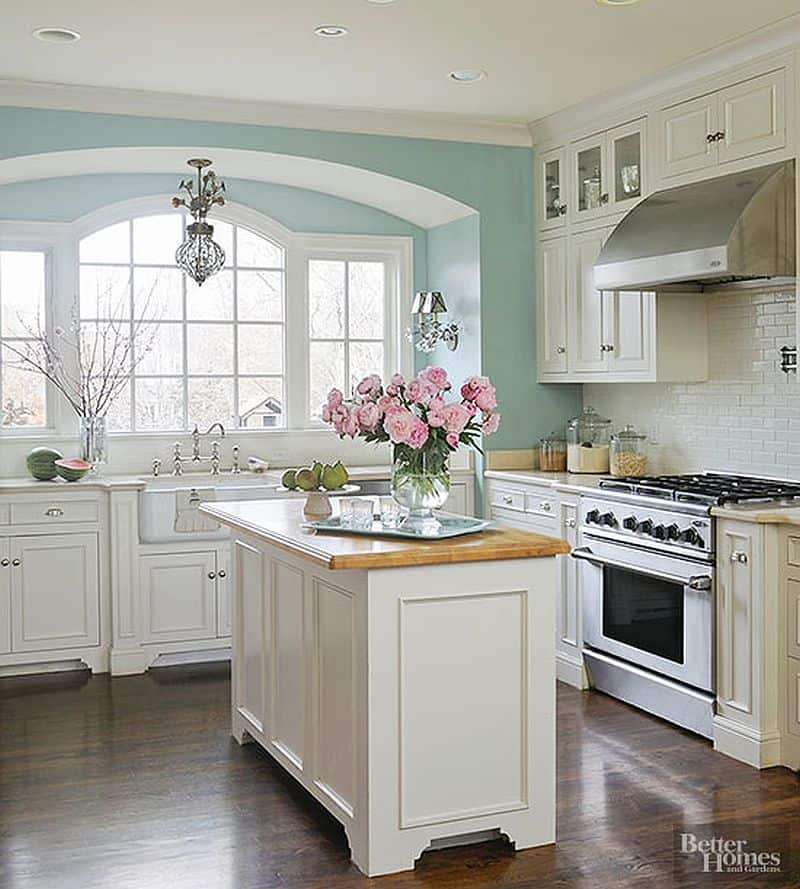
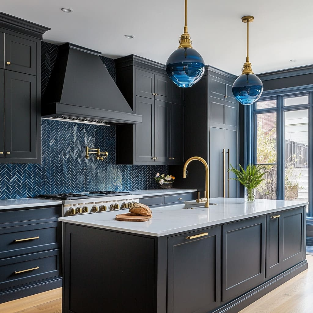
- Cool Colors: Blues, greens, and purples create a sense of calm, serenity, and spaciousness. They can be excellent for making a smaller kitchen feel larger or for achieving a more contemporary or spa-like atmosphere. Think of a kitchen with soft blue cabinets and a grey stone countertop; it often evokes a sense of peace.
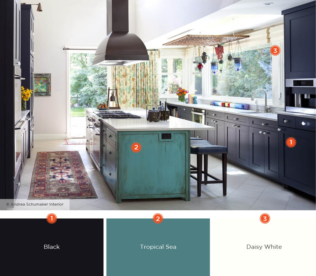
Many successful kitchen designs blend warm and cool elements. For instance, you might have cool-toned cabinetry balanced with warm wood accents or a warm-toned wall color complemented by cool-toned accessories. The key is balance and intention.
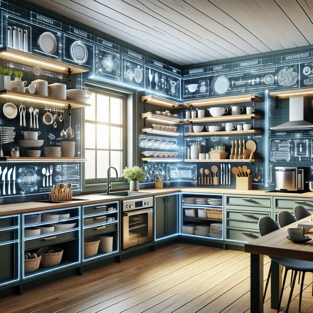
Materiality and Texture: The Supporting Cast
Color isn’t just about paint. The materials and textures you choose for your cabinets, countertops, flooring, and even your hardware play a vital role in your kitchen’s overall color story. Consider how different materials reflect and absorb light, and how their inherent colors interact.
- Wood Tones: From light maple to rich walnut, wood brings natural warmth and texture. Its inherent color can be a dominant or accent element.
- Stone and Quartz: These surfaces offer a spectrum of colors and patterns, from veined marble to solid-colored quartz. They can introduce subtle or bold color statements.
- Metals: Think of your cabinet hardware, lighting fixtures, and appliance finishes. Brass adds warmth, brushed nickel offers a cool modern touch, and black provides a grounding, sophisticated element.
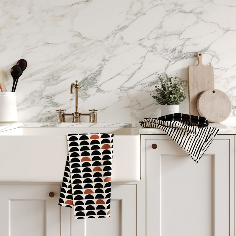
- Textiles: Even small touches like dish towels, placemats, or a runner rug can introduce color and texture, tying your scheme together. A patterned rug can be a fantastic way to introduce multiple colors and break up a large expanse of flooring.
Bringing it All Together: Examples in Action
Let’s look at a couple of ways color stories can manifest:
Example 1: The Coastal Calm Kitchen
- Dominant (60%): Soft, muted blues or seafoam green on cabinetry.
- Secondary (30%): Light, weathered wood tones for open shelving or a butcher block island, and crisp white walls.
- Accent (10%): Touches of sandy beige in a backsplash pattern, brushed nickel hardware, and perhaps some coral-colored accessories.
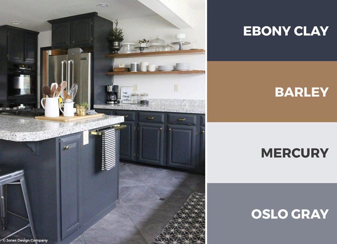
Example 2: The Modern Farmhouse Kitchen
- Dominant (60%): Classic white or a deep charcoal grey for the main cabinets.
- Secondary (30%): Natural wood tones for the island base or floating shelves, and a neutral grey or greige for the walls.
- Accent (10%): Black hardware for a sharp contrast, perhaps a vibrant ceramic pot on the counter, or a patterned rug with hints of farmhouse red or barn black.
These are just starting points, of course. The beauty is in adapting them to your own preferences and the unique architecture of your kitchen.
Testing and Refining Your Palette
Before committing to large purchases or gallons of paint, it’s always wise to test your chosen colors.
- Paint Samples: Buy sample pots and paint large swatches (at least 1ft x 1ft) on different walls in your kitchen. Observe them at various times of day, as the light changes everything.
- Material Samples: Gather samples of your countertop, backsplash, flooring, and cabinet finishes. Place them together under the lighting in your kitchen to see how they interact.
- Mood Board: Create a physical or digital mood board with all your chosen elements. This helps you visualize the overall effect and spot any potential clashes before they become a problem.
Don’t be afraid to adjust. Sometimes, a color that looks stunning on a small chip can feel overwhelming on a large wall, or a countertop sample might not quite harmonize with the cabinet finish you envisioned. That’s perfectly normal and part of the creative process. The goal is a space you’ll love spending time in.
Creating a beautiful and functional kitchen color story is an exciting journey. It’s about translating your personal style into a tangible, livable space. By understanding your core preferences, utilizing simple design principles like the 60-30-10 rule, considering the mood set by warm and cool tones, and paying attention to how materials and textures play together, you can craft a kitchen that truly sings. Remember to test, refine, and most importantly, enjoy the process of making your kitchen a reflection of you. A well-executed color story doesn’t just make a kitchen look good; it makes it feel good, becoming a welcoming and inspiring hub for all your culinary adventures and everyday moments.