Walk into any kitchen, and you’ll likely notice the colors first. They’re not just a visual backdrop; they’re silent storytellers, shaping how you feel, how you move, and how you even taste your food. It’s fascinating, isn’t it, how a simple shade of blue or a bold splash of red can completely alter the vibe of a room? Let’s dive deep into how these hues play a crucial role in crafting your home’s unique atmosphere.
We often think about kitchen colors in terms of aesthetics – what looks good, what’s trendy. But the truth is, color psychology is a powerful force, especially in a space as central as the kitchen. This room is where families gather, where meals are prepared and shared, and where memories are made. The colors you choose here don’t just decorate; they contribute to the overall feeling of your home. They can make a small kitchen feel expansive, a bustling kitchen feel calm, or a sterile kitchen feel warm and inviting. It’s about creating a functional and emotionally resonant space. So, how exactly do these shades work their magic?
The Psychology of Popular Kitchen Hues
Different colors evoke different emotions and responses. Understanding this can help you make more intentional choices for your kitchen.
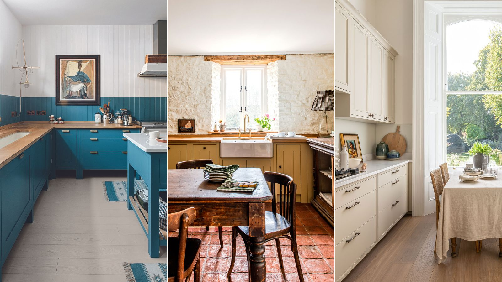
- Blues: Often associated with calmness and serenity, blue can be incredibly soothing. Think of a gentle sky blue or a deep navy. These shades can make a kitchen feel more tranquil, perfect for unwinding after a long day. However, too much of a cool blue can sometimes make a space feel a bit chilly or unappetizing, so balance is key. Pairing blues with warmer wood tones or pops of yellow often works wonders.
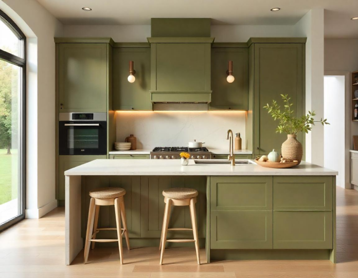
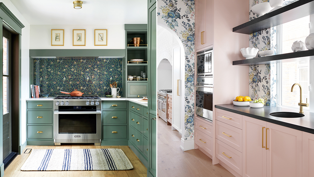
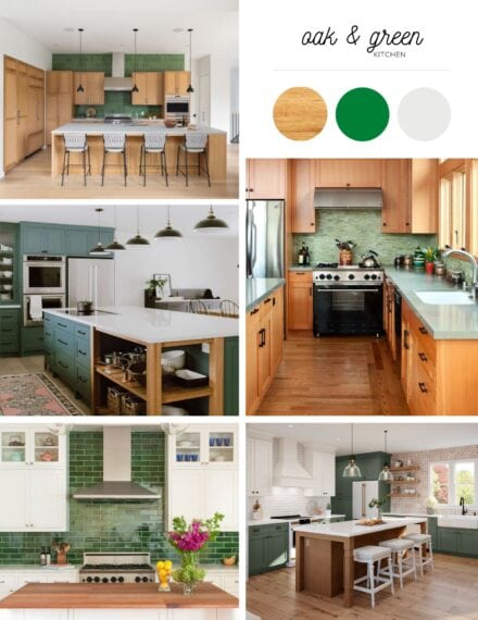
- Greens: Nature’s favorite color, green, brings a sense of freshness, health, and renewal. It’s a very balanced and grounding color. Lighter greens can make a kitchen feel airy and clean, while deeper forest greens can create a cozy, earthy feel. Green is also known to stimulate appetite, making it a wonderful choice for a dining area within the kitchen.
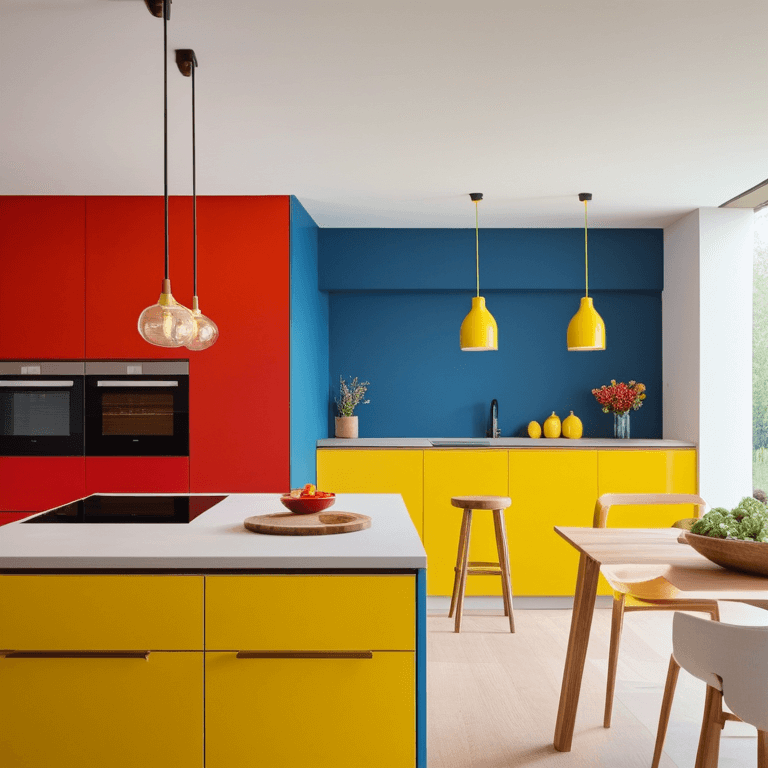
- Yellows: Oh, yellow! This is the color of sunshine and happiness. It’s incredibly uplifting and can make any kitchen feel brighter and more cheerful. Yellow is known to stimulate creativity and conversation. However, very bright or intense yellows can sometimes be overwhelming or even cause eye strain if used too extensively. A softer, buttery yellow is often a safer bet for a lasting appeal.
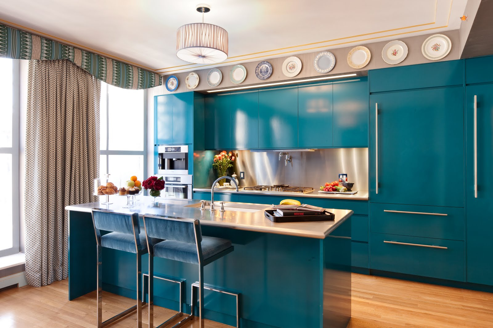
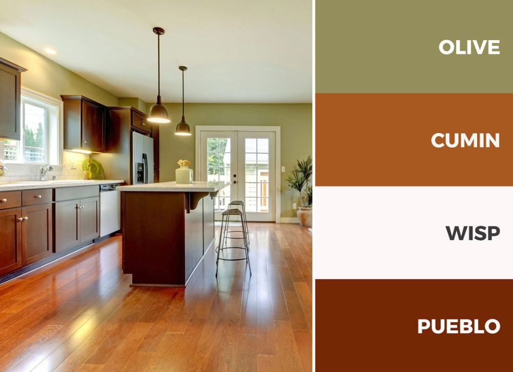
- Reds and Oranges: These are the colors of energy, passion, and warmth. They’re fantastic for creating a lively and inviting atmosphere. Red is known to stimulate appetite and conversation, making it a bold choice for a kitchen. Orange, a bit softer than red, still brings a lot of warmth and enthusiasm. The trick with these vibrant colors is moderation. A red accent wall, orange cabinetry, or even just red accessories can add a significant punch without overpowering the space.
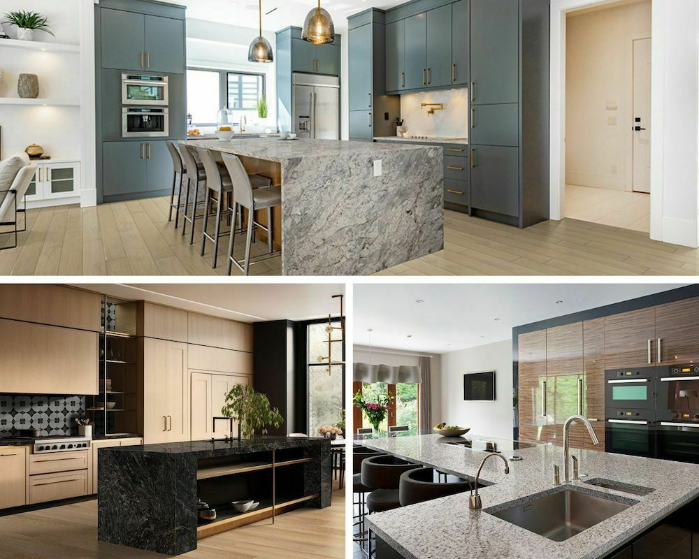
Neutrals: The Versatile Foundation
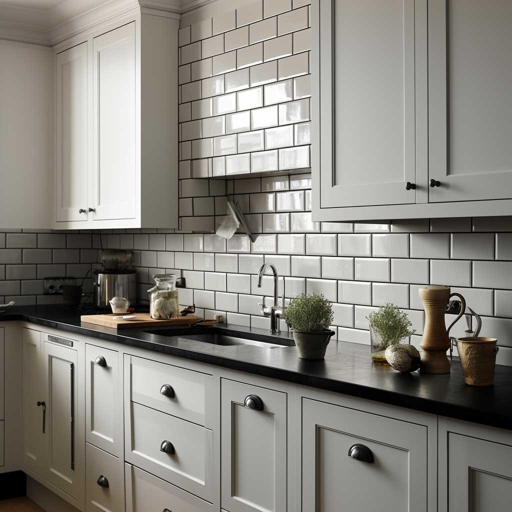
Neutrals like white, gray, beige, and black are incredibly popular for a reason. They offer a timeless and versatile backdrop that can be adapted to almost any style. But don’t mistake ‘neutral’ for ‘boring’! These colors have their own subtle influences.
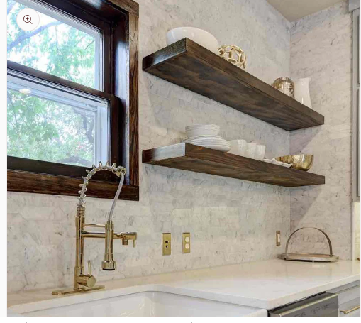
- Whites: White is classic, clean, and bright. It reflects light, making spaces feel larger and more open. A crisp white kitchen can feel very modern and airy. It also serves as a fantastic canvas for other colors through accessories or décor. The potential downside? White can sometimes feel a bit stark or clinical if not balanced with warmer elements like wood, metallic finishes, or colorful accents.
- Grays: Gray offers a sophisticated and modern feel. It’s a bit softer than black but provides more depth than white. Light grays can make a kitchen feel airy and chic, while darker charcoals can create a sense of drama and intimacy. Gray is also a great neutral that pairs well with almost any accent color, from bright yellows to deep blues.
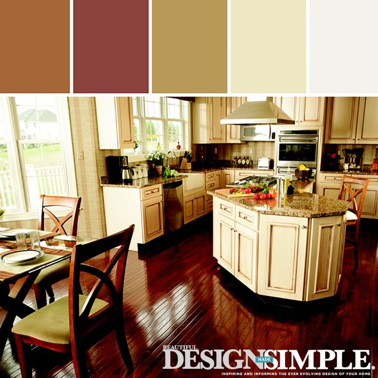
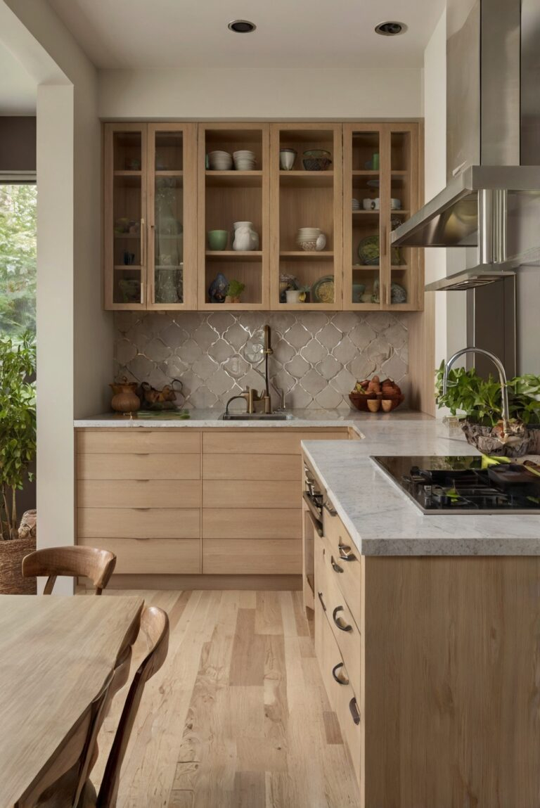
- Beiges and Creams: These warmer neutrals bring a sense of comfort, coziness, and natural elegance. They’re softer than stark whites and can make a kitchen feel incredibly welcoming and relaxed. Think of a creamy beige for cabinetry or a warm taupe for walls – these shades create a serene and inviting environment.
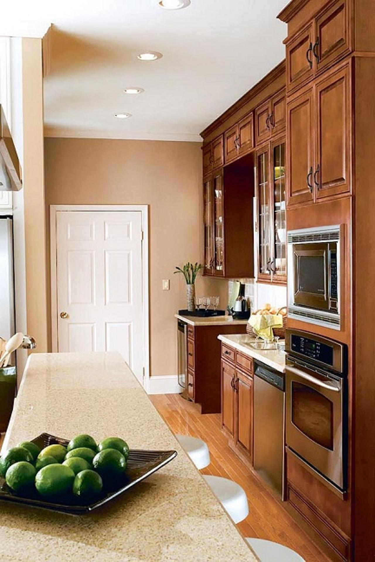
- Black: Black is bold, dramatic, and undeniably chic. It can make a kitchen feel luxurious and sophisticated. When used strategically, perhaps on lower cabinets or as an accent, black can ground a space and add a touch of modern elegance. It’s crucial to balance black with lighter colors and good lighting to avoid making the kitchen feel too dark or small.
The Impact of Light and Dark Shades
It’s not just the color itself, but its intensity and tone that matter. Light colors tend to make spaces feel more open, airy, and expansive. They are excellent for smaller kitchens or rooms with limited natural light, as they reflect more light. Conversely, darker colors absorb light, which can make a large kitchen feel more intimate and cozy, or a small kitchen feel cramped if not handled carefully. Consider the natural light your kitchen receives throughout the day when choosing between a pale sage green and a deep emerald, or a soft dove gray and a charcoal hue.
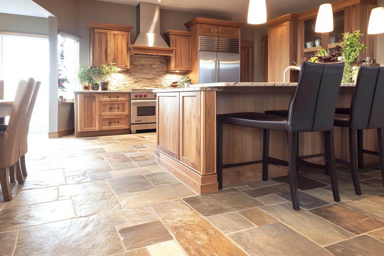
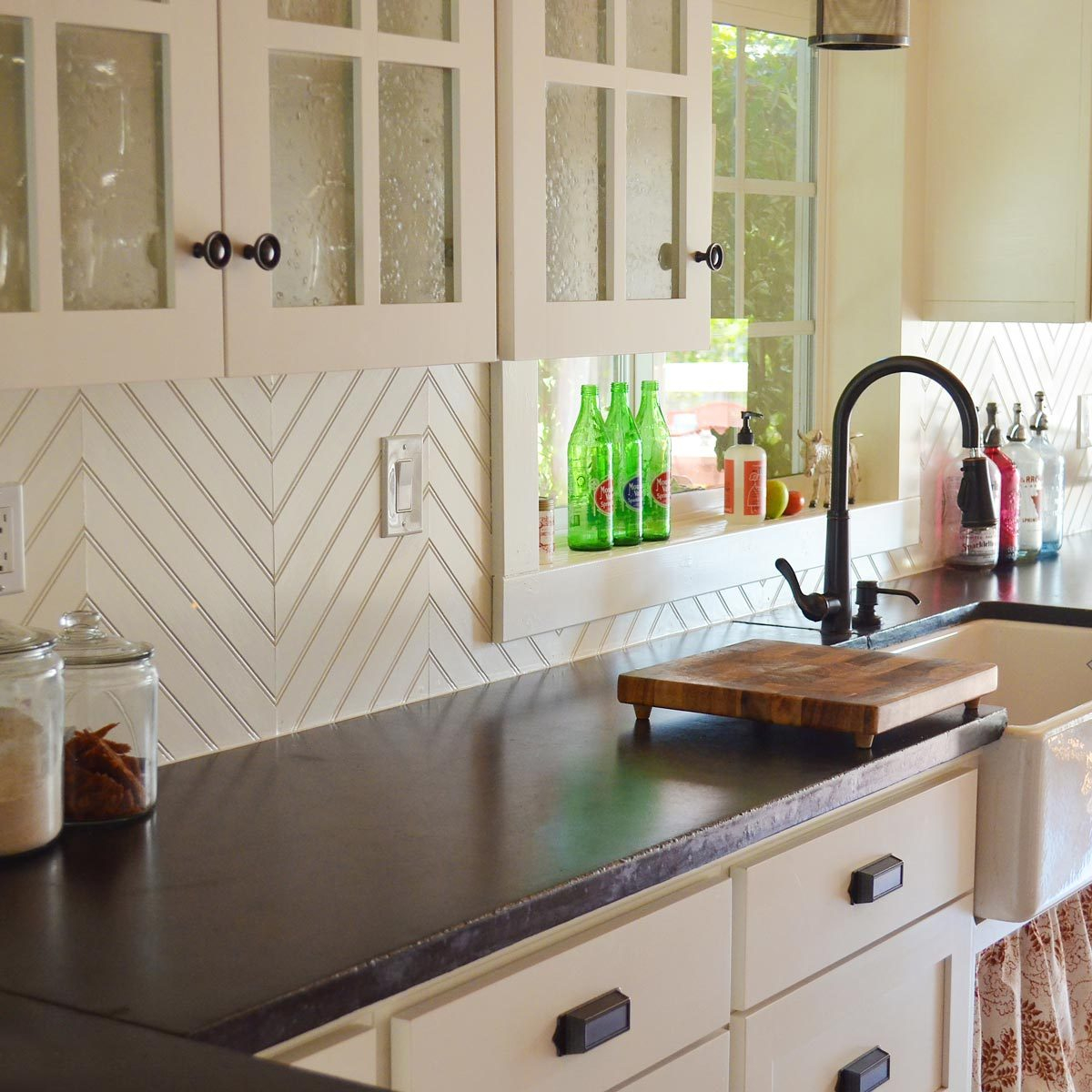
Material Matters: How Texture Interacts with Color
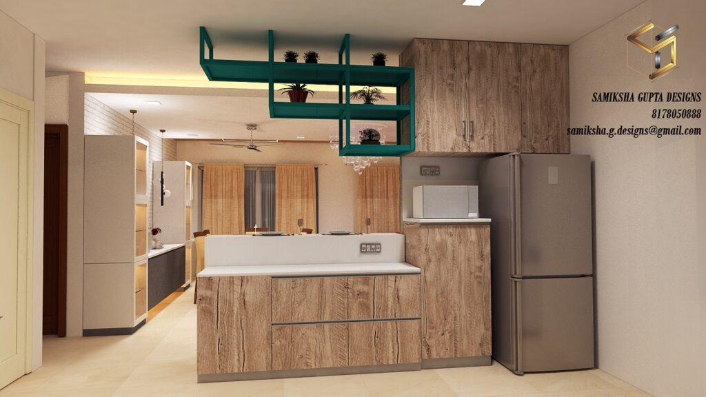
The material you choose for your cabinets, countertops, and backsplashes also plays a significant role in how a color is perceived. A matte finish on a cabinet door will absorb light and appear softer than the same color in a high-gloss finish, which will reflect light and appear brighter and more vibrant. Natural materials like wood have their own inherent colors and textures that will interact with your chosen paint colors, adding depth and complexity. For instance, a rich walnut cabinet will offer a different feel with a cream backsplash than a white oak cabinet would. Think about how the sheen and grain of your materials will complement the overall color scheme you’re aiming for.
Creating Balance and Harmony
The key to a successful kitchen color scheme is balance. You don’t want a single color to dominate to the point of being overwhelming. Think about using a dominant color, a secondary color, and an accent color. For example, you might have white cabinets (dominant), a gray island (secondary), and then add pops of teal through your backsplash or bar stools (accent). This creates visual interest and prevents the space from feeling monotonous. Consider the 60-30-10 rule: 60% of your space should be a primary color, 30% a secondary color, and 10% an accent color. This principle helps ensure a pleasing and well-proportioned aesthetic.
Practical Tips for Choosing Your Kitchen Colors
Choosing kitchen colors doesn’t have to be daunting. Here are a few practical steps to guide you:
- Consider your lifestyle: Are you a busy family that needs a durable, easy-to-clean space, or do you prefer a calm, serene retreat? Your lifestyle should inform your color choices.
- Look at your home’s existing style: Try to ensure your kitchen colors complement the overall aesthetic of your home. Do you have a modern farmhouse, a sleek contemporary design, or a cozy traditional look? Your kitchen should feel like a cohesive part of your house.
- Get samples and test them: Never commit to a color based on a small swatch or a picture online. Buy sample pots and paint large swatches on different walls in your kitchen. Observe how the colors look at different times of day and under various lighting conditions.
- Don’t forget the lighting: As we’ve touched upon, lighting is critical. Natural light, overhead lighting, and task lighting all affect how colors appear. Ensure your chosen colors work well with your kitchen’s lighting plan.
- Think about the finishes: Matte, satin, semi-gloss, and high-gloss finishes all interact differently with light and can alter the perceived color. Choose finishes that suit both the look and the practicality of your kitchen.
Ultimately, the colors you select for your kitchen are deeply personal. They have the power to transform a functional space into an emotional one. Whether you’re drawn to the calming influence of blues, the energizing spirit of yellows, or the timeless appeal of neutrals, understanding how these colors affect your home’s atmosphere allows you to make more informed and impactful decisions. So, go ahead, experiment with samples, trust your instincts, and color your kitchen with intention. You might be surprised at how profoundly these choices can shape your daily experience within the heart of your home.