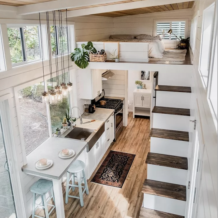
Have you ever walked into a room and instantly felt calm or energized? That’s not just coincidence. The colors around us have a profound effect on our moods, emotions, and even our physical health. When it comes to creating a space that truly supports your well-being, understanding color psychology becomes crucial. Your living room isn’t just furniture and decor—it’s a canvas for emotional healing and daily comfort.
We spend a significant portion of our lives in our homes, particularly in our living rooms. This space often serves as the heart of our households, where we relax, entertain guests, and recharge after long days. But what if I told you that the colors you choose for this sacred space could influence how you feel every single day? Color psychology explores how different hues affect our emotions, behaviors, and mental states. In living room design, this knowledge becomes a powerful tool for crafting environments that nurture our well-being. From the gentle blues that soothe anxiety to the vibrant oranges that spark creativity, each color carries its own unique energy. Understanding these connections allows us to transform our living spaces from merely decorative areas into therapeutic sanctuaries that support our emotional health.
The Science Behind Color and Emotion
Color psychology isn’t just a trendy concept—it’s rooted in scientific research. Our brains process color information through the visual cortex, triggering chemical reactions that affect our mood and behavior. Different wavelengths of light stimulate various parts of our nervous system, creating physiological responses. For instance, warm colors like reds and oranges tend to increase heart rate and stimulate appetite, while cool colors such as blues and greens generally lower blood pressure and promote relaxation. This biological response happens almost instantaneously. When you see a deep blue wall, your body might naturally begin to wind down, preparing you for restful sleep. Conversely, a bright yellow accent might instantly lift your spirits and boost your energy levels. These reactions occur without conscious thought, making color selection a powerful tool for intentional design.
Cool Colors for Calm and Serenity
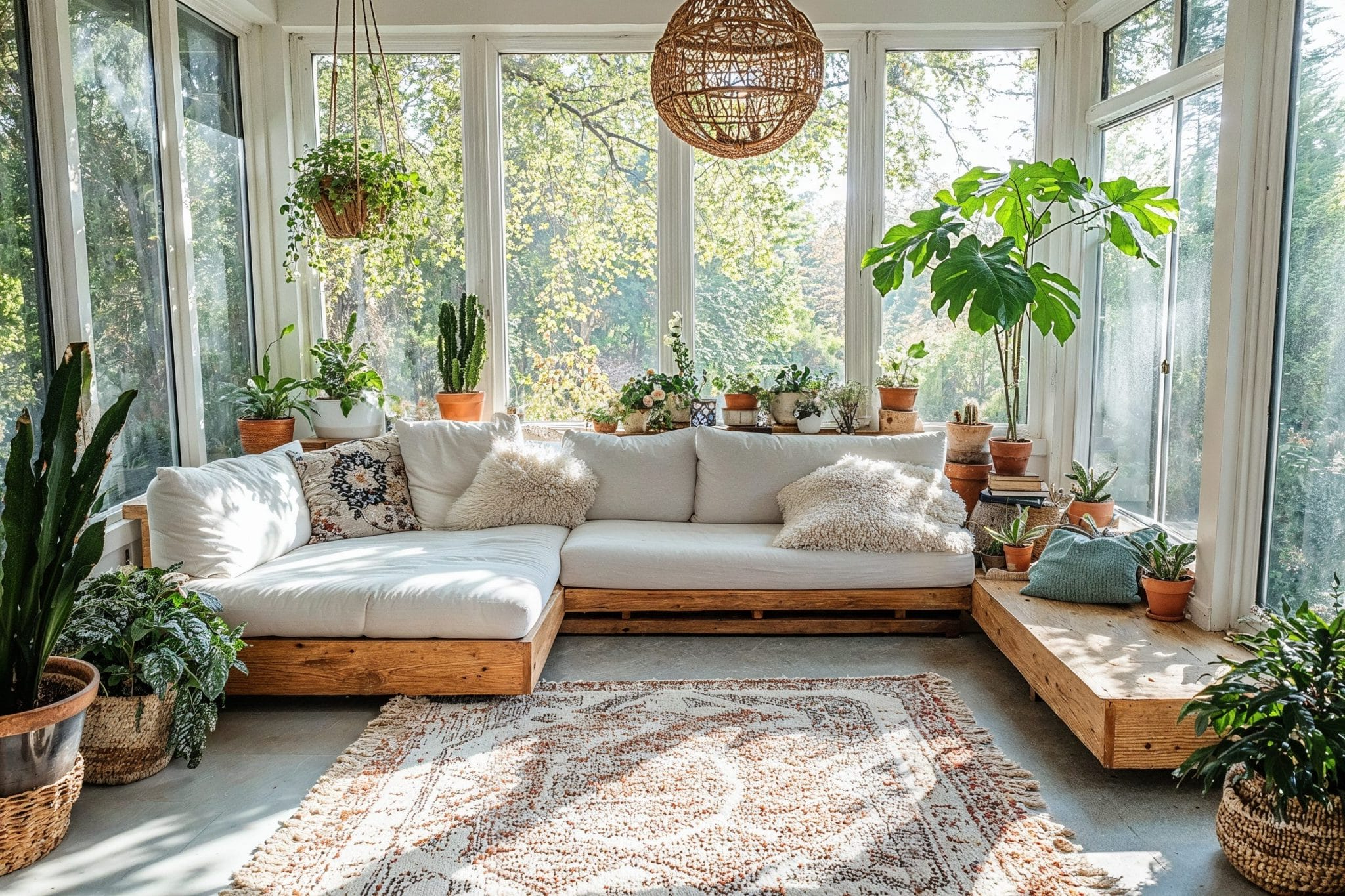
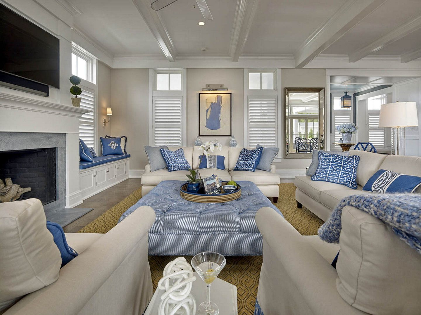
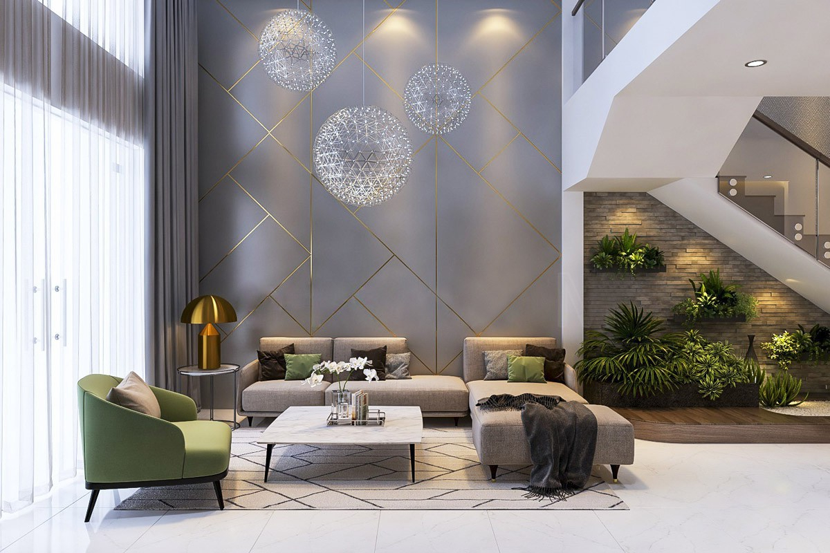
Blue reigns supreme when it comes to promoting peace and tranquility in living spaces. This hue has been shown to reduce stress hormones and slow breathing rates. Light blues create an airy, open feeling that makes small rooms seem larger and more inviting. Think of the calming effect of looking out at a clear sky or a peaceful ocean. These same qualities translate beautifully into interior design. Soft aquas and pale turquoise work wonderfully in living rooms, especially in spaces where you want to encourage conversation and relaxation. Green, another cool color, brings nature indoors and offers similar calming benefits. Forest greens or sage tones create a grounded, earthy atmosphere that helps people feel centered and balanced. Consider incorporating these colors through accent walls, throw pillows, or even artwork. The key is to balance these soothing hues with warm elements to avoid creating a space that feels too clinical or sterile.
Warm Colors for Energy and Connection
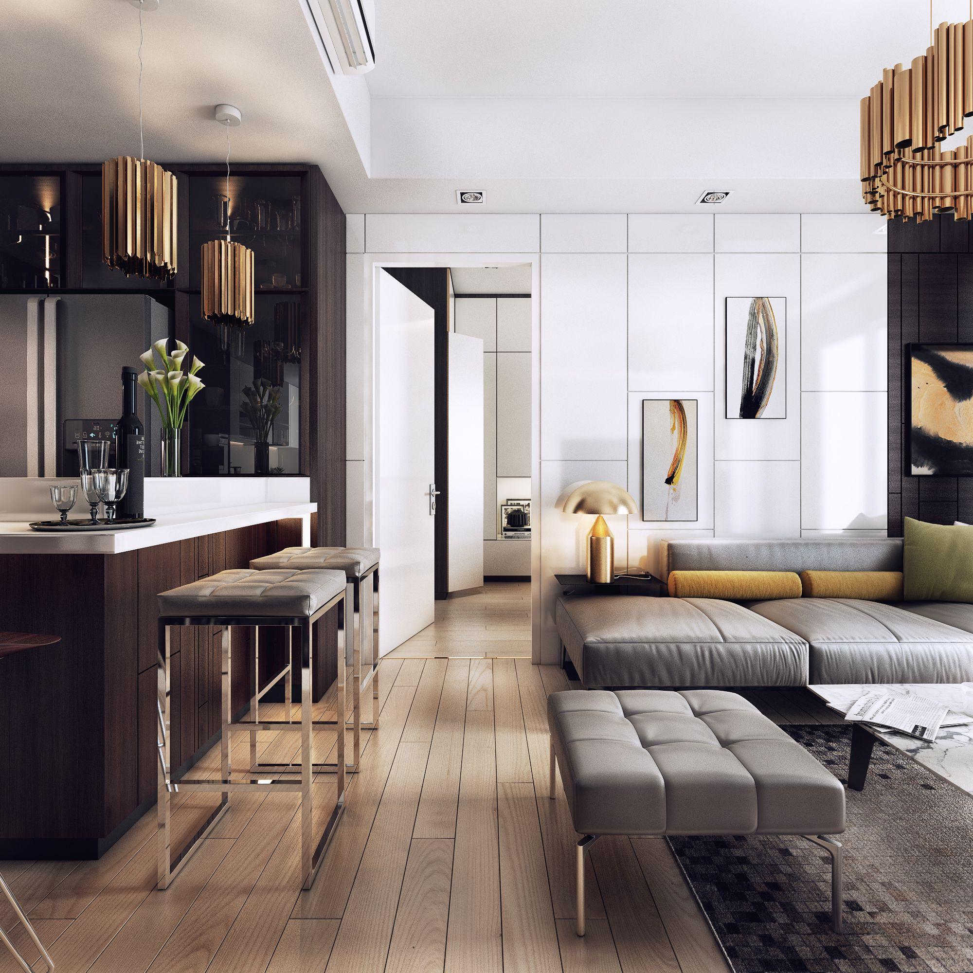
Warm colors like red, orange, and yellow are the lifeblood of social spaces. They naturally draw attention and create a sense of intimacy and connection. Red, while powerful and intense, can stimulate conversation and passion when used thoughtfully. It’s perfect for dining areas or spaces where you want to encourage interaction. Orange brings joy and enthusiasm to a room, making it ideal for family areas where laughter and playfulness thrive. Yellow, perhaps the most uplifting color, can brighten even the gloomiest corners and boost cognitive function. However, it’s important to note that these warm tones should be used strategically. A single red accent chair can energize a neutral space, but a red wall might overwhelm and overstimulate. The key lies in finding the right balance between warmth and comfort. Using warm colors in smaller doses creates the perfect balance of energy and coziness.
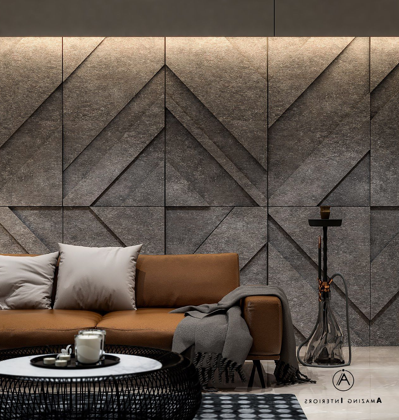
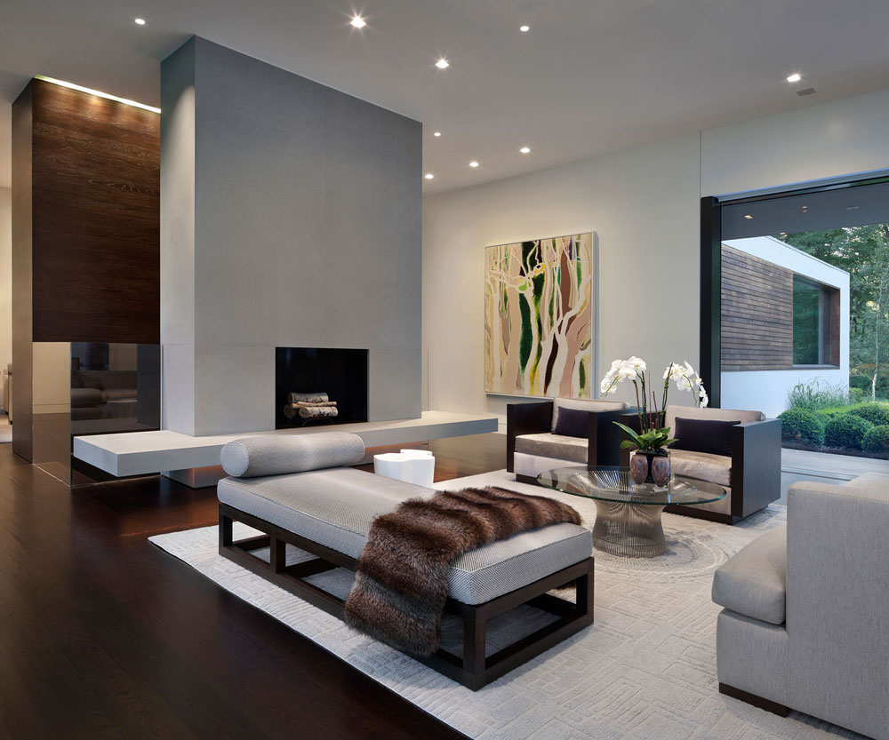
Neutral Tones: The Foundation of Balance
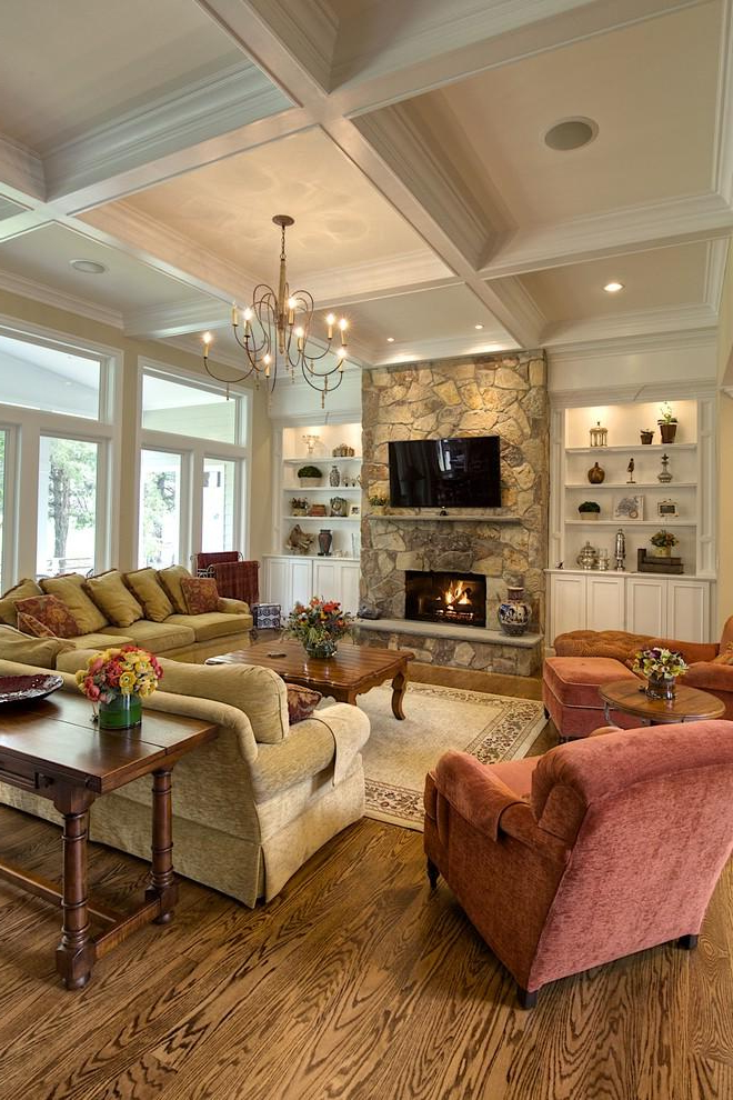
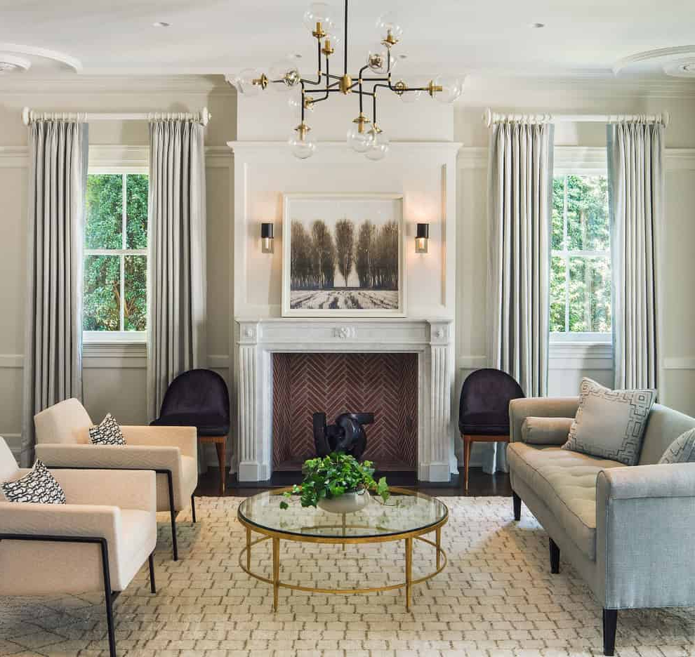
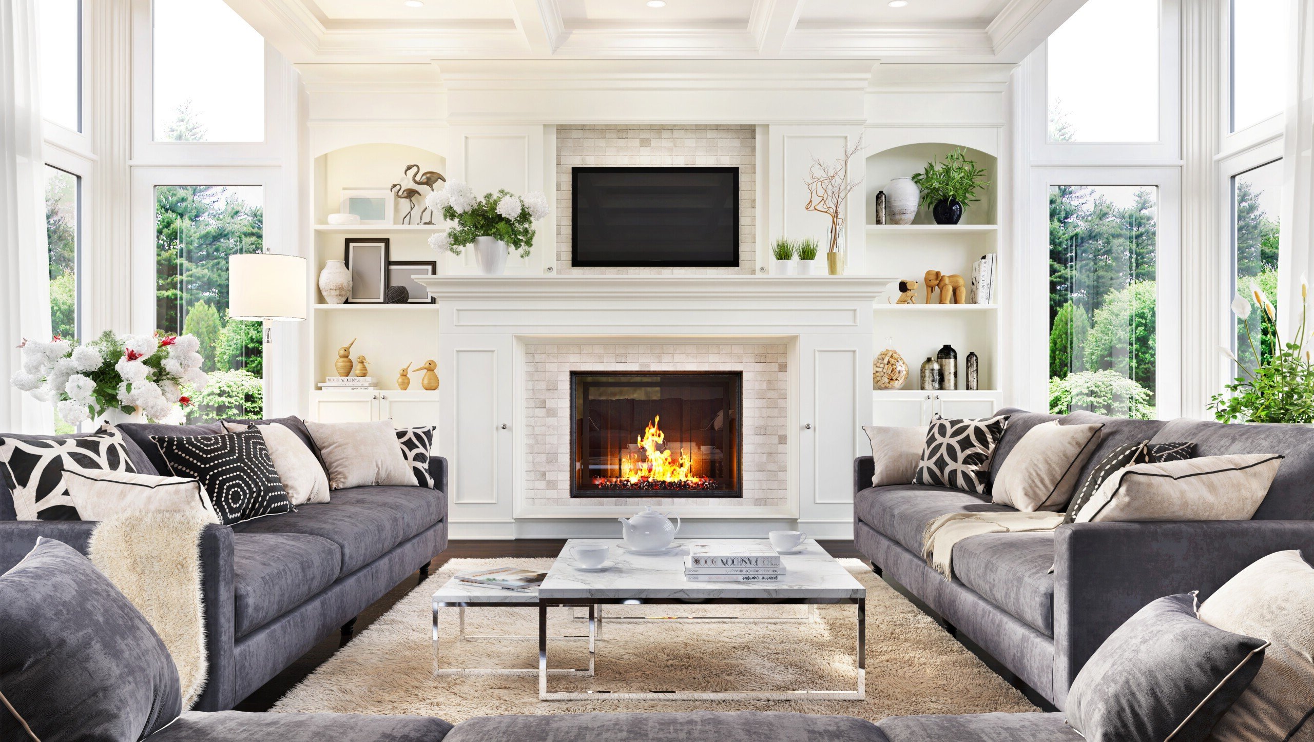
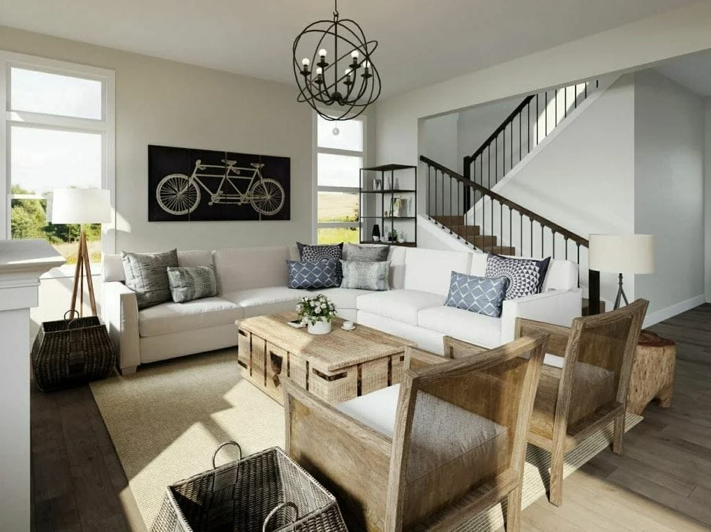
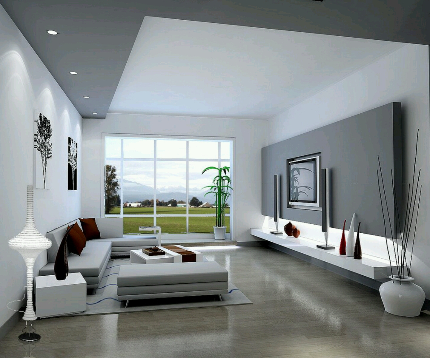
Neutrals like beige, cream, gray, and white serve as the perfect canvas for emotional well-being. These colors don’t carry strong psychological impacts themselves, but they provide stability and allow other colors to shine. White walls, for example, reflect light and make spaces appear larger, while also creating a clean, uncluttered feeling that promotes mental clarity. Beige and cream offer warmth without overwhelming, making them excellent choices for large furniture pieces or textured fabrics. Gray provides sophistication and modernity, perfect for contemporary living spaces. The beauty of neutrals lies in their versatility—they can be easily paired with either cool or warm accents depending on your desired mood. Think of them as the foundation upon which your emotional palette builds. Many interior designers swear by the rule of 60-30-10: 60% neutral base, 30% secondary color, and 10% accent color. This ratio ensures balanced, harmonious spaces that feel both intentional and comfortable.
Creating Personalized Color Schemes
Every person responds differently to colors based on their experiences, cultural background, and personal preferences. What feels calming to one person might feel too stark to another. The best approach is to consider your lifestyle and emotional needs when choosing colors. If you struggle with anxiety, lean toward cool blues and greens. For those who feel withdrawn or sad, warm yellows and oranges can help lift spirits. People who work from home might benefit from a mix of energizing yellows and grounding greens to support focus and creativity. Consider the activities that happen most in your living room. If it’s primarily for quiet reading, softer tones work best. If it’s a hub for entertaining, bolder colors can create an exciting atmosphere. Testing paint samples on actual walls gives you the best idea of how colors will look and feel in different lighting conditions throughout the day. Sometimes, the perfect color combination emerges through experimentation rather than following strict rules.
Practical Tips for Implementing Color Psychology
Starting with color psychology doesn’t require a complete redesign of your entire living room. Small changes can yield significant results. Begin by identifying the primary purpose of your space and the emotions you want to evoke. For example, if you want to create a peaceful retreat, start with a soft blue accent wall or incorporate blue artwork. Add warmth gradually with wooden furniture or warm-toned lighting. Consider layering textures and materials to soften the impact of bold colors. A rich blue velvet sofa can provide drama while maintaining comfort. Use natural elements like plants and wood to ground any color scheme. Remember that lighting dramatically affects how colors appear—what looks calm in morning light might appear energizing under evening illumination. Don’t be afraid to mix colors within the same family for depth and interest. A combination of different shades of green can create a sophisticated, nature-inspired environment that feels both fresh and grounded. The most important thing is to trust your instincts and create a space that feels authentically you.
Color psychology in living room design offers a fascinating way to consciously shape your emotional environment. By understanding how different hues affect our moods and behaviors, we can create spaces that actively support our well-being rather than simply decorate our homes. Whether you prefer the serene quality of cool blues and greens or the vibrant energy of warm oranges and yellows, the key is thoughtful application. Remember that your living room should feel like a safe harbor where you can truly be yourself. Start small, experiment with different combinations, and pay attention to how your space makes you feel. The most successful color schemes aren’t necessarily the most popular—they’re the ones that resonate with your personal needs and lifestyle. After all, your home should be more than just a place to live; it should be a place where you thrive emotionally and mentally. The colors you choose today might just be the foundation for a more peaceful tomorrow.