Have you ever walked into a room and instantly felt calm, energized, or relaxed? That’s not just coincidence. The colors surrounding us have a powerful impact on our moods, thoughts, and even our physical health. Every hue we choose for our homes tells a story, creates an atmosphere, and subtly guides our behavior. From the moment we wake up to the time we go to sleep, we’re immersed in a sea of color that shapes our experience in ways we might not even realize.
Think about your last visit to someone’s house. Did you immediately feel drawn to certain rooms? Maybe you found yourself gravitating toward a particular area because it felt cozy or uplifting. That’s color psychology in action. It’s the science of how different hues affect our mental and emotional states. When we talk about color in home design, we’re not just discussing aesthetics – we’re talking about creating environments that support our well-being. The right palette can transform a house into a sanctuary that nurtures our minds and bodies. Whether you’re redecorating your entire home or simply updating one room, understanding how colors influence us can help you make choices that truly serve your lifestyle and needs.
Understanding the Basics of Color Psychology
Color psychology isn’t some mystical art form. It’s rooted in scientific research and centuries of observation. Our brains process colors differently than other visual elements, triggering specific responses in our nervous system. Red, for instance, stimulates our heart rate and increases energy levels. Blue, on the other hand, tends to slow our breathing and lower blood pressure. These reactions happen almost instantaneously, before we even consciously register what we’re seeing. Different cultures have their own associations with colors too.
While white often represents purity in Western cultures, it can symbolize mourning in many Eastern traditions. Understanding these nuances helps us make better decisions when choosing colors for our living spaces. The key is recognizing that each color carries its own personality and energy. Some colors feel bold and exciting, while others offer comfort and tranquility. By learning to read these emotional signals, we can create homes that truly reflect our inner selves.
The Emotional Impact of Warm vs Cool Colors
Warm colors like reds, oranges, and yellows create feelings of energy, excitement, and warmth. They’re perfect for social areas where you want to encourage conversation and activity. A living room painted in warm tones can make guests feel welcomed and comfortable. Red, in particular, can stimulate appetite and conversation, making it ideal for dining areas. Orange brings enthusiasm and creativity, perfect for spaces where you want to inspire innovation. Yellow offers happiness and optimism, though it should be used carefully to avoid overwhelming effects.
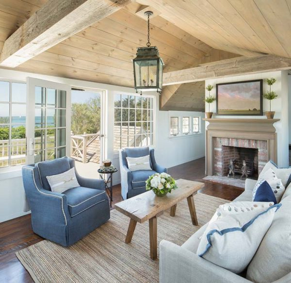
Cool colors such as blues, greens, and purples tend to create calming and peaceful atmospheres. Blue is particularly effective for bedrooms and bathrooms, helping to reduce stress and promote restful sleep. Green represents nature and balance, offering a sense of renewal and harmony. Purple combines the energy of red with the calm of blue, creating luxury and creativity. The beauty of using cool colors lies in their ability to make small spaces feel larger and more open. Many people find that incorporating cool tones into their home design creates a more serene and contemplative environment.
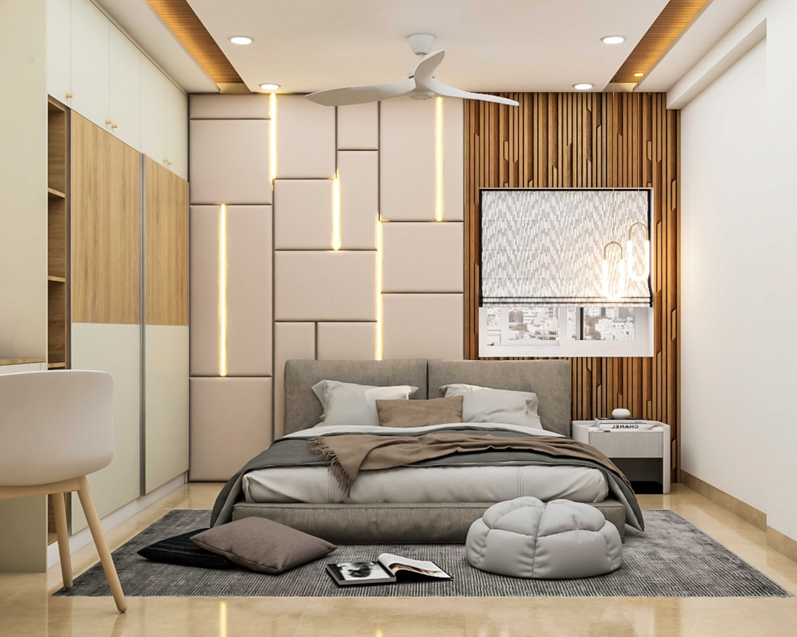
Creating the Perfect Bedroom Atmosphere
Your bedroom deserves special attention when it comes to color selection. After all, this is where you spend one-third of your life resting and recovering. The right color choices can significantly improve sleep quality and overall well-being. Soft blues and greens work wonderfully for promoting relaxation and restfulness. These colors naturally signal to our brains that it’s time to wind down. Lavender and pale purple combinations create a spa-like atmosphere that encourages peace and serenity. If you prefer more vibrant options, consider using warm neutrals like beige or cream as a base with one accent wall in a soft blue or green.
Avoid bright reds or oranges in bedroom settings, as they can increase energy levels and make it harder to fall asleep. The key is choosing colors that make you feel safe and comfortable. Some people swear by white or very light gray walls, claiming they help them feel more peaceful and centered. Others find that a gentle blush pink or soft sage green creates a more romantic and soothing ambiance. Experiment with different shades and see what makes you feel most relaxed when you enter your bedroom.
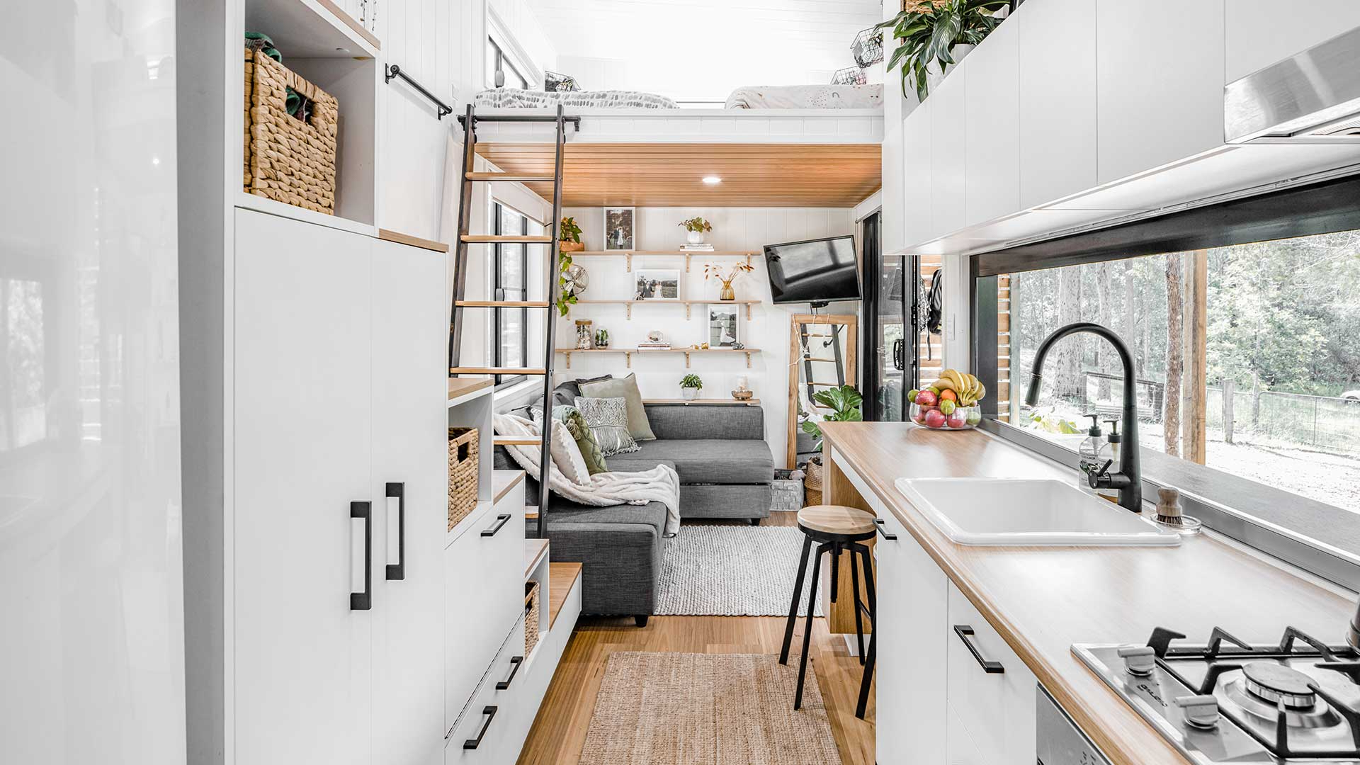
Kitchen and Dining Room Color Strategies
Kitchens and dining rooms are the heart of most homes, where families gather and meals are shared. These spaces benefit greatly from colors that stimulate appetite and encourage social interaction. Warm yellows and oranges can make food look more appetizing and create a cheerful atmosphere. Many restaurants strategically use these colors to encourage customers to eat more quickly. Red accents in kitchen areas can add energy and excitement, especially in smaller spaces where you want to create a sense of vibrancy.
However, be careful not to overdo it – too much red can become overwhelming. Cream, beige, and light wood tones provide a neutral foundation that allows other colors to pop. These backgrounds also make the space feel cleaner and more spacious. For dining areas, consider using slightly deeper tones to create intimacy and encourage conversation. Darker greens or blues can make a statement while still maintaining a welcoming feel. The goal is to create an environment where people want to stay and enjoy their time together. Remember that lighting plays a huge role in how colors appear, so test your chosen colors during different times of day before committing.
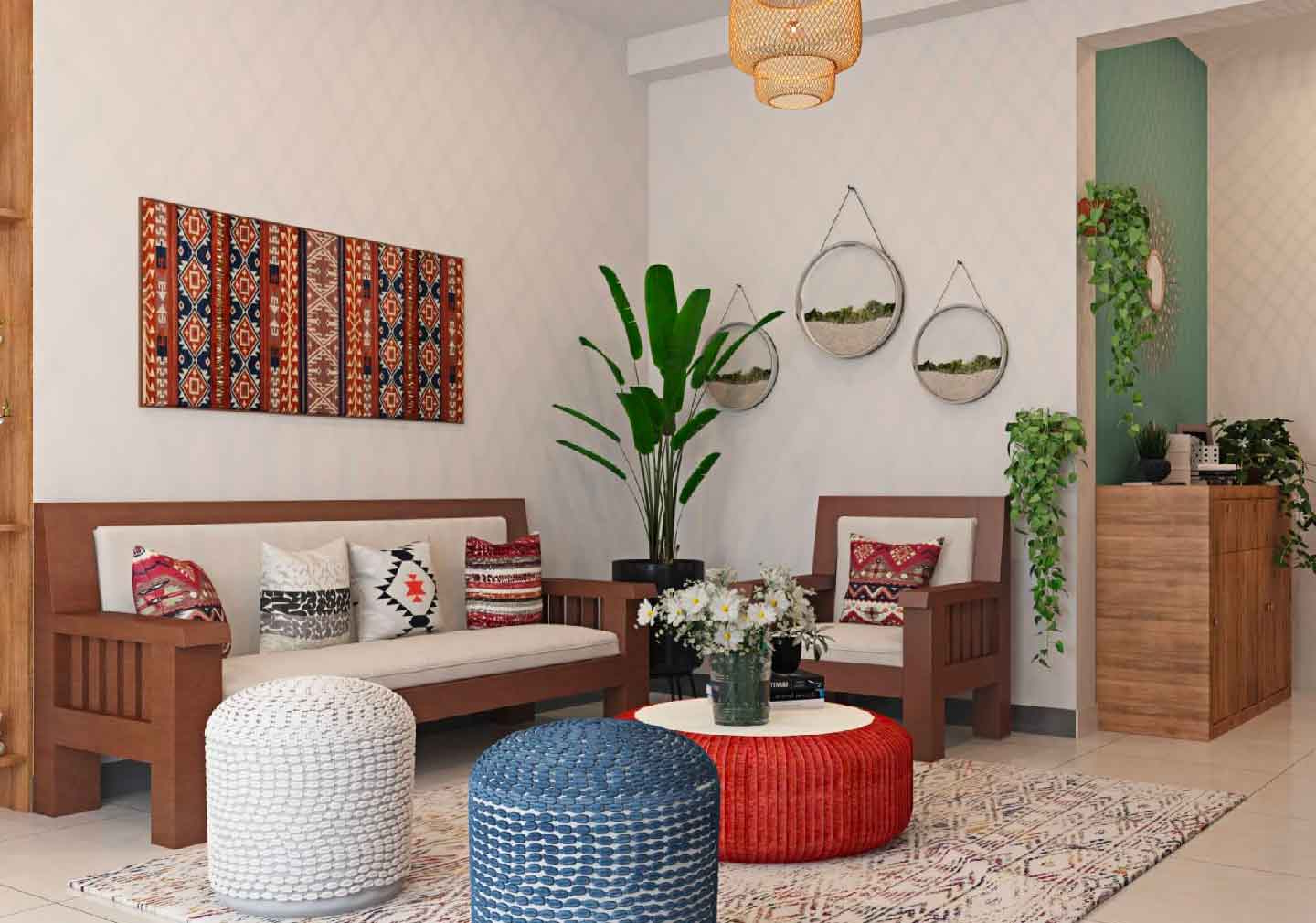
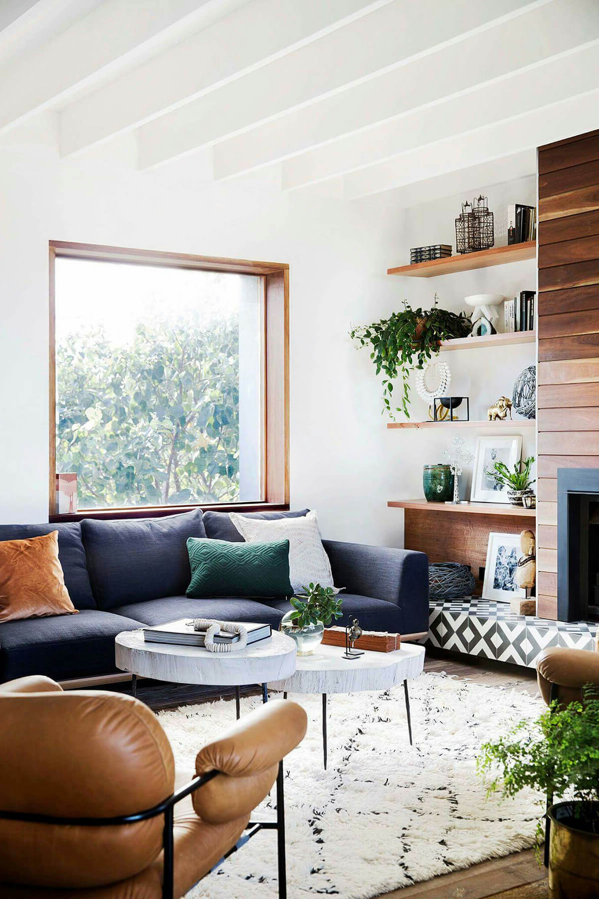
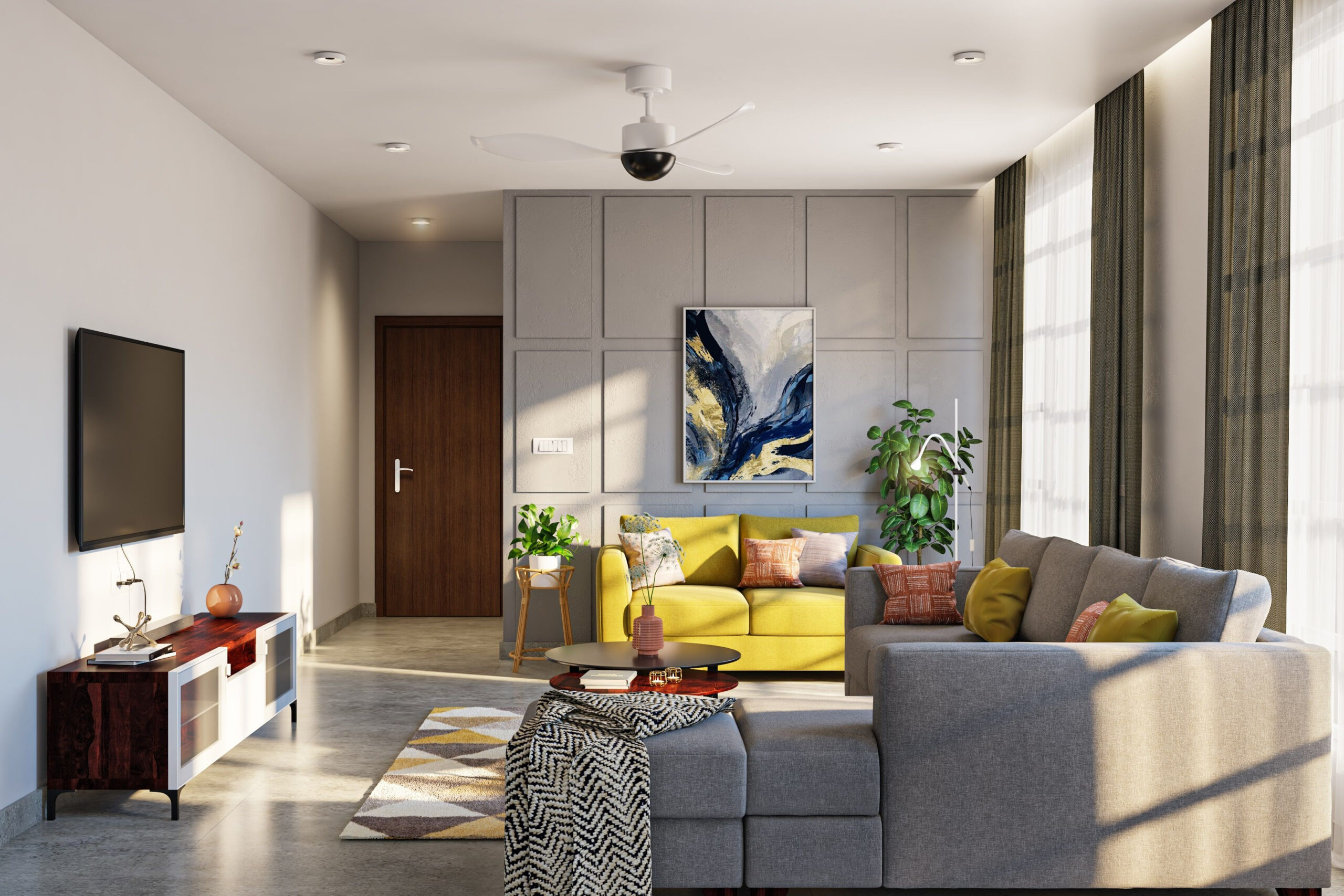
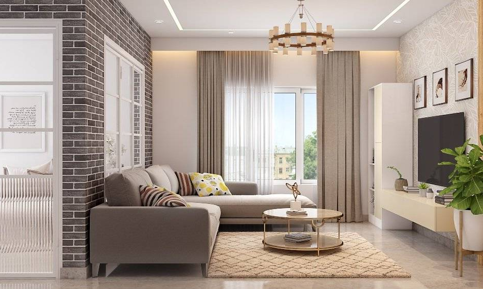
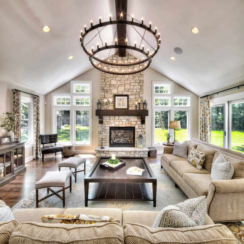
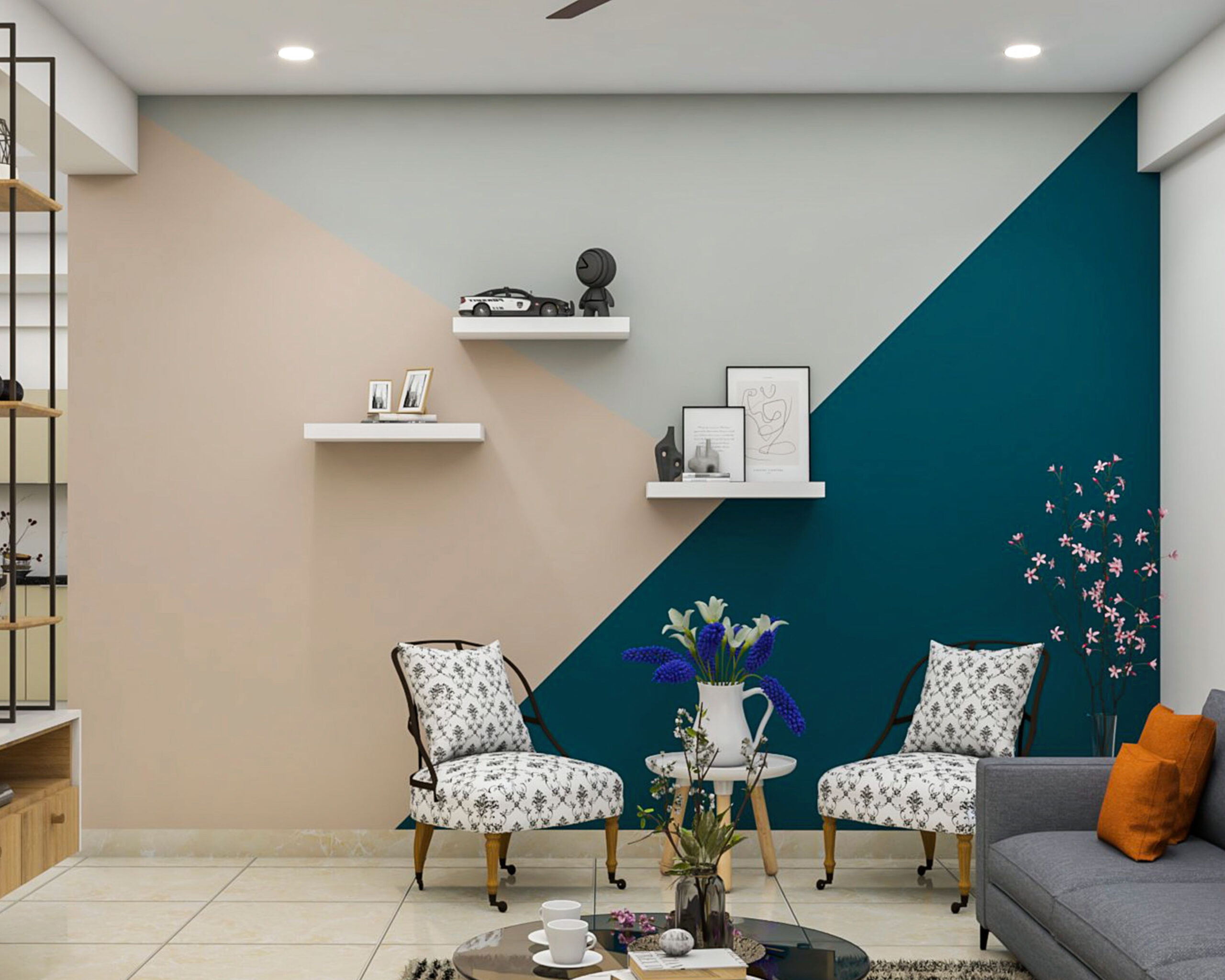
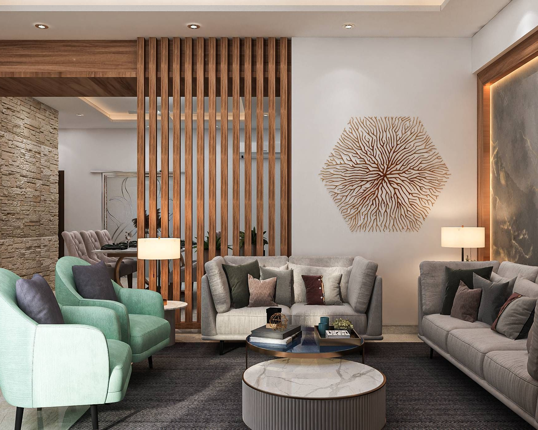
Living Spaces: Balancing Energy and Calm
Living rooms represent the middle ground of home design – they need to be inviting yet functional. The challenge lies in finding the right balance between energy and tranquility. Neutral tones like beige, cream, or light gray work as excellent bases, providing flexibility for adding pops of color through furniture and accessories. These backgrounds allow the space to feel both welcoming and sophisticated. Consider using warm colors like terracotta or burnt orange for accent pieces if you want to add excitement without overwhelming the space.
For those who prefer a calmer approach, soft blues or greens can create a peaceful retreat within the home. The trick is to think about how you want to use the space. Do you entertain frequently? You might lean toward more vibrant colors that spark conversation. Do you prefer quiet evenings at home? Cooler tones may suit your needs better. Many homeowners find success with a two-color scheme – one for the main walls and another for accent areas. This approach gives you the best of both worlds without the risk of creating visual chaos.
Practical Tips for Choosing Colors That Work
Choosing the right colors for your home doesn’t have to be overwhelming. Start by considering the function of each room and the mood you want to create. Test paint samples on your walls rather than just looking at swatches. Natural light changes throughout the day, affecting how colors appear. What looks great in morning light might seem different under evening illumination. Take advantage of sample pots to paint small sections of your walls and observe them at various times. Consider the size of your space too – lighter colors make small rooms appear larger, while darker colors can make large rooms feel cozier.
Don’t forget about existing furniture and décor when selecting new colors. If you already have pieces in a particular style, choose colors that complement rather than compete with them. Sometimes it’s helpful to look at the colors in your favorite clothing or accessories as inspiration. Finally, remember that you can always change your mind. Many people start with a neutral base and gradually add more color through artwork, textiles, and decorative items. This approach allows you to experiment safely and adjust as you learn what works best for your personal preferences.
The colors in our homes are more than just decoration – they’re silent communicators that shape our daily experiences. By understanding how different hues affect our moods and behaviors, we gain the power to design spaces that truly serve our needs. Whether you’re seeking calm and focus, energy and excitement, or simply a comfortable place to rest, there’s a perfect color palette waiting to be discovered. Remember, there’s no single ‘right’ way to decorate. Your home should reflect your personality and lifestyle.
Start small if you’re unsure – perhaps try a new accent color on one wall or update a single piece of furniture. Pay attention to how different colors make you feel, and let that guide your decisions. The most important thing is creating a space that feels authentic to you. After all, you live in your home every day, so it should make you feel good, not just look good. Let the power of color psychology help you craft a living environment that supports your well-being and enhances your quality of life.