Every time you step into your kitchen, you’re experiencing a carefully crafted visual story. The colors beneath your feet aren’t just decorative—they’re silent architects shaping your mood, energy levels, and even how you interact with your space. What if we told you that choosing the right tile color could transform your daily cooking routine?
Think about it. You spend countless hours in your kitchen, whether you’re preparing meals, enjoying family dinners, or simply washing dishes. That floor under your feet becomes more than just a surface—it’s part of your daily emotional landscape. Modern designers understand this deeply. They know that every hue carries weight, every shade tells a story, and every tile choice impacts how you feel in your most-used room. Color psychology isn’t just a buzzword anymore. It’s a powerful tool that transforms ordinary kitchens into extraordinary experiences.
Understanding Color’s Emotional Impact
Colors don’t just sit there on your floor—they actively influence your emotions and behaviors. Warm tones like reds and oranges can make a space feel cozy and inviting, while cool blues and greens often promote calmness and focus. When you’re standing on tiles that naturally make you feel relaxed, you’re more likely to enjoy your time in the kitchen. This isn’t just wishful thinking. Studies show that color affects our brain chemistry and stress levels. A study published in the Journal of Environmental Psychology found that people working in rooms with blue walls showed improved performance on detail-oriented tasks. The same principle applies to your kitchen floor.
The Science Behind Color Perception
Our brains process color differently based on cultural background, personal experiences, and even age. For instance, younger people might respond more strongly to bright, saturated hues, while older adults often prefer softer, muted tones. In kitchens, this means that a tile choice that feels energizing to one person might seem overwhelming to another. Consider your family’s preferences and lifestyle when choosing. A busy parent might find calming greens or soft grays more appealing than bold patterns. The science also shows that darker colors can make small spaces feel smaller, while lighter shades have the opposite effect. This is particularly important when designing kitchens where floor space can feel limited.
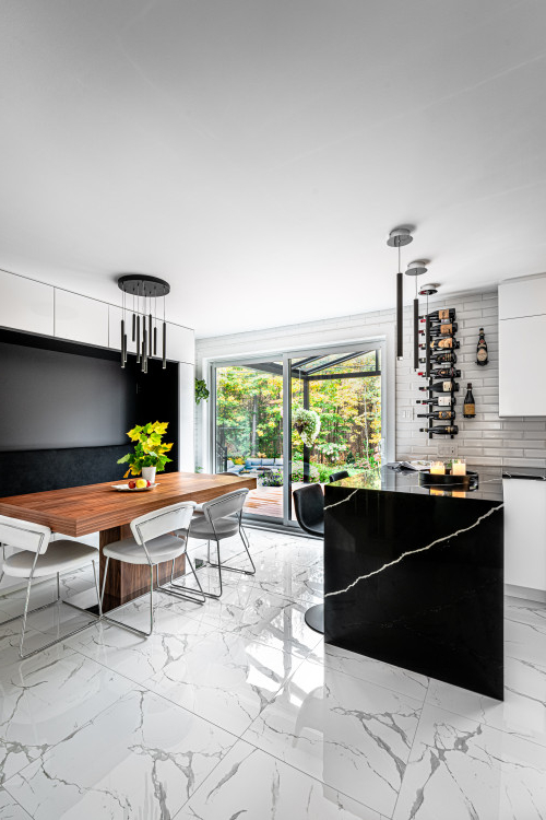
Popular Color Trends in Modern Kitchens
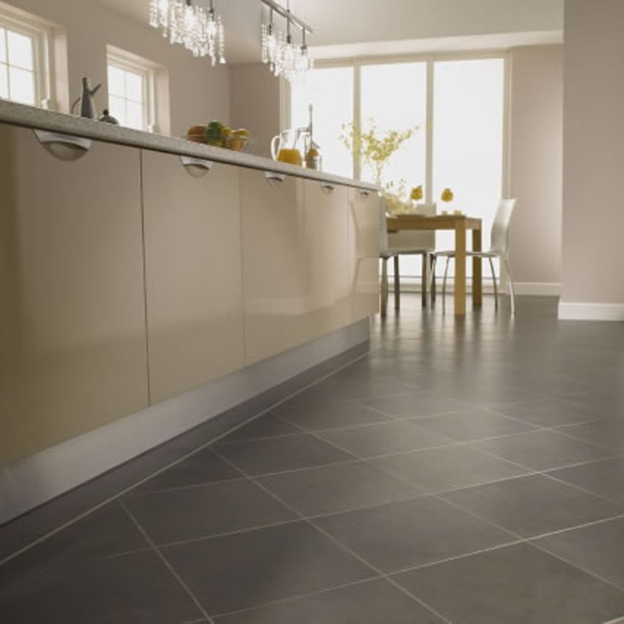
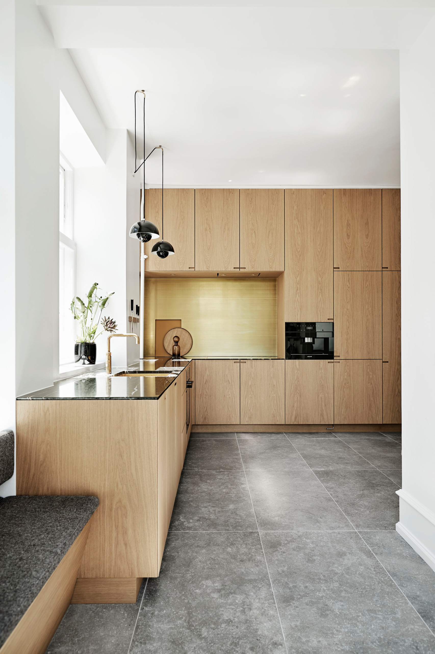
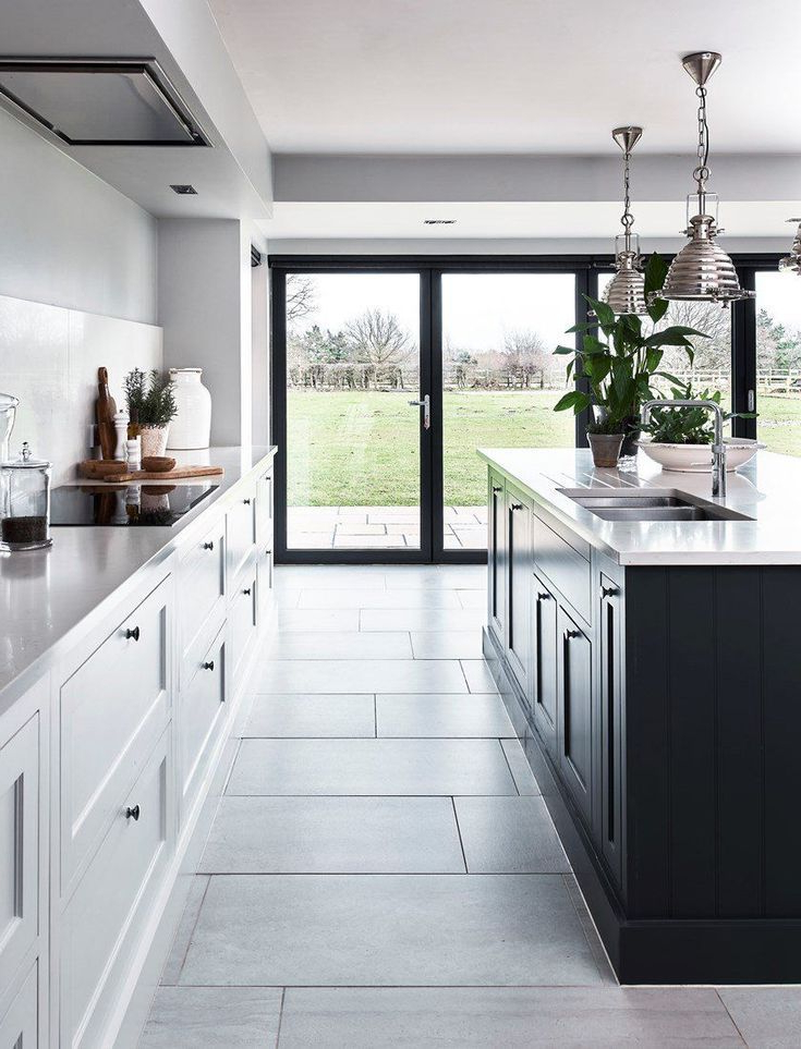
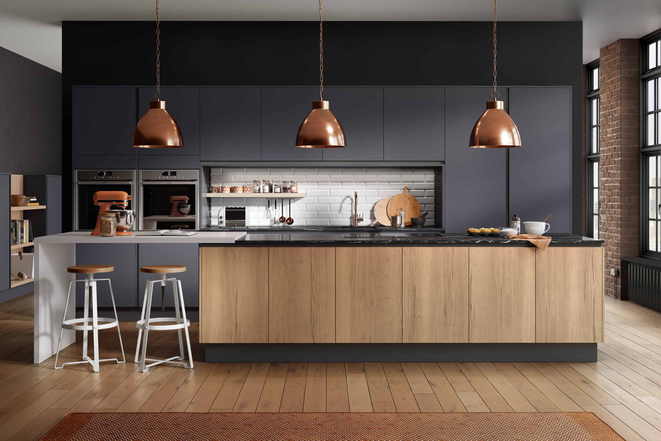
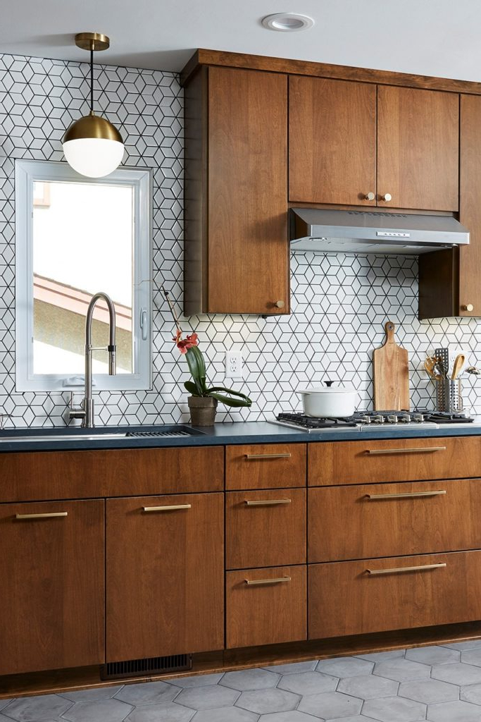
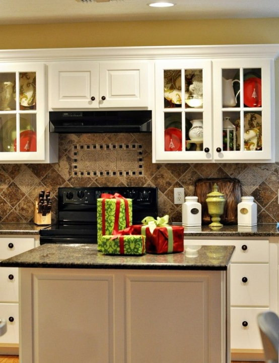
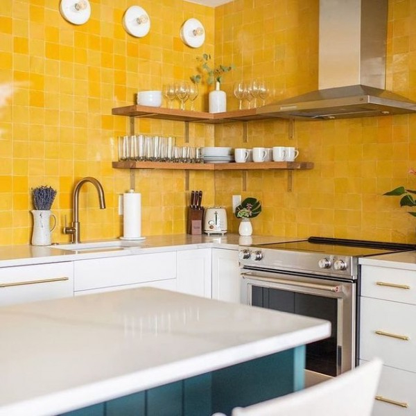
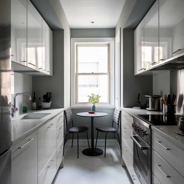
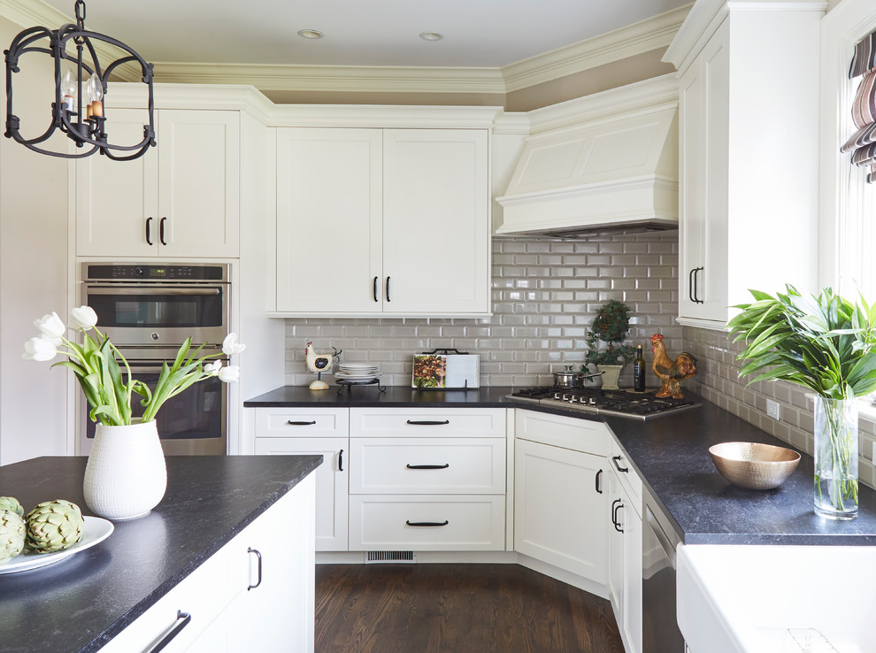
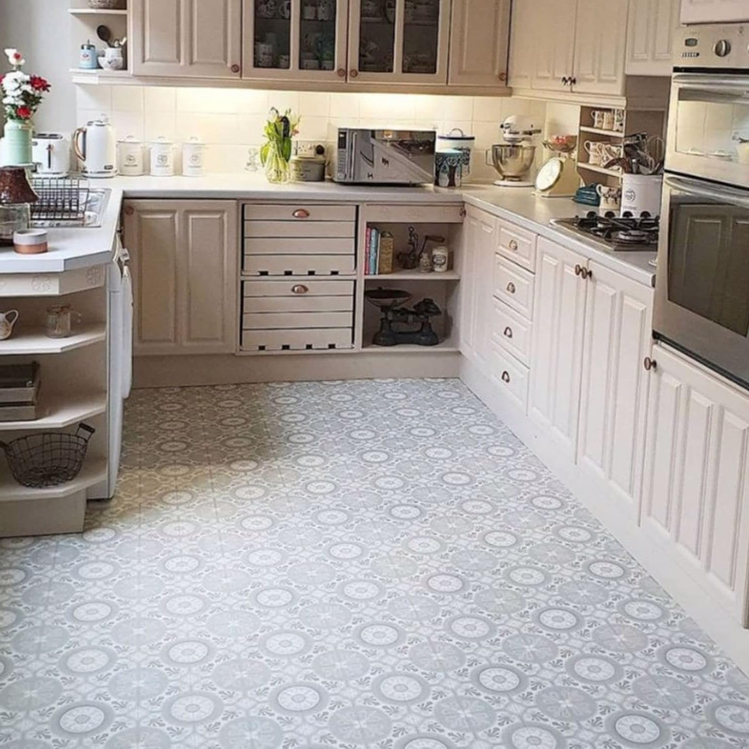
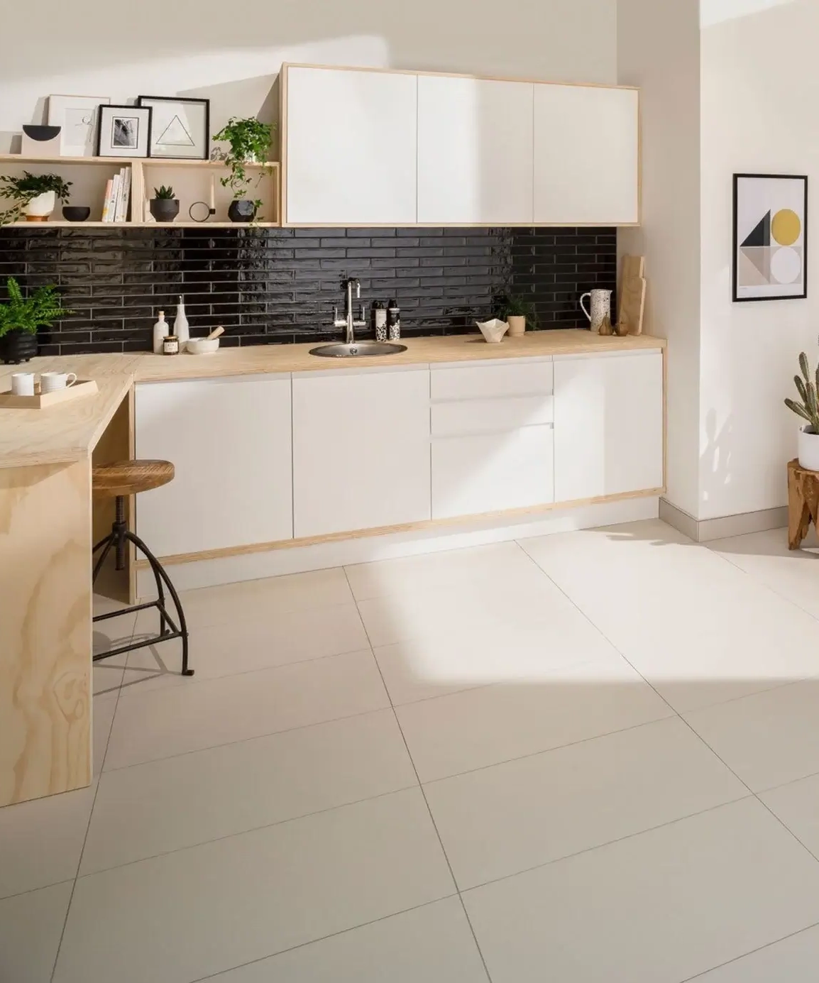
Current trends reflect both practical needs and emotional desires. Light wood tones and neutral grays dominate many contemporary designs because they offer versatility and timeless appeal. These colors work well with various cabinet styles and lighting conditions. Black and white combinations continue to be popular because they create clean, sophisticated looks that feel modern and fresh. But don’t overlook the power of earth tones like terracotta, warm browns, and sage greens. These colors bring warmth and connection to nature, making them especially appealing in today’s environmentally conscious home design movement. Natural stone patterns in beige and cream also remain favorites because they offer the look of luxury without the high cost.
Practical Considerations for Tile Selection
Beyond the emotional benefits, there are practical aspects to consider. Light-colored tiles reflect more light, which can make your kitchen feel brighter and more open. This is particularly beneficial in kitchens with limited natural light. Darker tiles can hide dirt and wear better in high-traffic areas, though they may require more frequent cleaning to maintain their appearance. Consider how much maintenance you want to invest in your floor. Some colors show scratches and stains more easily than others. If you have young children or pets, you might want to choose colors that are more forgiving. Also think about how different colors will look under various lighting conditions throughout the day.
Matching Colors to Kitchen Functionality
Different areas of your kitchen benefit from different color approaches. In the prep area, where you’ll spend a lot of time slicing vegetables or chopping ingredients, colors that promote focus and clarity work best. Soft blues or gentle greens can help reduce eye strain during long cooking sessions. The dining area might benefit from warmer tones that encourage conversation and social interaction. Creams, warm yellows, or soft oranges can create a welcoming atmosphere for family meals. The cleaning zone, including areas around sinks and dishwashers, might work well with cooler tones that feel fresh and hygienic. Remember, you’re not limited to one color throughout the entire kitchen. Many designers successfully incorporate multiple colors strategically to define different zones.
Making Smart Choices for Your Family
Ultimately, the best tile color is one that works for everyone who uses the kitchen regularly. Consider the personalities and needs of all family members. Do you have a teenager who loves bold colors? Maybe a grandparent who prefers classic neutrals? Think about how the colors will age with your family’s changing needs. Some families prefer to go with timeless colors that won’t feel dated in a few years, while others embrace trends that change every season. It’s also worth considering how the tile will complement other elements in your kitchen. The cabinets, countertops, and appliances should all work together to create a cohesive look. Don’t forget about the ceiling and walls too—the whole space should feel balanced and harmonious.
Choosing the right color for your kitchen floor tiles is more than just aesthetics. It’s about creating an environment that supports your lifestyle and enhances your daily experiences. Whether you’re drawn to the calming effects of soft blues, the warmth of earth tones, or the sophistication of classic neutrals, remember that color psychology plays a significant role in how you feel and function in your space. Take time to consider not just what looks good, but what feels right for your family’s unique rhythm and preferences. After all, your kitchen floor should be a foundation that makes you want to spend more time in your most cherished room. The right colors can turn a simple floor into a source of joy and inspiration.
[sps_html tag=”img” src=”https://roofdrivein.com/wp-content/uploads/2026/01/contemporary-kitchen-flooring-16-mid-century-modern-kitchen-ideas-to-inside-color-psychology-in-contemporary-kitchen-tile-floor-design.jpg” alt=”Contemporary Kitchen Flooring 16 Mid Century Modern Kitchen Ideas To inside Color psychology in contemporary kitchen tile floor design” style=”width: 100%; height: auto;”]
[sps_html tag=”img” src=”https://roofdrivein.com/wp-content/uploads/2026/01/modern-kitchen-floor-tile-ideas-things-in-the-kitchen-pertaining-to-color-psychology-in-contemporary-kitchen-tile-floor-design.jpg” alt=”Modern Kitchen Floor Tile Ideas – Things In The Kitchen pertaining to Color psychology in contemporary kitchen tile floor design” style=”width: 100%; height: auto;”]
[sps_html tag=”img” src=”https://roofdrivein.com/wp-content/uploads/2026/01/modern-floor-tiles-design-for-kitchen-inside-modern-kitchen-tile-floor.webp” alt=”Modern Floor Tiles Design For Kitchen inside Modern Kitchen Tile Floor” style=”width: 100%; height: auto;”]
[sps_html tag=”img” src=”https://roofdrivein.com/wp-content/uploads/2026/01/contemporary-kitchen-floor-tile-ideas-modern-kitchen-tiles-design-with-regard-to-modern-kitchen-tile-floor.jpg” alt=”Contemporary Kitchen Floor Tile Ideas | Modern Kitchen Tiles Design … with regard to Modern Kitchen Tile Floor” style=”width: 100%; height: auto;”]
[sps_html tag=”img” src=”https://roofdrivein.com/wp-content/uploads/2026/01/28-kitchen-floor-tiles-trendiest-floor-tiles-for-kitchens-regarding-color-psychology-in-contemporary-kitchen-tile-floor-design.jpg” alt=”28+ Kitchen Floor Tiles ( Trendiest ) - Floor Tiles For Kitchens regarding Color psychology in contemporary kitchen tile floor design” style=”width: 100%; height: auto;”]