Have you ever walked into a room and instantly felt calm, or perhaps sensed tension just by looking at the walls? That’s not just your imagination. Colors have a powerful influence on our emotions, our moods, and even our sleep patterns. In the sanctuary of your bedroom, this effect becomes even more pronounced. The right palette isn’t just about aesthetics—it’s about creating a space that truly nurtures your well-being.
Your bedroom is more than just a place to catch some Z’s. It’s your personal retreat, a space designed for restoration and renewal. But have you considered how the colors surrounding you might be affecting your ability to relax and sleep soundly? The science behind color psychology reveals that the hues we choose for our bedrooms can profoundly impact our mental state, stress levels, and ultimately, our quality of life. This isn’t just about pretty pictures or trendy palettes—it’s about understanding how colors work with our biology to either soothe or stimulate our nervous systems. Whether you’ve been struggling with restless nights or simply want to enhance your sleep experience, the right color choices could be the missing piece in your wellness puzzle.
Understanding Color Psychology Basics
Before diving into specific bedroom applications, it’s important to grasp how colors actually affect us. Every hue carries its own energy and emotional resonance. Red, for instance, is associated with passion and excitement, which makes it stimulating rather than calming. Blue, on the other hand, tends to lower heart rate and blood pressure, making it ideal for relaxation. Green represents nature and balance, offering a sense of harmony and peace. Purple evokes luxury and creativity, while yellow brings joy and optimism. These associations aren’t arbitrary—they’re rooted in both cultural history and scientific research. When we talk about bedroom design, we’re essentially selecting a palette that supports our body’s natural rhythms and promotes healthy sleep cycles.
The Science Behind Sleep and Color
Sleep is a complex biological process, and our environment plays a crucial role in facilitating it. Research shows that our brains respond differently to various wavelengths of light and color. For example, blue light suppresses melatonin production, which is essential for falling asleep naturally. Conversely, warm tones like soft orange and red encourage the release of serotonin, helping us feel more alert during the day. But in the evening hours, cooler tones become more beneficial. Studies suggest that bedrooms painted in soft blues or greens can reduce anxiety levels by up to 30%. This isn’t just theoretical—many people report better sleep quality when their sleeping spaces incorporate these calming hues. The key is choosing colors that align with your circadian rhythm and promote the transition from alertness to restfulness.
Best Colors for Relaxation
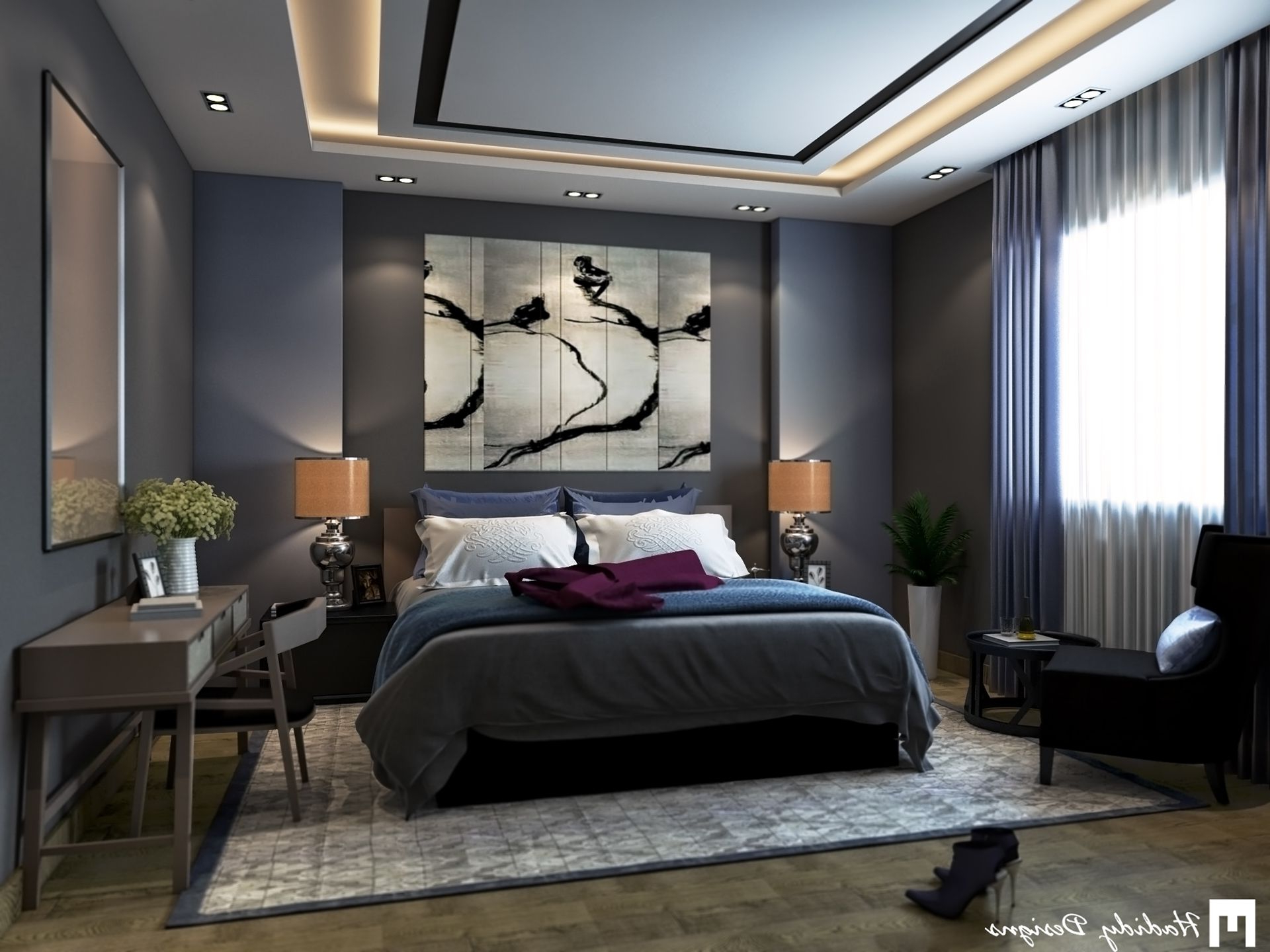
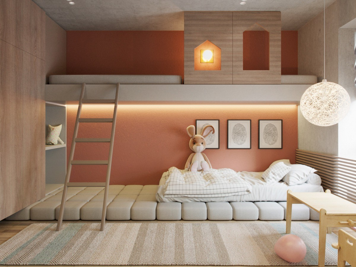
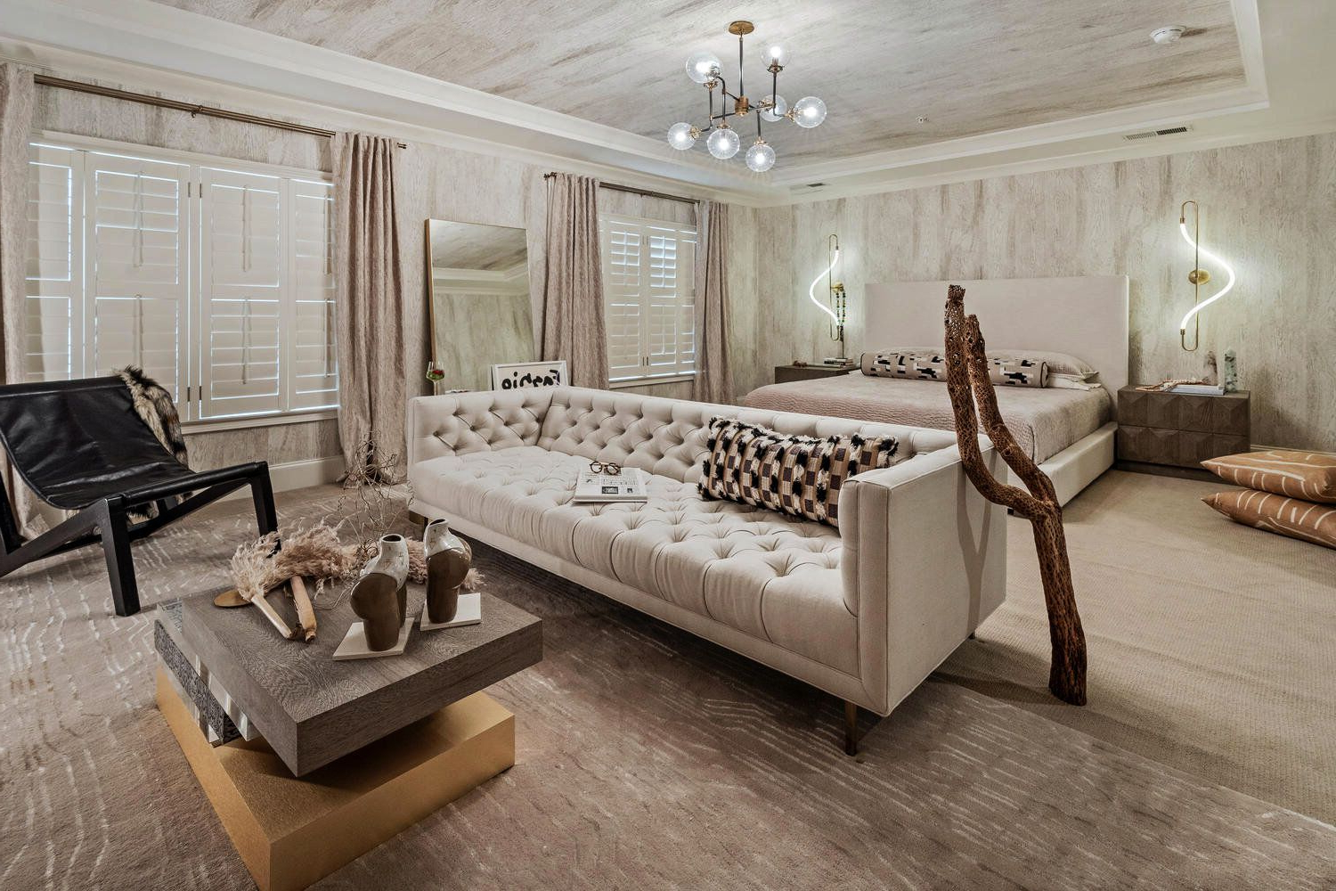
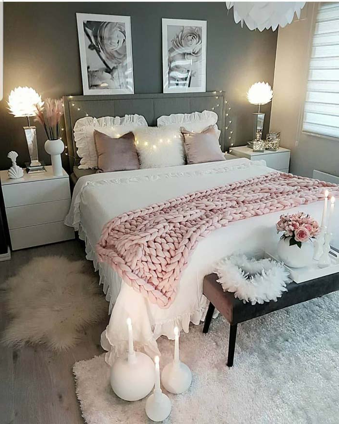
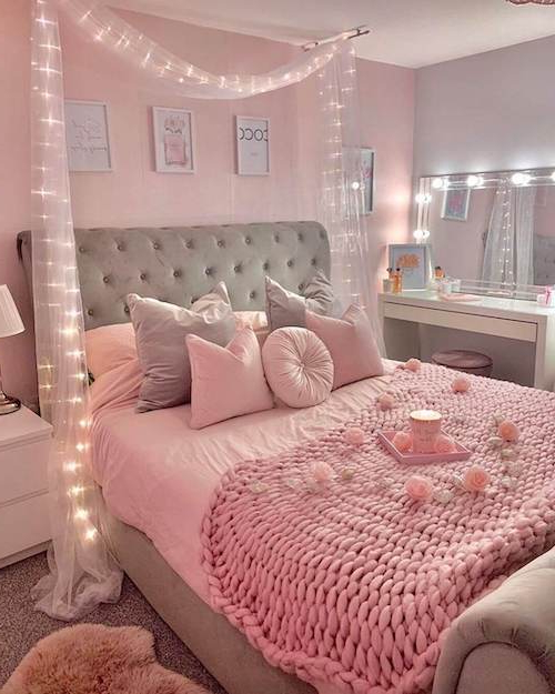
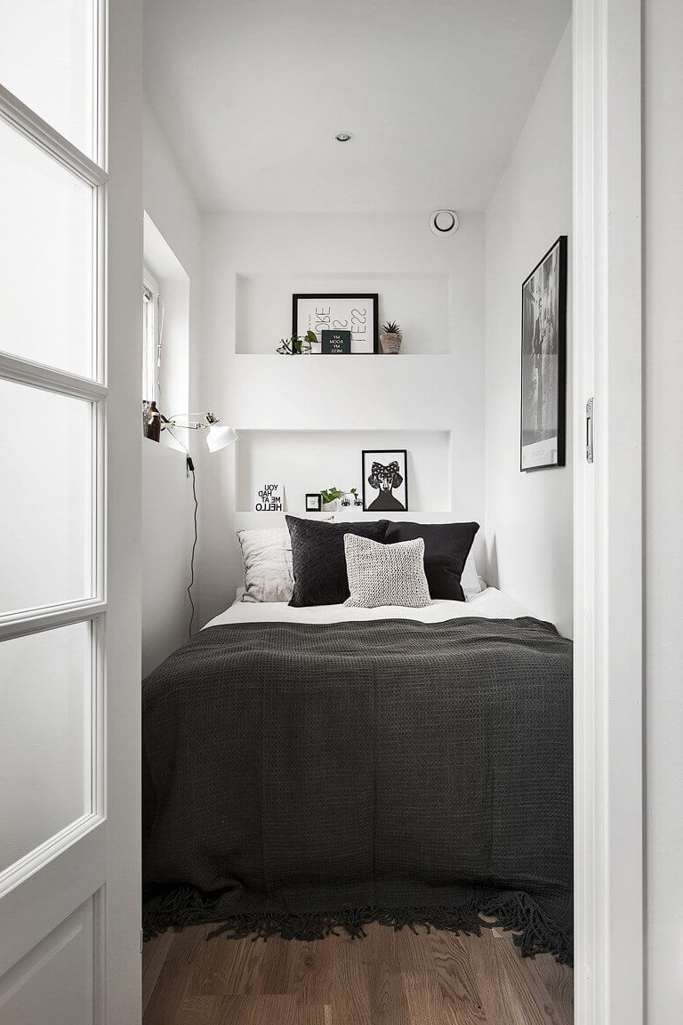
When it comes to relaxation, certain colors consistently prove their worth. Soft blues are perhaps the most popular choice, offering a sense of tranquility that mirrors the ocean or sky. They’re particularly effective because they’re associated with stillness and depth. Lavender brings a gentle, floral quality that many find soothing. It’s been used in aromatherapy for centuries and continues to be a favorite for bedtime routines. Soft greens provide a connection to nature, which can help reduce stress and improve focus. Neutral tones like beige and soft gray create a clean, uncluttered feeling that allows the mind to quiet down. These colors don’t demand attention—they simply exist, providing a backdrop for rest and recovery. The trick is using them in ways that feel natural and not overly clinical.
Avoiding Problematic Color Choices
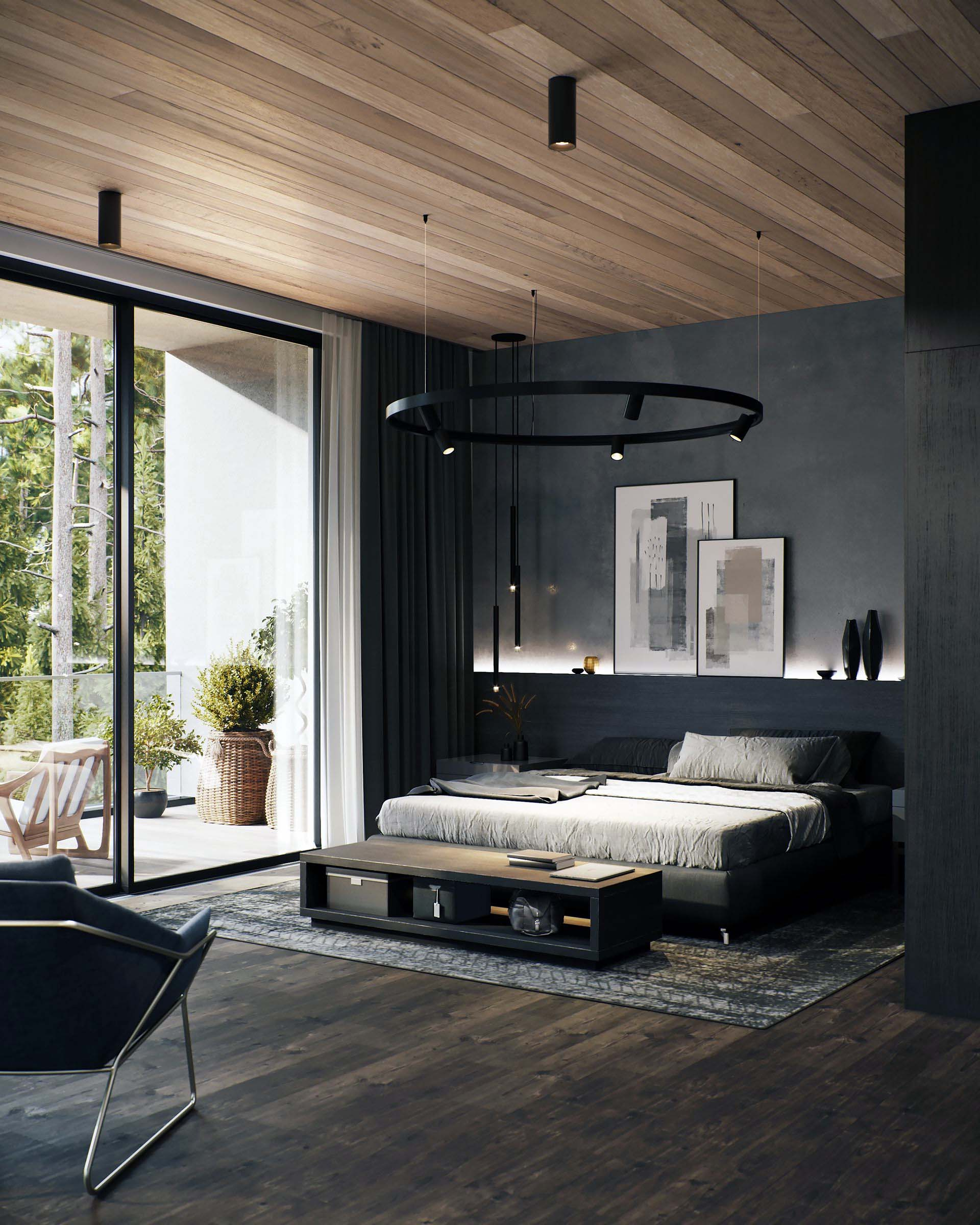
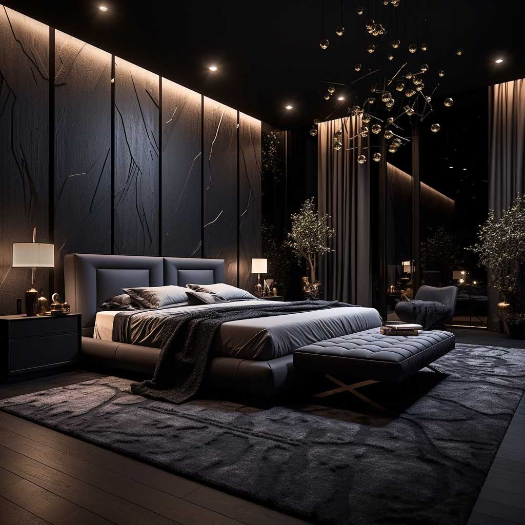
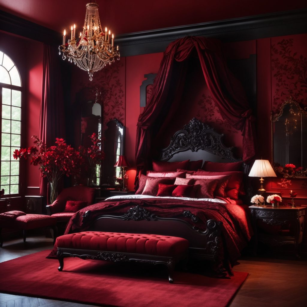
Not all colors are created equal when it comes to sleep environments. Bright, saturated colors like neon pink, electric yellow, or harsh reds can be overstimulating and disrupt sleep patterns. They activate the brain and increase alertness, which is exactly what you don’t want before bedtime. Similarly, dark colors like deep black or very dark brown can make a room feel heavy and oppressive. While they might seem dramatic, they often create a sense of confinement that works against relaxation. Overly bright whites, while appearing clean, can sometimes reflect too much light and make a space feel sterile or cold. The goal is balance—colors that feel comfortable, inviting, and supportive of your body’s natural sleep processes.
Creating Harmony Through Color Temperature
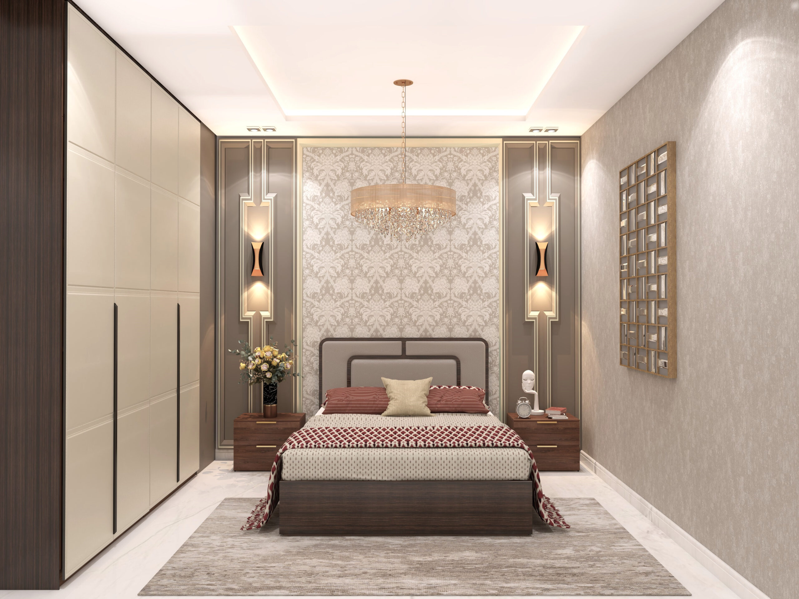
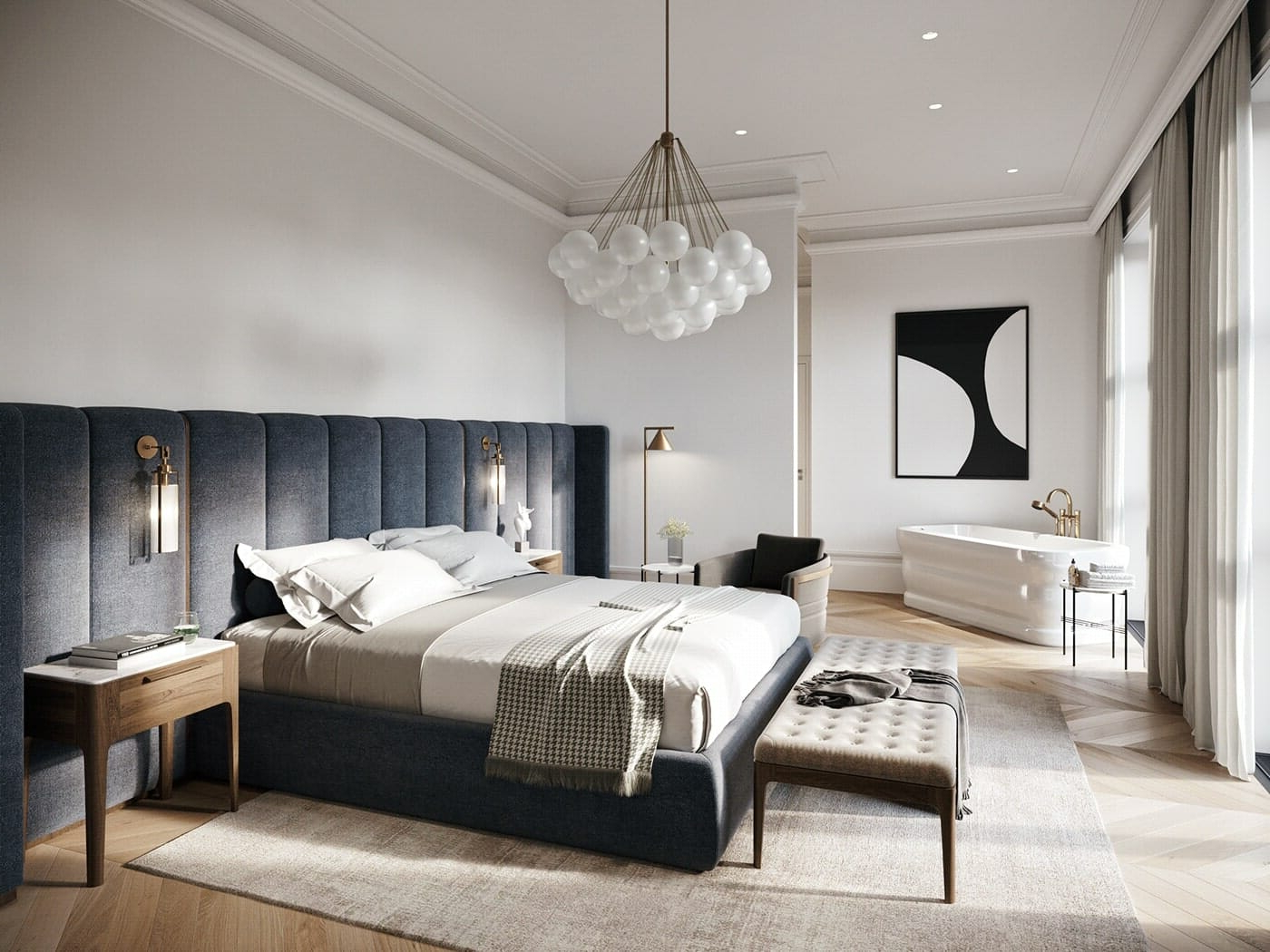
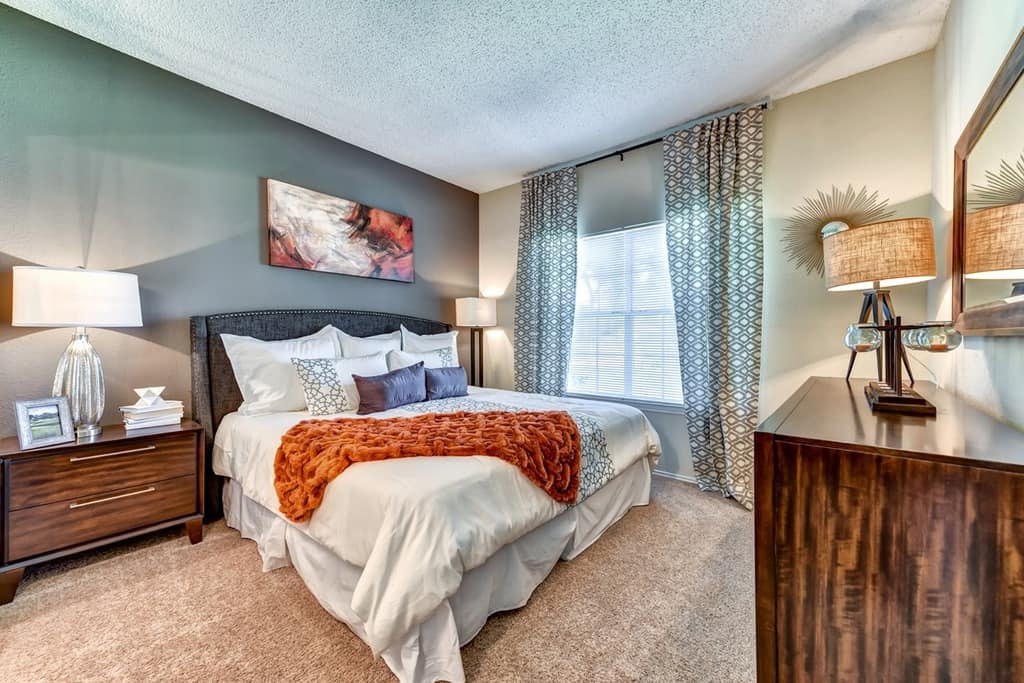
Color temperature plays a significant role in how colors appear and feel within a room. Warm colors tend to advance toward you, making spaces feel cozy and intimate. Cool colors recede, creating a sense of spaciousness and openness. In bedroom design, this means you might want to consider how different temperatures interact with your furniture and lighting. A warm-toned bedroom might feature soft yellows or terracotta accents, while a cool-toned space could incorporate pale blues or soft grays. Some designers recommend using a combination approach, mixing warm and cool tones strategically. For example, a wall in soft blue paired with warm wood furniture can create a balanced atmosphere. The interplay between these temperatures helps prevent any single hue from dominating the space in an overwhelming way.
Practical Tips for Implementing Color Psychology
Applying color psychology doesn’t require a complete redesign or expensive paint jobs. Start small with accent pieces like throw pillows, artwork, or bedding. You can test out different hues without committing to a full room transformation. Consider painting one wall in your chosen relaxing color to see how it feels in practice. Layer textures and materials to add depth and interest to your color scheme. Natural fabrics like linen or cotton can soften the impact of any color, while mirrors can help reflect light and make a space feel brighter. Remember that personal preference matters enormously—what feels calming to one person might not resonate with another. Trust your instincts and pay attention to how your body responds to different environments. Sometimes, the best approach is simply experimenting until you find what works for your unique needs and lifestyle.
Choosing the right colors for your bedroom isn’t just about making a space look pretty—it’s about creating a sanctuary that supports your physical and emotional health. By understanding how different hues influence our moods and sleep patterns, we can make intentional decisions about our living spaces. The journey toward better sleep and relaxation starts with small steps: maybe a new pillow in a calming shade, or a wall painted in a hue that makes you feel peaceful. There’s no one-size-fits-all solution, but there are proven principles that can guide us toward more restorative environments. Ultimately, your bedroom should feel like a safe harbor, a place where your mind can quiet down and your body can fully recover. With thoughtful color choices, you’re not just decorating—you’re investing in your well-being.
[sps_html tag=”img” src=”https://roofdrivein.com/wp-content/uploads/2026/01/modern-luxury-master-bedroom-designs-inside-modern-bedroom-design-ideas.jpg” alt=”Modern Luxury Master Bedroom Designs inside Modern Bedroom Design Ideas” style=”width: 100%; height: auto;”]
[sps_html tag=”img” src=”https://roofdrivein.com/wp-content/uploads/2026/01/top-50-modern-bedroom-interior-design-ideas-for-2025-within-color-psychology-in-bedroom-design-choosing-the-right-palette-for-relaxation.jpg” alt=”Top 50 Modern Bedroom Interior Design Ideas For 2025 within Color Psychology in Bedroom Design: Choosing the Right Palette for Relaxation” style=”width: 100%; height: auto;”]
[sps_html tag=”img” src=”https://roofdrivein.com/wp-content/uploads/2026/01/master-bedroom-design-ideas-bedroom-decorating-style-tips-within-modern-bedroom-design-ideas.jpg” alt=”Master Bedroom Design Ideas | Bedroom Decorating & Style Tips within Modern Bedroom Design Ideas” style=”width: 100%; height: auto;”]
[sps_html tag=”img” src=”https://roofdrivein.com/wp-content/uploads/2026/01/modern-bedroom-designs-2021-discover-bedroom-ideas-and-design-with-regard-to-color-psychology-in-bedroom-design-choosing-the-right-palette-for-relaxation.jpg” alt=”Modern Bedroom Designs 2021 / Discover Bedroom Ideas And Design … with regard to Color Psychology in Bedroom Design: Choosing the Right Palette for Relaxation” style=”width: 100%; height: auto;”]
[sps_html tag=”img” src=”https://roofdrivein.com/wp-content/uploads/2026/01/modern-bedroom-interior-design-interior-designs-bedroom-decoration-regarding-color-psychology-in-bedroom-design-choosing-the-right-palette-for-relaxation-scaled.jpg” alt=”Modern Bedroom Interior Design Interior Designs Bedroom Decoration. regarding Color Psychology in Bedroom Design: Choosing the Right Palette for Relaxation” style=”width: 100%; height: auto;”]