Are you tired of the same old neutral palette? Does your kitchen feel a little… bland? You’re not alone. For years, beige and its many cousins have dominated kitchen design, offering a safe and predictable choice. But what if you’re craving something more? Something that sparks joy, ignites conversation, and truly reflects your personal style? This guide is for you. We’re diving deep into the wonderful world of vibrant kitchen colors, showing you how to ditch the beige and embrace a space that’s as lively and dynamic as you are. Get ready to transform your kitchen from a functional space into a vibrant heart of your home.
Let’s be honest, kitchens have evolved. They’re no longer just places to prepare food; they’re gathering spots, entertaining hubs, and often, the busiest room in the house. So why should their décor be anything less than exciting? Choosing vibrant colors for your kitchen is more than just a trend; it’s a way to boost your mood, enhance your creativity, and make a bold statement about who you are. It’s about creating a space that feels alive, welcoming, and utterly you. Think about the energy a splash of color can bring. It can make a small kitchen feel more expansive or turn a large, cavernous space into something more intimate and cozy. It’s a powerful tool for self-expression, and we’re here to help you wield it effectively.
The Power of Color Psychology in the Kitchen
Before we start picking paint chips, let’s talk about what colors actually do. Color psychology is fascinating, and understanding it can help you make informed choices. For instance, warm colors like reds, oranges, and yellows are known to stimulate appetite and create a sense of energy and warmth. Imagine a sunny yellow island or a warm terracotta backsplash – instant cheer! Cool colors, such as blues and greens, tend to have a calming effect, promoting relaxation and a sense of spaciousness. A serene blue cabinetry could be perfect for a kitchen where you love to unwind. Don’t shy away from bolder hues either. Deep blues or rich greens can add a touch of sophistication and depth, while vibrant pinks or purples can inject a playful and unique personality. It’s all about finding the right balance and the hues that resonate with the atmosphere you want to cultivate.
Where to Introduce Vibrant Hues: Beyond the Walls
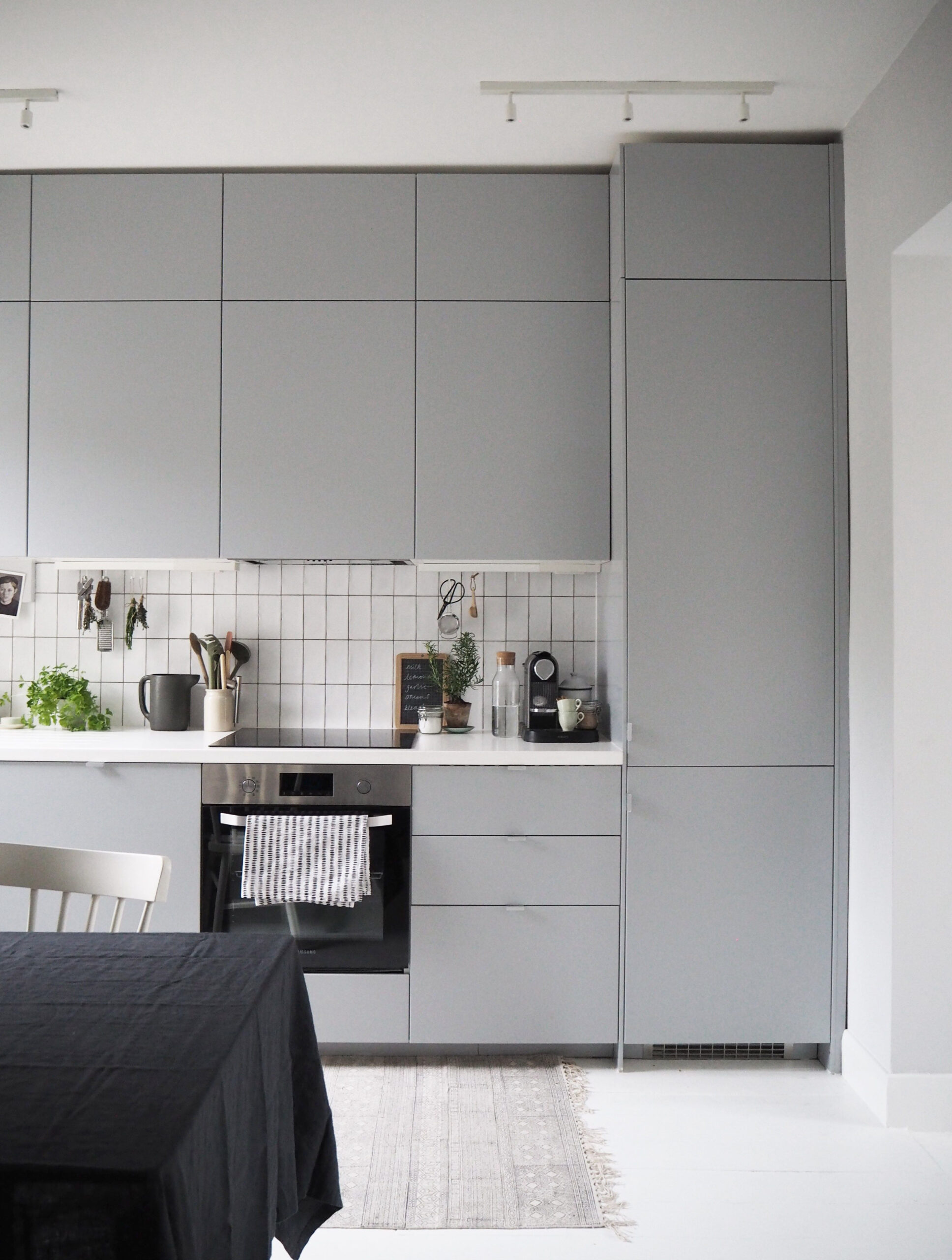
You don’t have to paint every single wall a shocking color to achieve a vibrant kitchen. There are so many ways to weave in pops of personality. Consider your cabinetry. Instead of standard white or wood tones, why not opt for emerald green uppers and a deep navy lower? Or perhaps a cheerful coral for your island? Backsplashes are another fantastic canvas. A mosaic of colorful tiles or a single, striking slab of a vibrant stone can be a real showstopper. Don’t forget the smaller details: think about colorful appliances (a retro-style toaster or a bright stand mixer), vibrant upholstery on your bar stools, or even uniquely colored hardware on your cabinets. Even a brightly colored rug can anchor the space and introduce a lively element. It’s about strategic placement and choosing elements that speak to you.
Exploring Popular Vibrant Kitchen Color Palettes
Ready for some inspiration? Let’s look at some winning combinations:
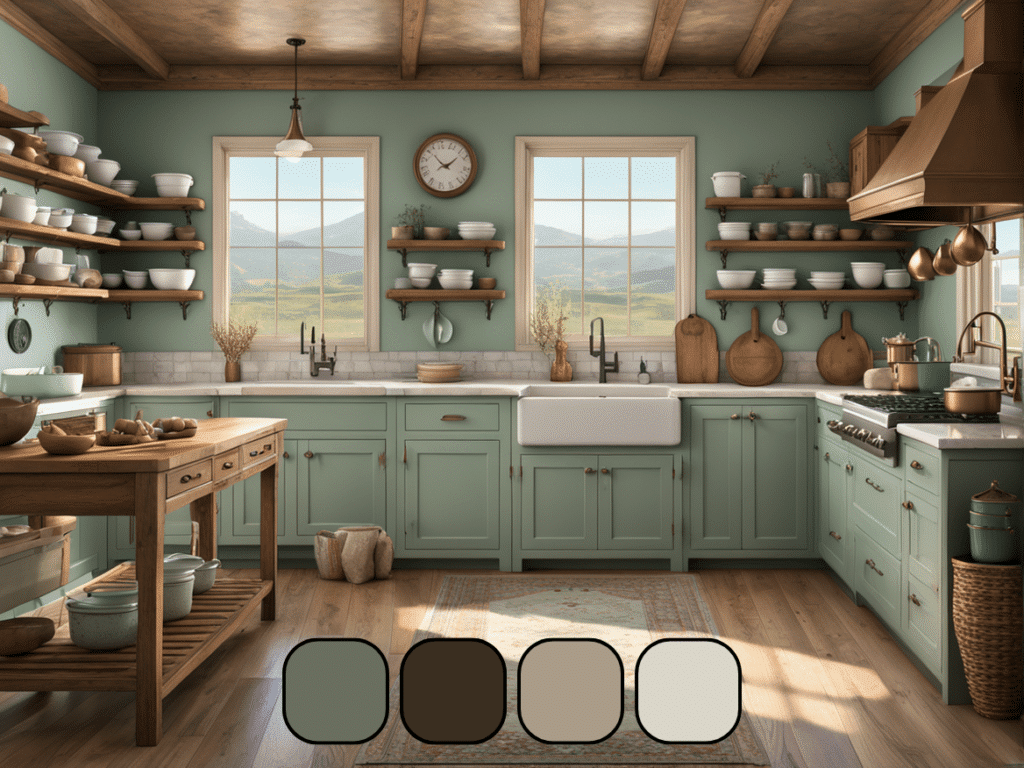
- Coastal Charm: Think seafoam green cabinetry paired with a sandy beige (yes, beige can be a supporting player!) and accents of coral or turquoise in your accessories. It’s fresh and breezy.
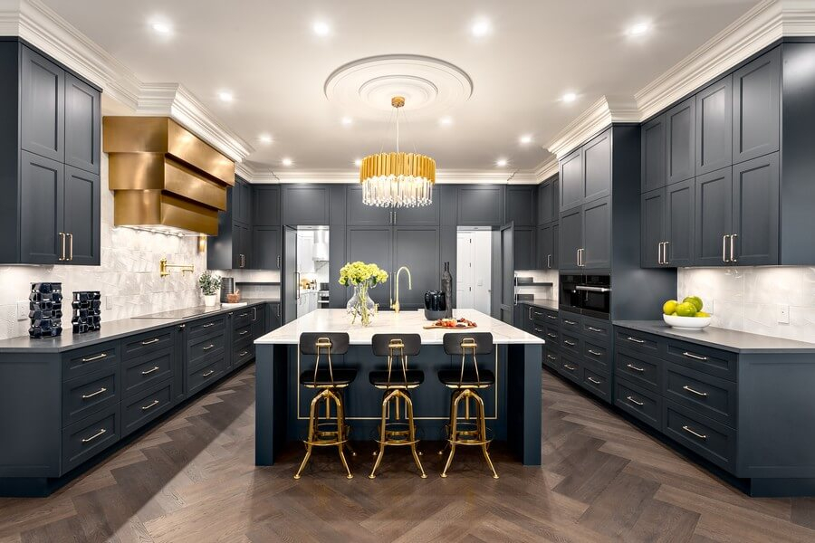
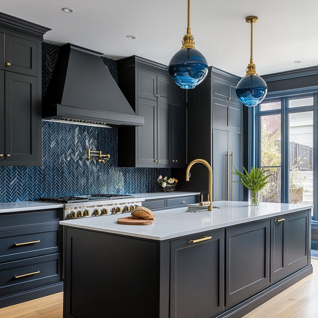
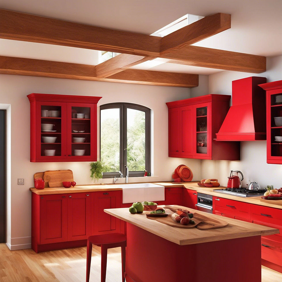
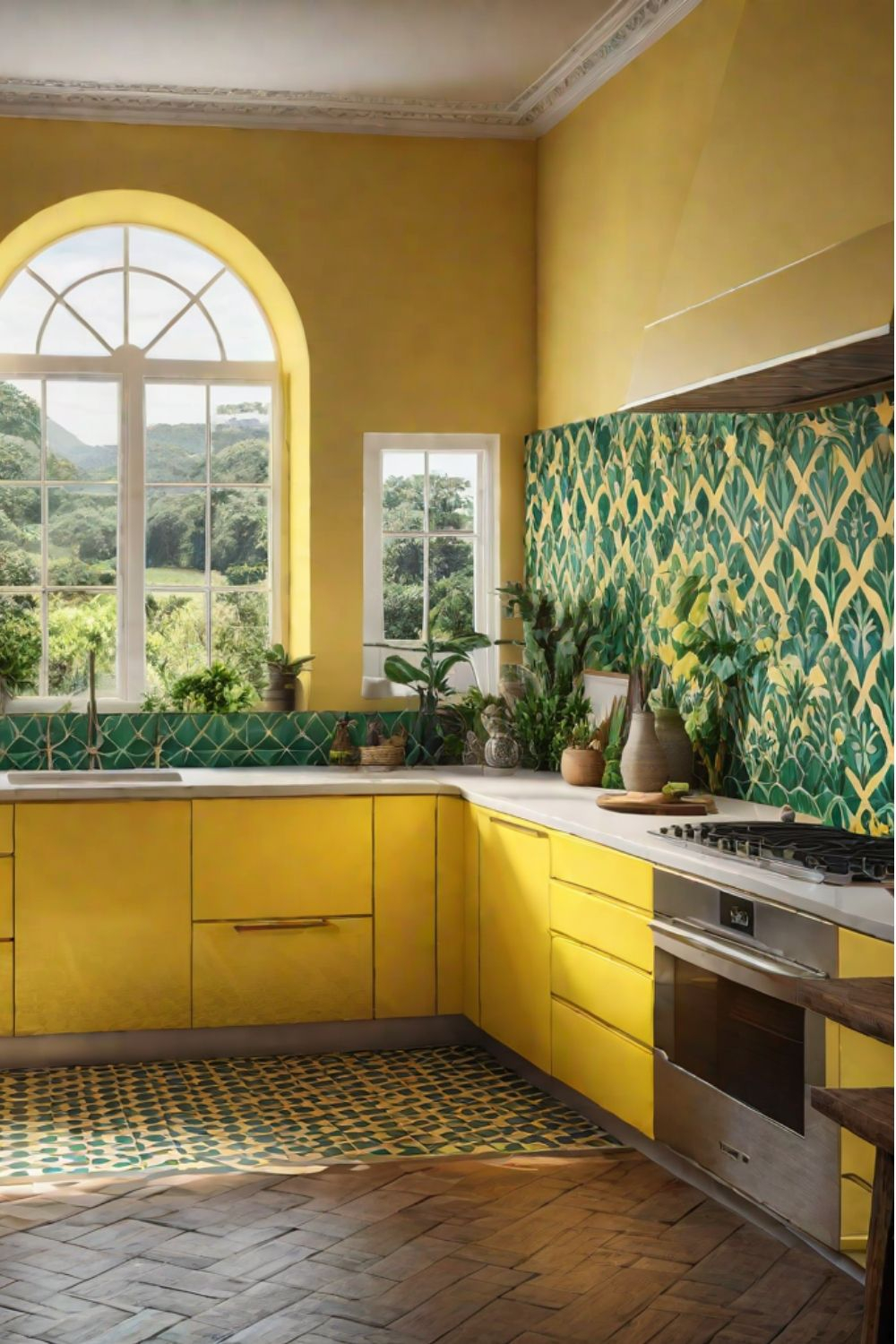
- Modern Bold: Deep teal or navy blue cabinets against crisp white countertops, with pops of mustard yellow in the hardware or a pendant light. This combination is sophisticated yet energetic.
- Earthy & Energetic: Warm terracotta or burnt orange hues can be beautifully balanced with natural wood tones and accents of olive green. This creates a grounded yet vibrant feel.
- Playful Pastels: Don’t think vibrant means only bright and loud. Soft yet rich hues like dusty rose, sage green, and sky blue can create a uniquely vibrant and calming atmosphere. Combine a few for a dreamy effect.
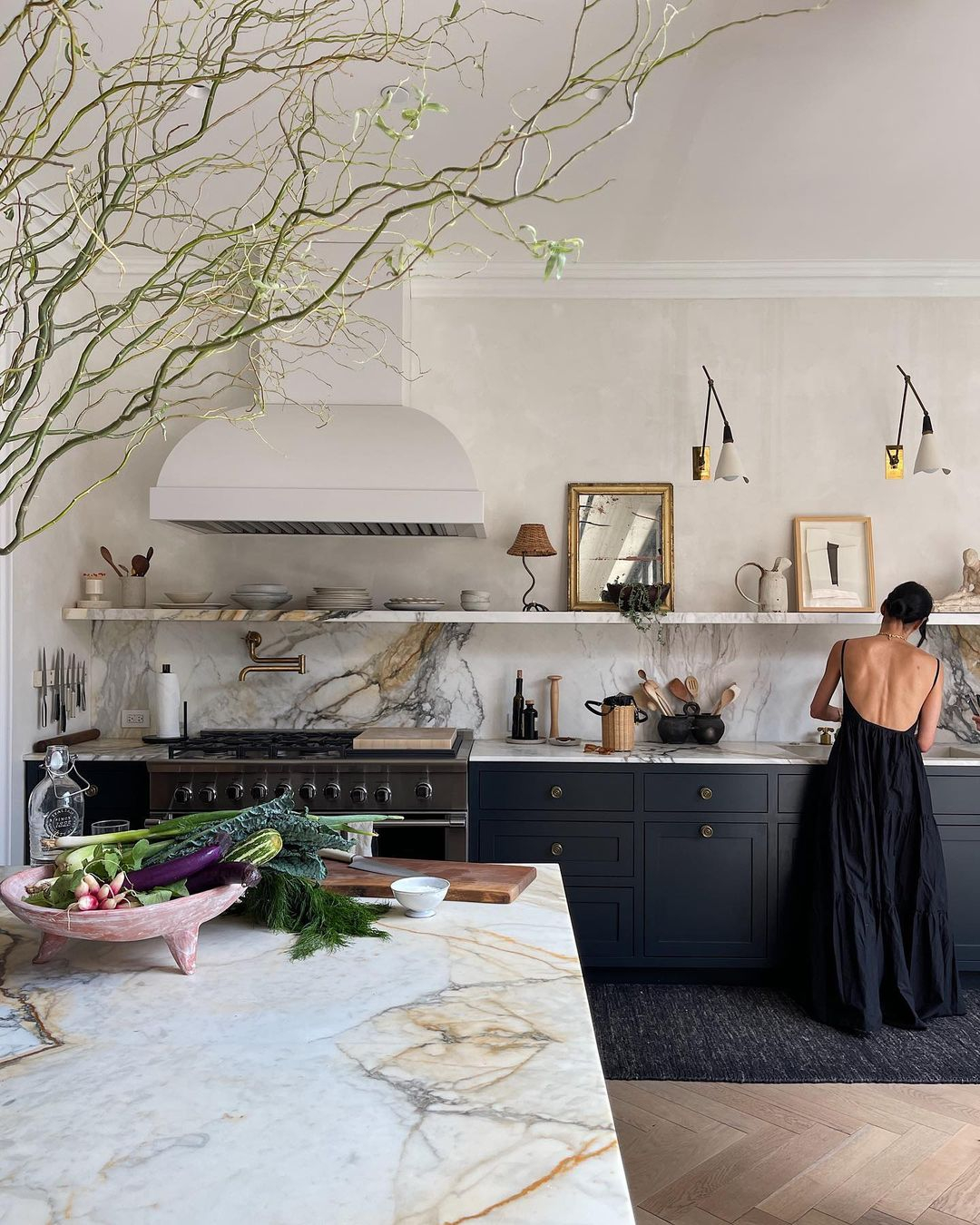
- Classic with a Twist: Keep your main cabinetry neutral (like a soft grey) but inject vibrant color through a bold patterned backsplash or a striking island in a jewel tone like sapphire or ruby. This offers a more subtle approach to vibrancy. Remember, the goal isn’t just to use color, but to use it in a way that feels harmonious and pleasing to the eye. Experiment with different shades and combinations to find what truly sings to you.
Tips for a Successful Vibrant Kitchen Makeover
Embarking on a colorful kitchen journey can feel daunting, but with a few smart strategies, it’s completely manageable. Start small if you’re hesitant. Perhaps a new set of colorful tea towels or a bright fruit bowl. If you’re ready for more, consider painting just one wall or your island. Gather inspiration from magazines, Pinterest, or even nature. Always test your colors! Paint swatches on your walls and observe them in different lighting conditions throughout the day. Natural light can drastically change how a color appears. Think about the overall feel you want to achieve. Do you want a high-energy space for entertaining, or a more tranquil environment for family meals? Consider the existing elements in your kitchen – your flooring, countertops, and any large appliances. You’ll want your new colors to complement, not clash. And most importantly, don’t be afraid to break the rules. It’s your kitchen, after all!
Material Matters: How Finishes Enhance Color
The finish of your chosen color can make a significant difference in how it’s perceived. High-gloss finishes, for instance, reflect light and can make colors appear brighter and more intense. This works wonderfully for cabinetry or even a bold backsplash. Matte finishes, on the other hand, absorb light, offering a softer, more sophisticated look. They can be excellent for walls or larger surfaces where you want the color to be present but not overwhelming. Consider also the materials themselves. A vibrant color on a smooth, lacquered cabinet will look and feel different from the same color applied to a textured wood grain or a natural stone. Think about how a glossy ceramic tile in a bright blue will catch the light compared to a matte painted plaster wall in a similar shade. These textural and reflective qualities add another layer of depth and interest to your vibrant color choices.
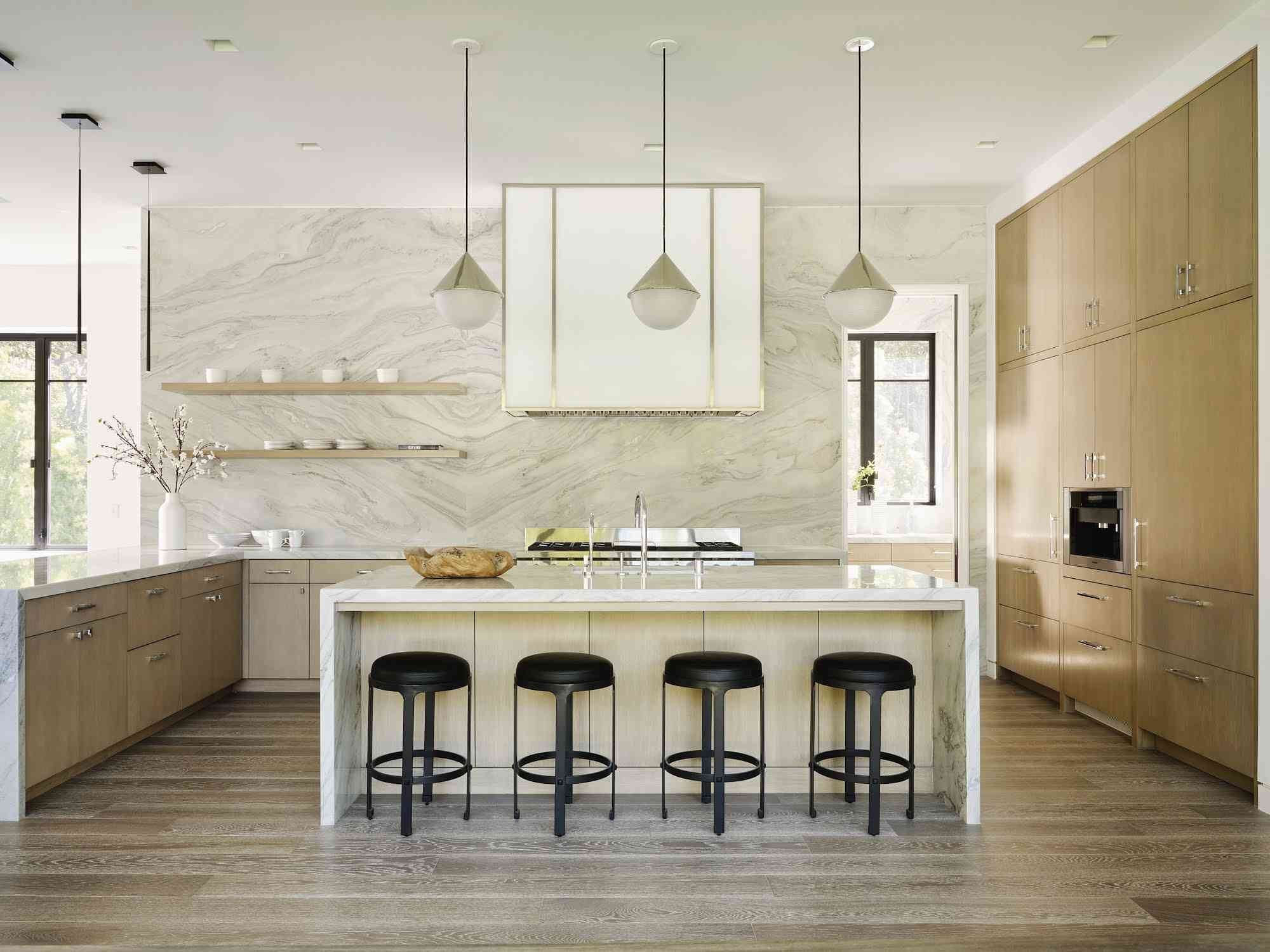
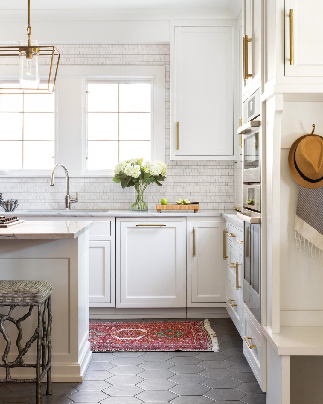
Balancing Vibrant Colors with Neutrals
While we’re celebrating vibrant colors, it’s crucial to remember the power of balance. Overdoing it can lead to a space that feels chaotic or overwhelming. This is where neutrals come in. Think of them as the supporting cast that allows your vibrant stars to shine. White, cream, grey, black, and natural wood tones can all serve as excellent neutral backdrops. For example, if you’re opting for bold, colorful cabinetry, pairing it with a simple white or light grey countertop and a neutral backsplash can prevent the space from becoming too visually busy. Conversely, if you have neutral walls and cabinets, a vibrant rug or a colorful appliance can provide the perfect focal point without dominating the room. The key is to use neutrals to ground the vibrant elements and create a cohesive, inviting atmosphere. It’s about creating a dialogue between the bold and the understated.
Ditching the beige doesn’t mean you have to create a space that’s jarring or uninviting. It means embracing the potential for joy, personality, and life that color can bring. Whether you’re drawn to the energizing warmth of reds and oranges, the calming serenity of blues and greens, or the playful charm of unexpected brights, there’s a vibrant palette waiting for you. Remember to consider color psychology, explore different application points beyond just the walls, and don’t be afraid to experiment. By thoughtfully balancing your chosen hues with neutrals and paying attention to material finishes, you can create a kitchen that’s not only beautiful but also deeply reflective of your unique spirit. So go ahead, pick that color you’ve been dreaming of and transform your kitchen into the vibrant, welcoming heart of your home it deserves to be.