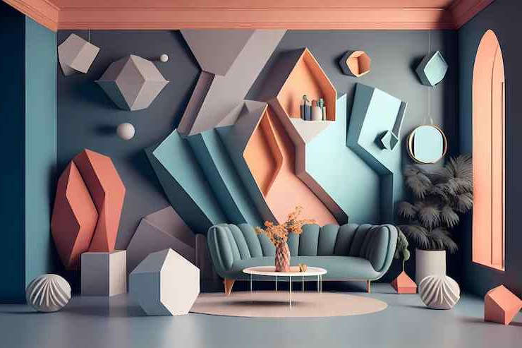
Have you ever walked into a room and instantly felt a certain way? That’s not just coincidence. The colors on your walls are silently communicating with your subconscious mind, influencing your mood, energy levels, and even your behavior. It’s like having a conversation with your space that happens entirely without words. Every hue, shade, and tone carries its own unique message and emotional impact. Understanding this invisible force can transform your living environment from merely functional to truly supportive of your well-being.
Think about the last time you visited someone’s home. What did you notice first? Was it the furniture, the artwork, or perhaps the color scheme? While we often focus on the obvious elements of interior design, the most powerful influence on our experience of a space might be the subtle magic happening behind the walls. Paint isn’t just about aesthetics anymore—it’s about creating environments that nurture our mental and physical health. Every brushstroke of color becomes a decision about how we want to feel when we’re in our homes.
This isn’t some new-age fad; it’s rooted in decades of psychological research that shows how our brains respond to different wavelengths of light and color. Whether you’re redecorating your entire house or simply refreshing a single room, understanding the psychology behind paint choices can make all the difference between a space that feels right and one that feels wrong.
The Science Behind Color Perception
Color perception isn’t just about what we see—it’s about what our brains interpret. When light hits a surface, our eyes send signals to our brain, which then processes these signals through a complex system involving hormones, neurotransmitters, and ancient survival mechanisms. Red, for example, stimulates our sympathetic nervous system, increasing heart rate and blood pressure. Blue, conversely, activates the parasympathetic nervous system, promoting calmness and relaxation. These responses happen automatically, often without us being aware of them.
Scientists have discovered that our reaction to color is influenced by both biological factors and cultural conditioning. In Western cultures, white often represents purity and cleanliness, while in some Eastern traditions, it signifies mourning. This universal yet culturally specific response makes color selection both a scientific and deeply personal art form. The key insight? Colors don’t just decorate our spaces—they literally change how we think and feel.
Warm Colors: Energy and Comfort
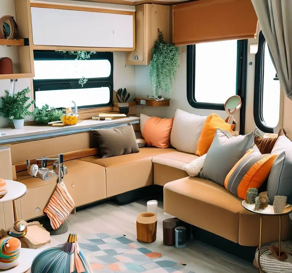
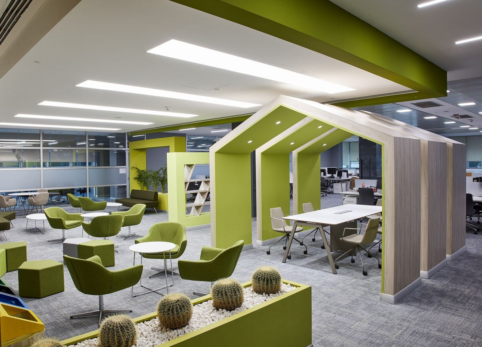
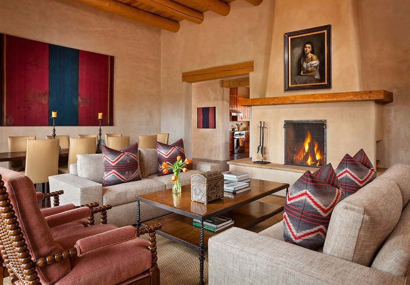
Warm colors like reds, oranges, and yellows are the life of the party in any room. They create feelings of warmth, energy, and excitement. Red is particularly powerful—it can increase appetite and stimulate conversation. That’s why restaurants often use red walls to encourage diners to eat more and stay longer. Orange brings enthusiasm and creativity, making it ideal for family rooms or creative spaces. Yellow adds brightness and optimism, though too much can be overwhelming. These colors work best in spaces where you want to encourage activity and social interaction.
A living room painted in warm tones can make guests feel welcome and energized, while a kitchen in warm colors might make cooking feel more joyful. However, it’s important to balance these colors carefully. Too much heat can lead to restlessness or anxiety. Consider using warm colors as accent walls rather than entire rooms, or pair them with cooler tones to create a balanced atmosphere.
Cool Colors: Calm and Clarity
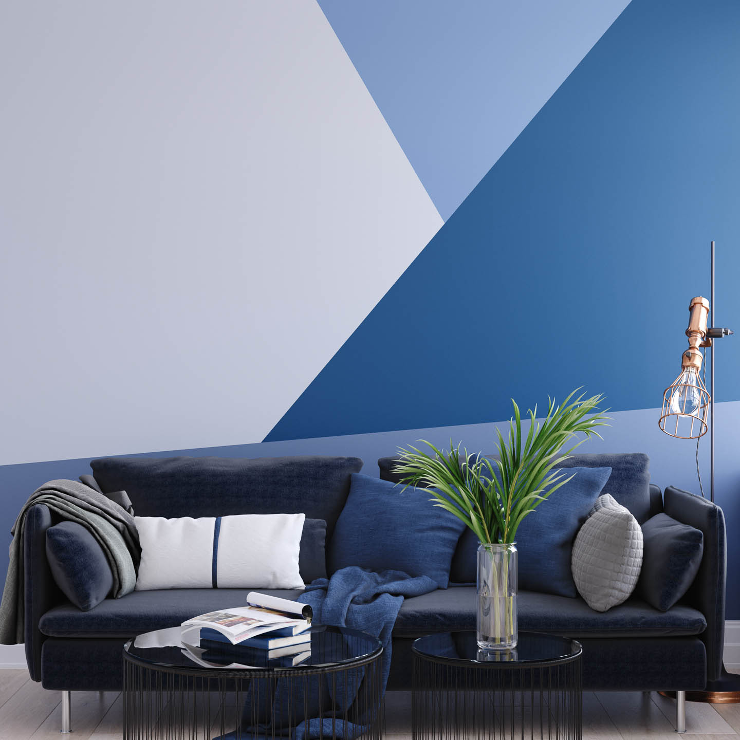
Cool colors such as blues, greens, and purples have a completely different effect on our psyche. They tend to make spaces feel larger, more open, and peaceful. Blue, in particular, is associated with tranquility and stability. Studies show that blue can lower blood pressure and reduce stress levels. Green brings nature indoors, promoting feelings of renewal and balance. It’s no wonder that hospitals often use green accents—they help patients feel more relaxed and healing. Purple combines the calm of blue with the creativity of red, making it perfect for meditation spaces or bedrooms. T
hese colors work exceptionally well in bedrooms, bathrooms, and home offices where you want to promote focus and relaxation. A bedroom painted in soft blue might help you sleep better, while a study in muted green could improve concentration. The trick with cool colors is to choose shades that aren’t too stark or clinical. Soft, warm-cool combinations often work best for creating comfortable environments.
Neutral Tones: Versatility and Balance
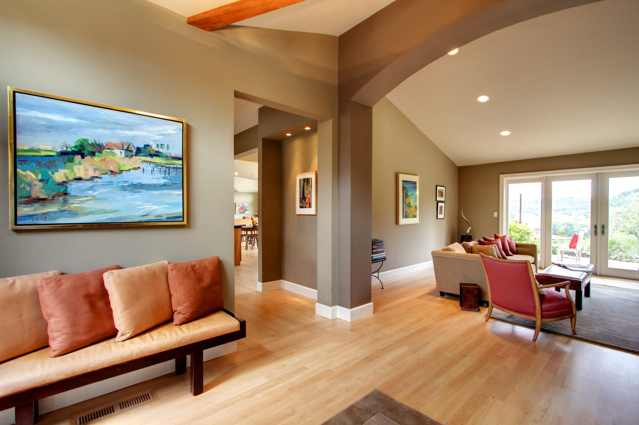
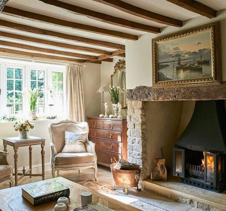
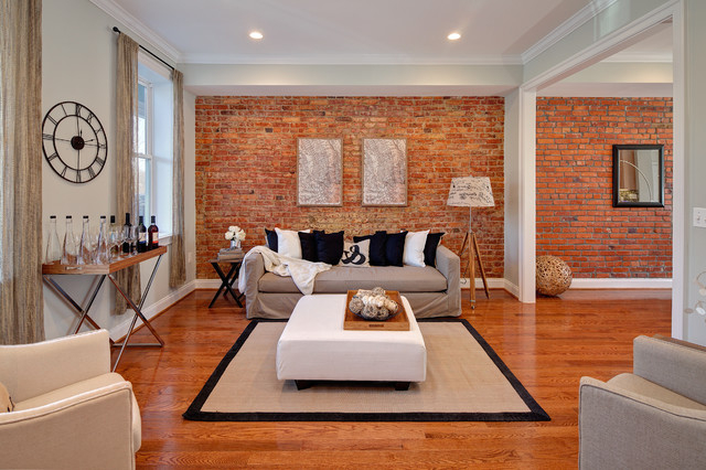
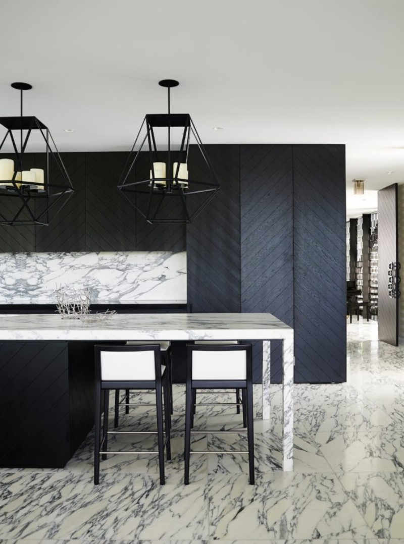
Neutrals like beige, gray, cream, and taupe provide the foundation for most successful home designs. They’re not just background colors—they’re incredibly versatile and psychologically beneficial. Neutrals offer a blank canvas that allows other design elements to shine while providing a sense of calm and sophistication. Gray, in particular, has become increasingly popular because it balances warmth and coolness perfectly. It can make a room feel both cozy and airy. Beige creates a welcoming, earthy feeling that works well in almost any space. Cream adds softness and elegance without being overpowering.
These colors are excellent for large spaces where you want to avoid visual chaos, but they’re also perfect for small rooms where you want to maximize the feeling of space. Neutral tones are especially helpful when you’re unsure about your preferences or planning to change decor frequently. They give you flexibility while maintaining a cohesive, balanced look that never feels dated.
Color Combinations and Room-Specific Applications
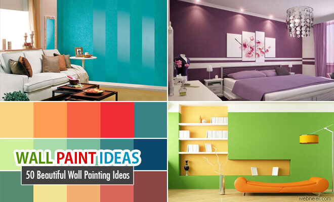
Understanding how colors interact with each other is crucial for successful home design. The rule of thumb is to use the 60-30-10 principle: 60% dominant color, 30% secondary color, and 10% accent color. For example, in a bedroom, you might choose soft blue as your main color, add cream for bedding and curtains (secondary), and use a pop of yellow in throw pillows or artwork (accent). Different rooms benefit from different approaches. Bedrooms often thrive with cool, calming colors like soft greens or lavender. Bathrooms can handle bold, refreshing colors like aqua or sage. Kitchens benefit from warm, appetizing hues like terracotta or warm yellow. Living rooms are perfect for creating conversation areas with warm, inviting colors.
The key is matching your color choices to the intended function of each space. Sometimes, the most effective approach is to think about how you want to feel in each room and then select colors that support those moods. Remember that lighting conditions can dramatically affect how colors appear, so always test samples before committing to full applications.
Practical Tips for Choosing the Right Paint Colors
Choosing paint colors can feel overwhelming, but there are several strategies that make the process manageable. Start by considering the natural lighting in each room. North-facing rooms tend to be cooler and may benefit from warmer undertones, while south-facing rooms often need cooler touches to balance their brightness. Test paint samples on actual walls rather than just swatches, and observe them at different times of day. Consider the size of the room—the same color can feel completely different in a small versus a large space. Darker colors make small rooms feel cozier but can also make them feel smaller, while lighter colors do the opposite.
Think about existing elements like furniture, flooring, and artwork that will complement your chosen colors. Don’t forget to consider the psychological needs of everyone who will use the space. A child’s room might benefit from playful, bright colors, while a home office might need something more focused and professional. Finally, remember that you can always change your mind later—start with smaller projects like an accent wall or a single room to experiment with new color schemes.
The relationship between color and our emotional well-being is profound and undeniable. Every time you pick up a paintbrush or browse through color samples, you’re making decisions that shape not just your home, but your daily experience within it. The colors you choose don’t just reflect your personality—they actively contribute to your mental and physical health. Whether you’re drawn to the bold energy of warm tones, the serene quality of cool colors, or the timeless appeal of neutrals, understanding the psychology behind your choices gives you the power to create environments that truly serve you.
Remember, there’s no one-size-fits-all approach to color in home design. What matters most is finding the right balance that supports your lifestyle and enhances your wellbeing. The next time you walk into a room, pay attention to how it makes you feel. You might discover that the secret to a more pleasant living space lies not in expensive furniture or trendy decor, but in the simple act of choosing the right colors. Your home deserves to be more than just a place to live—it deserves to be a place that helps you thrive.