When we think of neutral bathroom palettes, beige often springs to mind. It’s safe, it’s sensible, but is it truly inspiring? What if we told you there’s a whole spectrum of warmth and sophistication waiting to be discovered, a color that whispers elegance and embraces comfort? We’re talking about cream, of course. It’s not just a pale shade; it’s a world of subtle variations that can completely redefine your bathroom’s atmosphere. Let’s dive in and see how this versatile hue can elevate your design from ordinary to extraordinary.
So many of us are drawn to neutrals for our bathrooms. They offer a sense of calm and a clean canvas. But sometimes, ‘neutral’ can lean towards ‘bland’. If your bathroom feels a little… uninspired, it might be time to look beyond the ubiquitous beige and embrace the richer, more nuanced world of cream. Cream isn’t just a single shade; it’s a family of colors, each with its own personality. From soft, buttery tones to slightly warmer, almost vanilla hues, cream offers a depth that beige often lacks. It’s a color that feels both classic and contemporary, providing a foundation for a truly serene and stylish sanctuary. Ready to explore its potential?
The Spectrum of Cream: Finding Your Perfect Shade
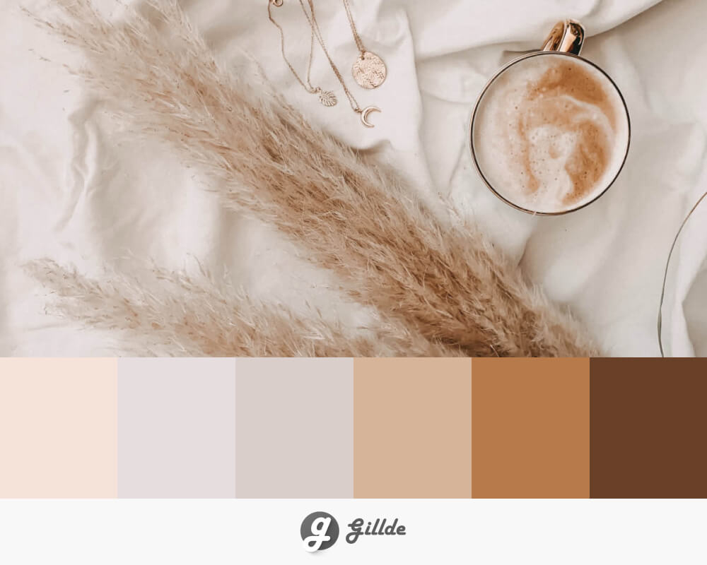
The first step in mastering cream in your bathroom is understanding its diverse family. Think of it like ice cream flavors – vanilla is just the start. You have delicate off-whites with a hint of yellow, giving a soft, sun-kissed glow. Then there are creams with subtle pink undertones, offering a gentle warmth and a touch of romance. Some creams lean towards a warmer, almost beige-adjacent tone, providing a grounding effect, while others are so pale they border on a soft, milky white. The key is to consider the natural light in your bathroom and the overall mood you want to create. A room with less natural light might benefit from a cream with a slightly brighter, yellower undertone to maximize that sense of openness and warmth. Conversely, a sun-drenched bathroom can handle a cream with more subtle undertones without feeling washed out. Don’t be afraid to grab a few samples and paint swatches on your walls to see how they truly look throughout the day and night. What looks good in the store might appear different in your unique space.
Cream as a Foundation: Walls and Tiles
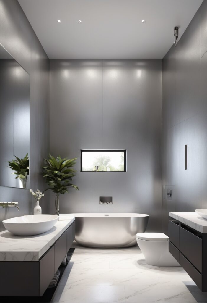
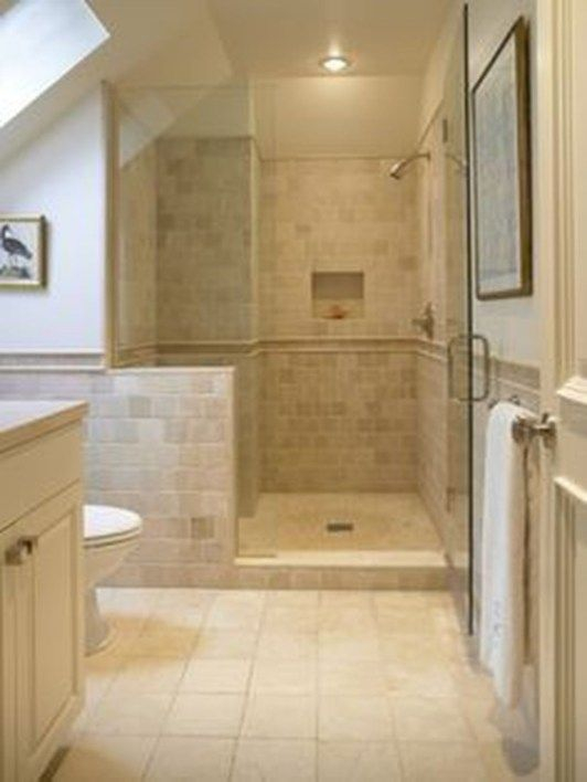
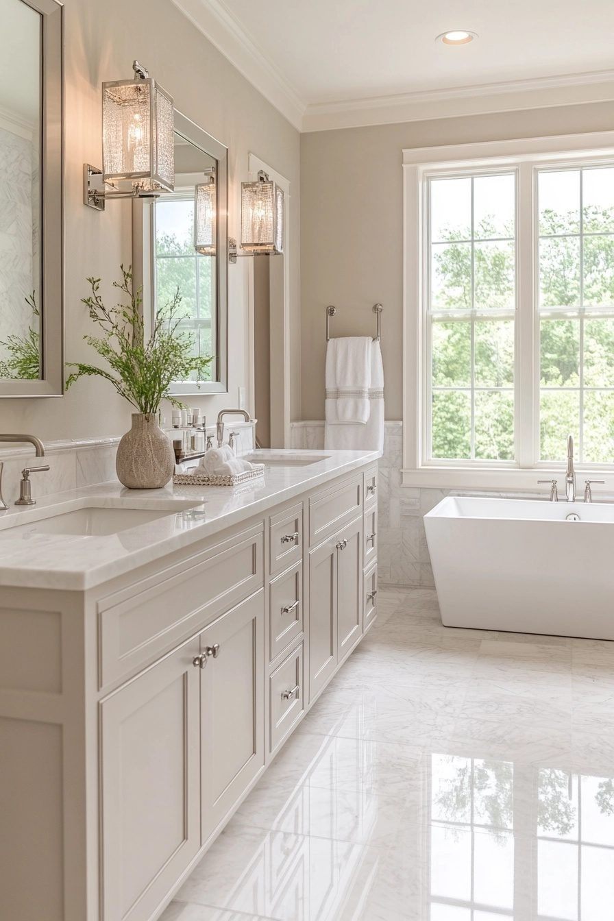
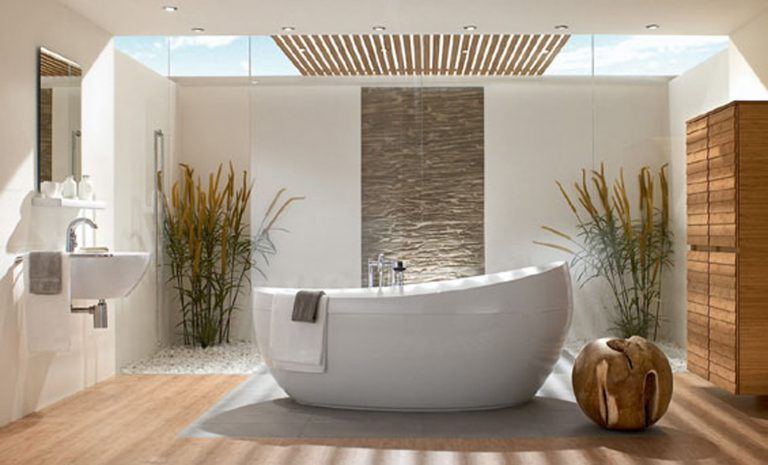
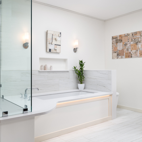
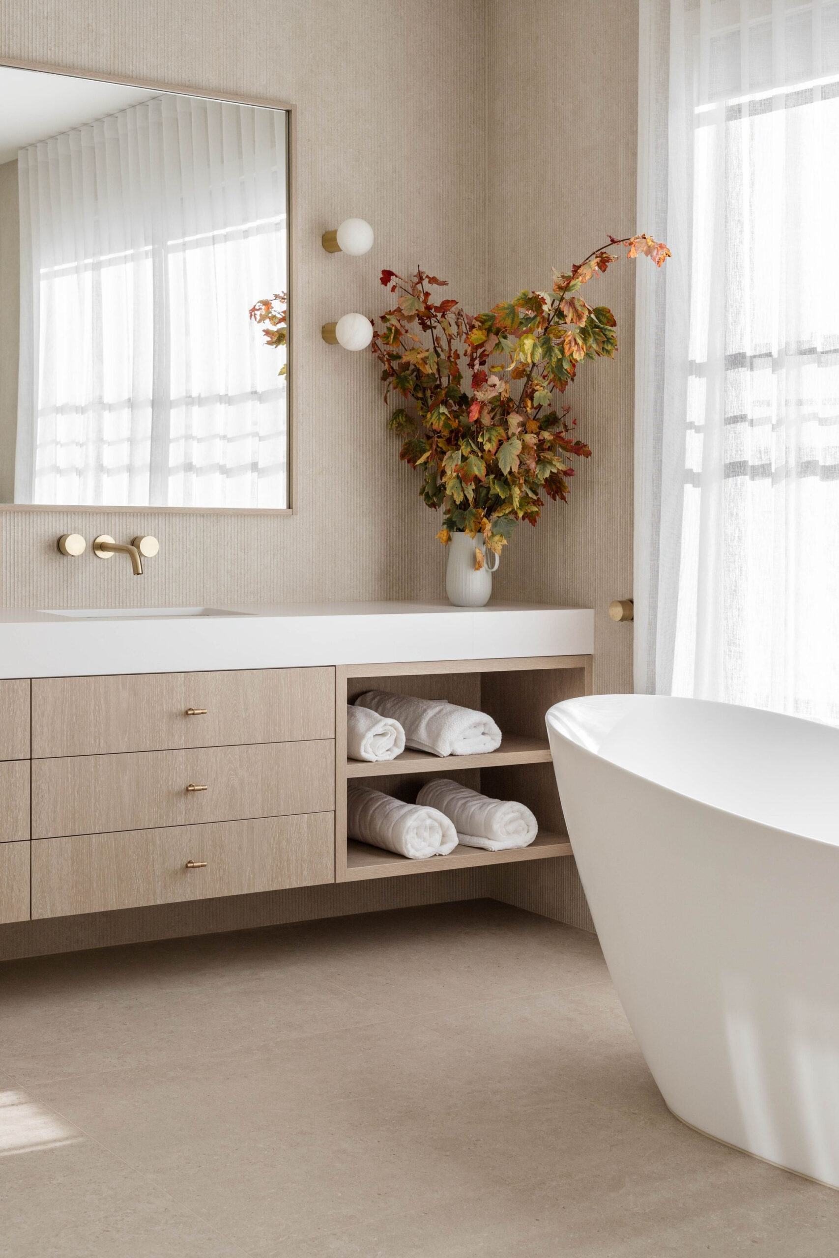
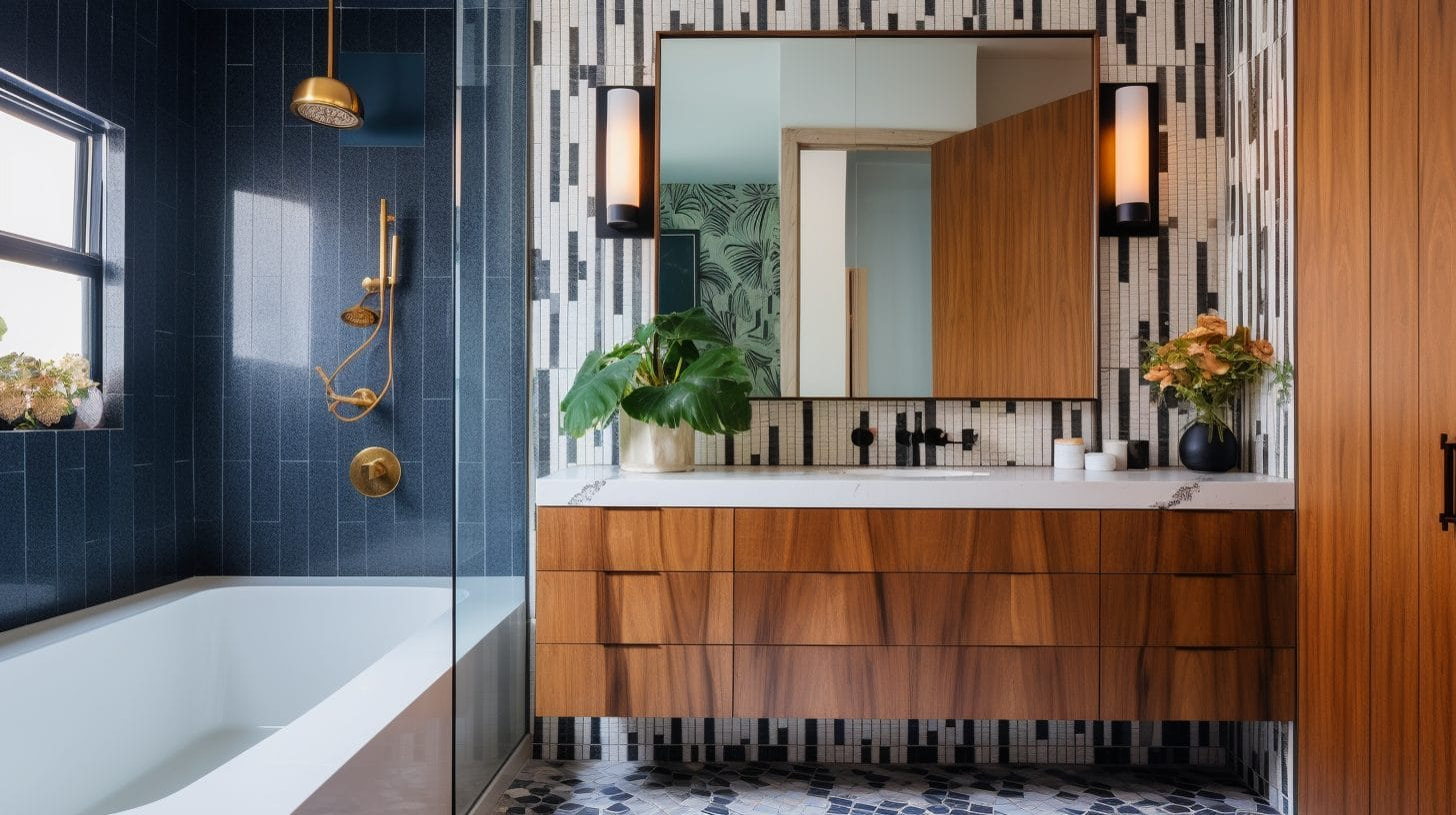
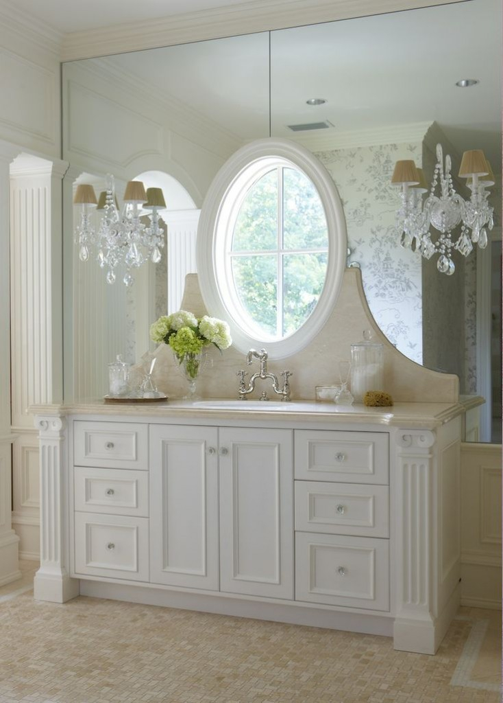
Cream on your walls is a classic for a reason. It creates an immediate sense of spaciousness and tranquility. But don’t stop there. Consider cream for larger surfaces like floor tiles or shower surrounds. A large-format cream porcelain tile can offer a seamless, sophisticated look, particularly in a matte finish which minimizes glare and adds a tactile quality. For walls, a subtle cream paint with a satin finish can reflect light beautifully, making the room feel more expansive. You could even opt for cream subway tiles in the shower for a timeless yet fresh appearance. The beauty here is that cream provides a versatile backdrop, allowing you to introduce other colors and textures without overwhelming the space. It’s like a perfectly tailored neutral suit – it goes with everything.
Adding Depth with Cream Accents and Fixtures
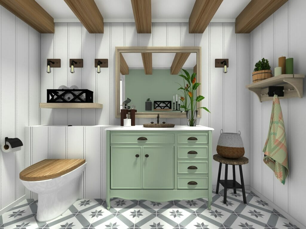
Cream isn’t just for the big stuff; it shines in the details too. Think about cream-colored cabinetry for your vanity. This can soften the look of darker countertops or provide a gentle contrast to lighter ones. A cream ceramic vessel sink, or even a cream-toned quartz countertop, can introduce a touch of understated luxury. Even smaller elements like cream-colored towels, bath mats, or decorative accessories can make a surprisingly big impact. Imagine a cream ceramic soap dispenser or a set of frosted cream glass jars for your cotton swabs. These small touches weave the color throughout the room, creating a cohesive and inviting feel. It’s these nuanced applications that truly elevate a design.
Pairing Cream with Other Colors and Materials
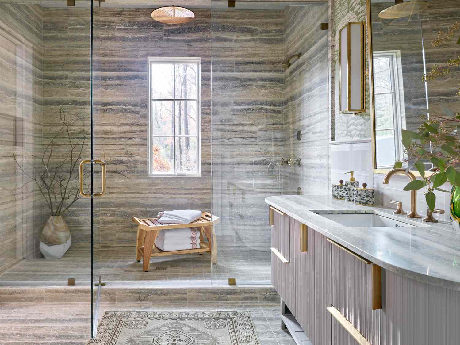
The real magic of cream happens when you pair it with other elements. It’s incredibly forgiving and adaptable. For a truly serene and spa-like feel, combine cream with natural wood tones. Think a light oak vanity or bamboo accents. This pairing brings warmth and organic texture. For a more modern and crisp look, pair cream with black or charcoal gray. A cream vanity with a black countertop and matte black fixtures is incredibly chic. If you’re feeling bolder, cream acts as a beautiful counterpoint to jewel tones like emerald green or sapphire blue. A cream backdrop with deep blue towels or a green plant can be stunning. Metallics also play well with cream; brushed brass or gold can add a touch of opulence, while brushed nickel or chrome offers a cooler, more contemporary feel. Don’t shy away from introducing other neutrals too – soft grays, muted taupes, and even subtle whites can coexist harmoniously with cream, adding layers of sophistication.
Texture: The Secret Ingredient with Cream
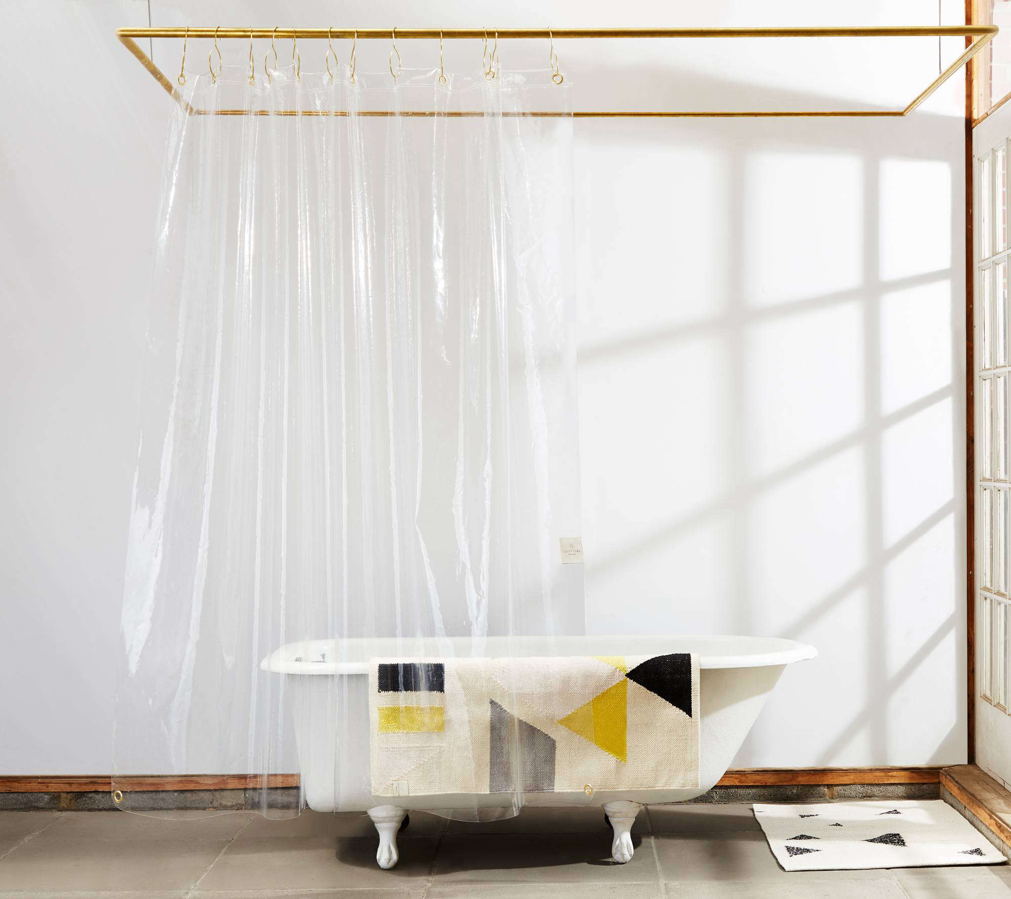
Because some shades of cream can be quite pale, texture becomes your best friend for adding visual interest and preventing a flat appearance. Think about incorporating different finishes. A matte cream tile on the floor alongside a slightly glossy cream tile on a feature wall, for example. Consider textured elements like linen shower curtains, woven bamboo storage baskets, or even a subtly textured cream wallpaper on one accent wall. A fluffy cream bath mat provides both comfort and visual softness. The interplay of light across these different textures will bring your cream palette to life, giving it a richness and depth that a single, flat color simply cannot achieve. It’s about creating a tactile experience as much as a visual one.
Practical Tips for a Creamy Dream Bathroom
While cream is beautiful, a couple of practical considerations can ensure your bathroom stays looking its best. For high-traffic areas like floors or shower floors, opt for durable porcelain or ceramic tiles with a slightly textured or matte finish to help disguise minor scuffs and water spots. When choosing paint for walls, a washable or scrubbable finish is your best bet, especially in a busy family bathroom. For cabinetry and vanities, select materials and finishes that are resistant to moisture and easy to wipe clean. And remember, while cream is generally easy to maintain, occasional deep cleaning with appropriate products will keep those lovely hues looking pristine. Investing in good quality towels and accessories that are easy to wash will also help maintain the overall fresh and inviting aesthetic.
Stepping beyond beige and embracing cream in your bathroom design is a decision that offers a wealth of possibilities. It’s a color that’s both understated and impactful, capable of creating spaces that feel luxurious, serene, and deeply inviting. By understanding the nuances of its different shades, strategically applying it to walls, tiles, and fixtures, and thoughtfully pairing it with complementary colors and textures, you can craft a bathroom that is far from bland. Cream is an invitation to create a personal sanctuary, a place of calm and refined beauty. So, go ahead, explore the spectrum, and discover the delightful difference cream can make.