Think about the last time you walked into a kitchen that made you feel something special. Was it the way light danced off polished countertops? The way cabinets seemed to breathe with life? Or perhaps it was the subtle interplay of colors that created an atmosphere you simply couldn’t resist? That magic happens through smart color choices.
Kitchens have evolved far beyond simple functional spaces. They’ve become the heart of modern homes, where families gather, friends meet, and memories are made. The colors we choose for these spaces play a huge role in how we feel when we’re there. Whether you’re planning a complete renovation or just want to refresh your current space, understanding color strategies can completely transform your kitchen experience. This isn’t just about picking pretty shades – it’s about creating environments that feel right for your lifestyle and personality.
Understanding Color Psychology in Kitchen Design
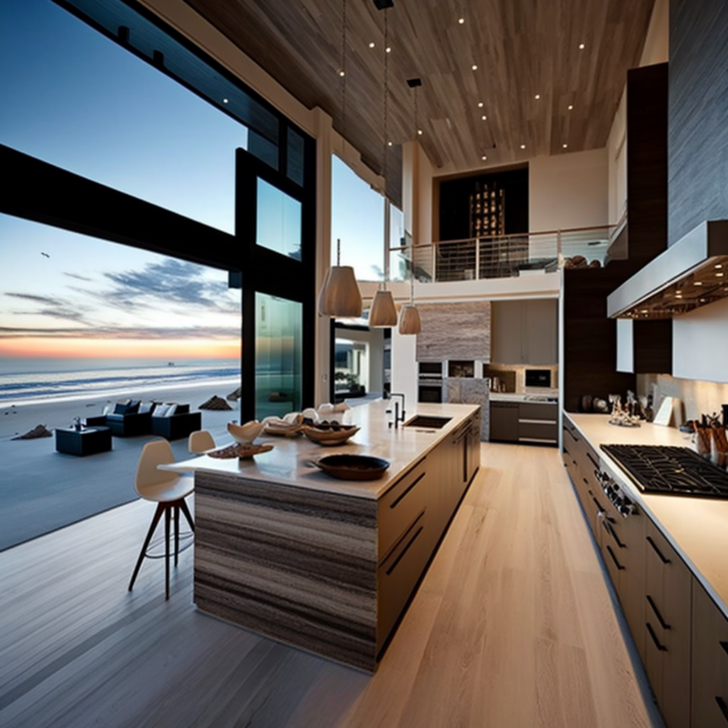
Colors don’t just sit on walls – they influence our moods, energy levels, and even our eating habits. Warm tones like reds and oranges can stimulate appetite and create cozy conversations, while cool blues and greens promote calmness and clarity. When you think about your kitchen’s purpose, consider how different colors might affect your daily routine.
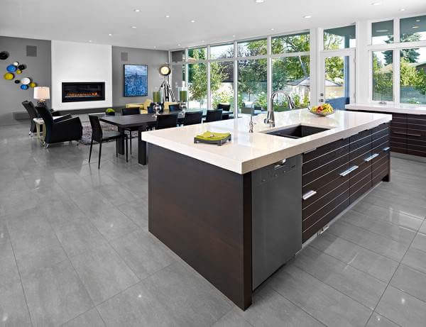
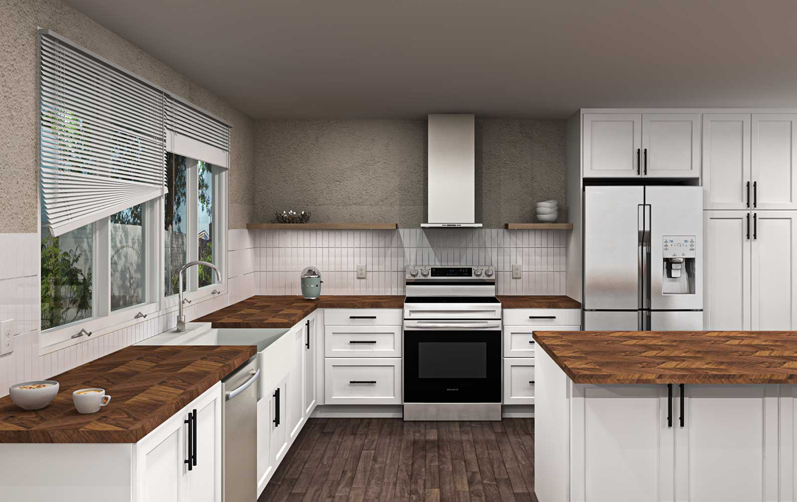
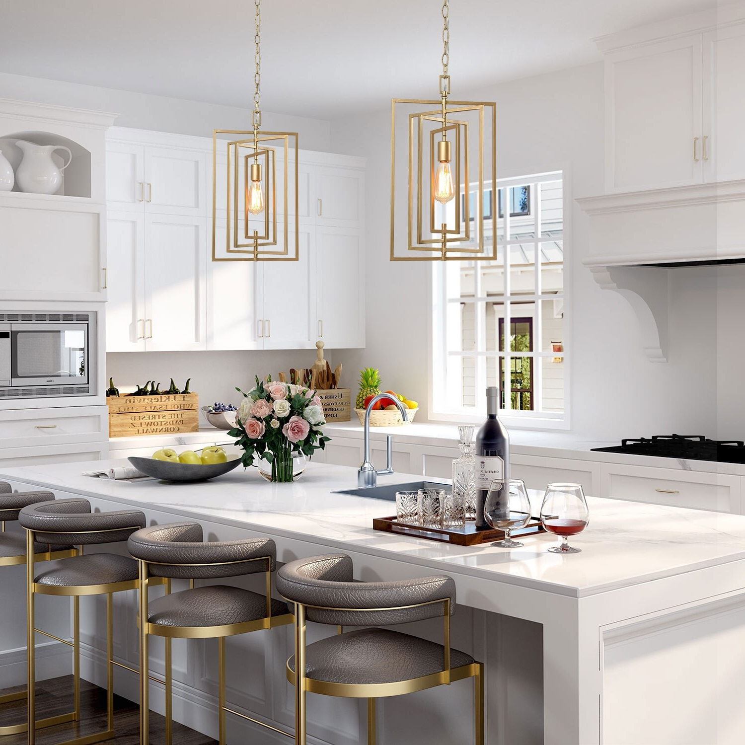
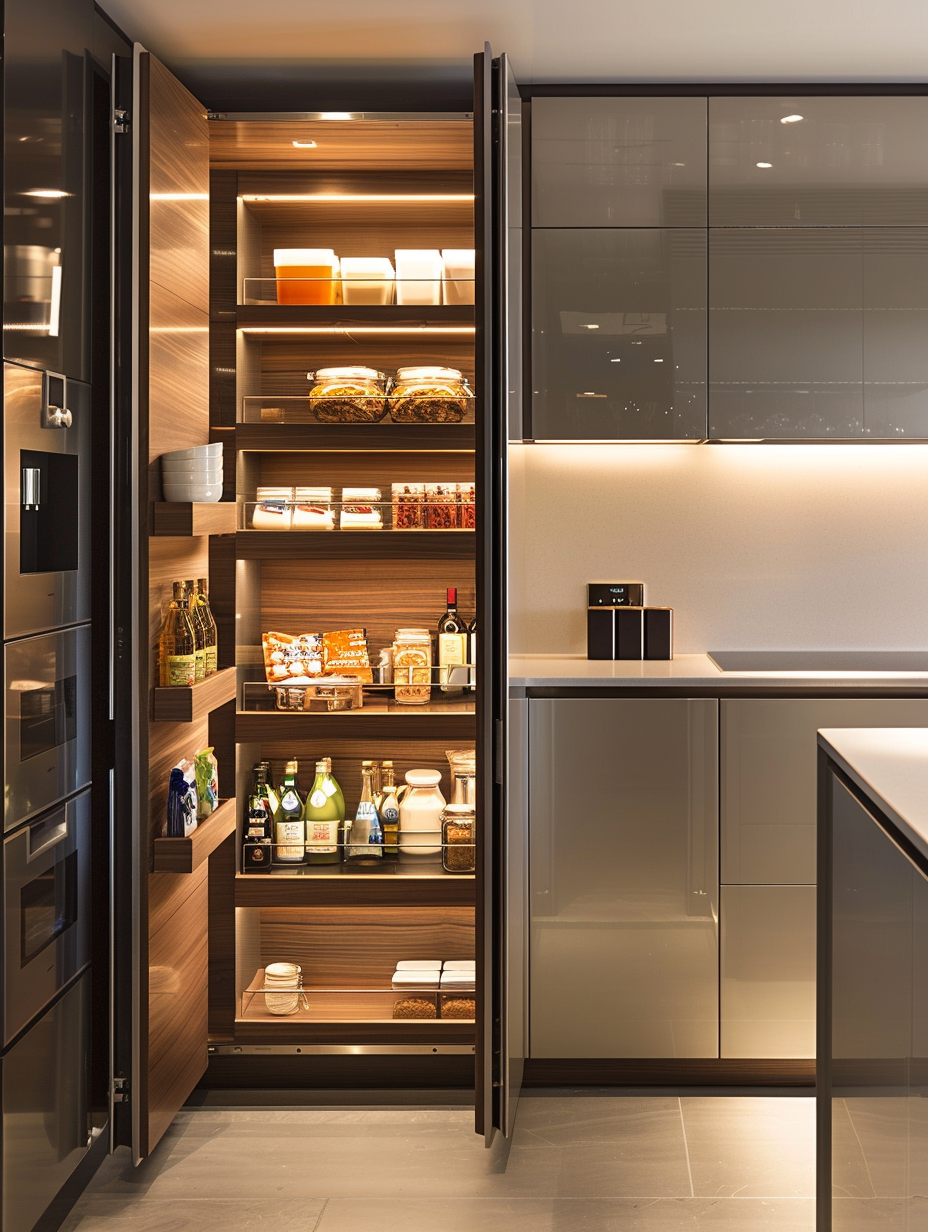
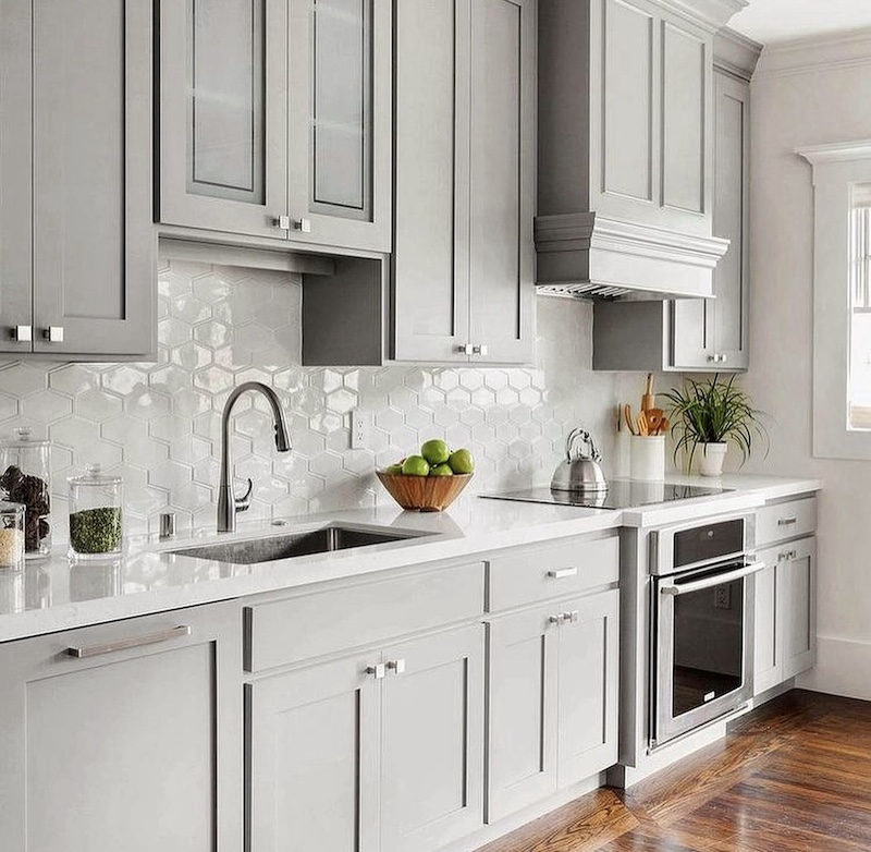
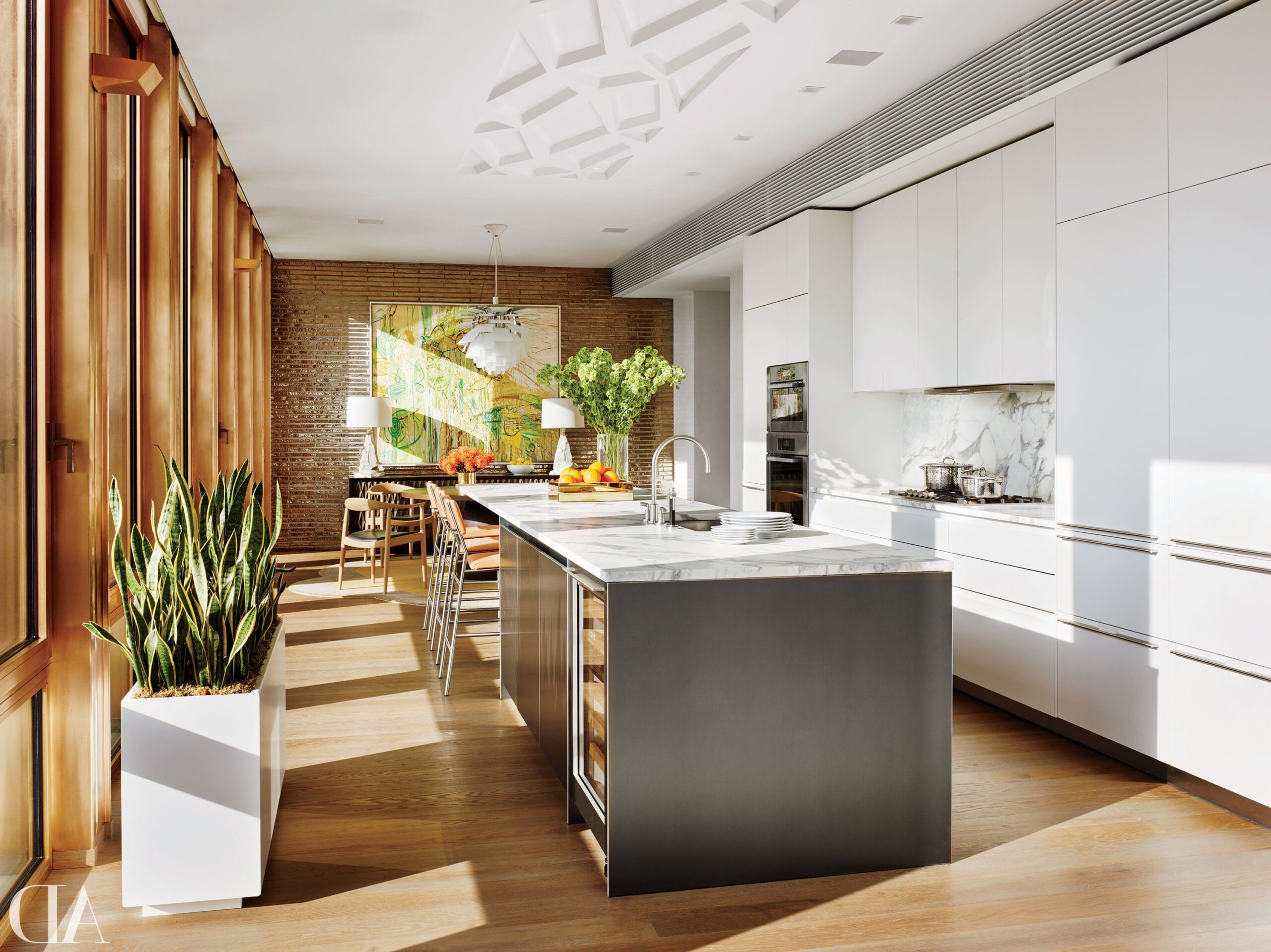
Neutral backgrounds provide the perfect canvas for your personality to shine through. These aren’t boring or bland – they’re versatile foundations that let everything else in your space pop. Think of them as the quiet voices that support the louder, more expressive elements around them. Many designers swear by warm whites and soft grays as starting points because they’re forgiving and adaptable.
The Timeless Appeal of Neutral Foundations
There’s something undeniably appealing about kitchens that start with neutral tones. They create a sense of calm and sophistication that never goes out of style. But neutrality doesn’t mean monotony – it means flexibility.
Consider these neutral options:
• Cream and beige tones that add warmth without overwhelming
• Soft grays that provide clean, modern appeal
• Warm whites that brighten spaces and make them feel larger
• Off-white variations that offer subtle texture and depth
These bases work especially well when you want to incorporate bold accent colors later. They allow you to experiment with backsplashes, hardware, or even appliances without feeling locked into one particular look forever. The beauty of neutral foundations lies in their ability to age gracefully while maintaining their appeal.
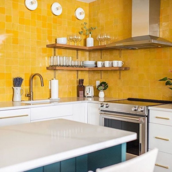
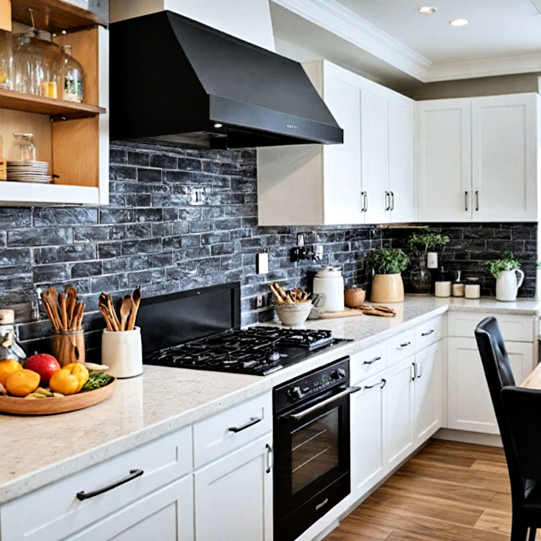
When to Embrace Bold Color Statements
Sometimes, your kitchen deserves to be a conversation starter. Bold colors can transform a mundane space into something truly extraordinary. But choosing the right bolder shade requires thoughtfulness.
Start with smaller elements first:
• A single cabinet door in deep navy blue
• Accent walls in rich emerald green
• Bold island paint that makes a statement
• Vibrant backsplash tiles that catch the light
Remember that bold colors can be overwhelming if not balanced properly. They work best when they’re anchored by neutral elements. Consider the room’s lighting – some colors appear dramatically different under various lights. Test samples on actual walls before committing to large areas.
Some popular bold choices include:
• Deep forest greens that bring nature indoors
• Rich burgundy that adds elegance and drama
• Electric blue that energizes the space
• Warm terracotta that creates a cozy, inviting feel
Creating Visual Balance Through Color Harmony
Even the most beautiful colors can clash if they’re not properly balanced. Understanding basic color relationships helps create spaces that feel intentional rather than chaotic.
The color wheel offers several approaches:
• Complementary colors (opposites on the wheel) create strong contrast
• Analogous colors (neighbors on the wheel) provide harmony
• Triadic schemes use three evenly spaced colors
In kitchens, these principles translate to practical applications. For example, pairing warm yellows with cool blues creates visual interest without being jarring. Using analogous colors in varying intensities adds depth to a space without overwhelming it.
Consider the Rule of 60-30-10:
• 60% dominant color (usually neutral)
• 30% secondary color (supporting)
• 10% accent color (pops)
This formula ensures that no single color dominates the space while still allowing for interesting contrasts.
Lighting Considerations for Color Success
This is often the most overlooked factor in kitchen color decisions. The same color can look completely different depending on whether it’s viewed in morning sunlight, evening candlelight, or artificial fluorescent lighting.
Natural light changes throughout the day, affecting how colors appear. A color that looks perfect during the afternoon might seem too dark or too bright in the morning. Artificial lighting also plays a crucial role. LED bulbs come in various color temperatures – from warm yellow to cool white – each affecting color appearance differently.
Here’s how to approach this challenge:
• Test color samples in different lighting conditions throughout the day
• Consider installing dimmer switches to adjust light levels
• Use multiple lighting sources (ambient, task, accent)
• Account for seasonal light changes when choosing colors
For example, a pale green kitchen might look fresh and airy in bright daylight but could appear washed out or grayish in dimmer evening light. Understanding these dynamics helps you select colors that maintain their appeal across all times of day.
Practical Tips for Implementing Color Strategies
Transforming your kitchen through color doesn’t require a complete overhaul. Sometimes small changes can make dramatic impacts. Here are some practical approaches:
• Start with small, low-risk changes like new cabinet hardware or a colorful backsplash
• Use paint to test larger color areas before committing to full wall coverage
• Consider the kitchen’s function – a breakfast area might benefit from more vibrant colors than a formal dining space
• Take advantage of existing features like stone countertops or wood cabinetry that already provide color foundation
Remember that color is personal. What works for one family might not work for another. Trust your instincts and don’t be afraid to make adjustments as you go. The goal is to create a space that feels authentically yours while serving your practical needs.
Future Trends in Kitchen Color Design
The kitchen color landscape continues to evolve, but certain themes remain consistently popular. Current trends lean toward earth tones and natural materials that bring the outdoors inside. Colors inspired by nature – from soft sage to warm terracotta – continue to resonate with homeowners seeking timeless beauty.
Emerging trends include:
• Biophilic design elements using natural textures and earth tones
• Monochromatic schemes that create sophisticated, calming environments
• Metallic accents that add luxury without overwhelming the space
• Bold geometric patterns in backsplashes and accent walls
What’s important to remember is that trends come and go, but good color choices always serve your personal taste and lifestyle. Rather than following every trend blindly, focus on selecting colors that will make you happy every day you spend in your kitchen.
Choosing the right colors for your kitchen is both an art and a science. It combines aesthetic preferences with practical considerations about lighting, function, and personal style. Whether you prefer the understated elegance of neutral tones or the dramatic impact of bold statements, the key is thoughtful planning and testing. Remember that your kitchen is your space – it should reflect your personality and enhance your daily life. Don’t be afraid to experiment, make mistakes, and learn from them. After all, the most successful kitchen color schemes are those that make you want to spend time in your space. The right colors don’t just decorate a room – they create experiences that last long after the last meal is served.
[sps_html tag=”img” src=”https://roofdrivein.com/wp-content/uploads/2026/01/20-inspiring-modern-kitchen-design-ideas-home-decoration-and-with-regard-to-modern-kitchen-decor-ideas.jpg” alt=”20 Inspiring Modern Kitchen Design Ideas - Home Decoration And … with regard to Modern Kitchen Decor Ideas” style=”width: 100%; height: auto;”]
[sps_html tag=”img” src=”https://roofdrivein.com/wp-content/uploads/2026/01/30-modern-kitchen-ideas-contemporary-kitchens-for-color-strategies-for-modern-kitchens-from-neutral-foundations-to-bold-statements-scaled.jpg” alt=”30 Modern Kitchen Ideas - Contemporary Kitchens for Color Strategies for Modern Kitchens: From Neutral Foundations to Bold Statements” style=”width: 100%; height: auto;”]
[sps_html tag=”img” src=”https://roofdrivein.com/wp-content/uploads/2026/01/50-best-modern-kitchen-design-ideas-for-2021-regarding-color-strategies-for-modern-kitchens-from-neutral-foundations-to-bold-statements.jpg” alt=”50 Best Modern Kitchen Design Ideas For 2021 regarding Color Strategies for Modern Kitchens: From Neutral Foundations to Bold Statements” style=”width: 100%; height: auto;”]
[sps_html tag=”img” src=”https://roofdrivein.com/wp-content/uploads/2026/01/37-modern-kitchen-ideas-we-love-contemporary-kitchen-design-kitchen-with-modern-kitchen-decor-ideas-scaled.jpg” alt=”37 Modern Kitchen Ideas We Love | Contemporary Kitchen Design, Kitchen … with Modern Kitchen Decor Ideas” style=”width: 100%; height: auto;”]
[sps_html tag=”img” src=”https://roofdrivein.com/wp-content/uploads/2026/01/modern-kitchen-decor-trendy-ideas-2025-throughout-color-strategies-for-modern-kitchens-from-neutral-foundations-to-bold-statements.jpg” alt=”Modern Kitchen Decor: Trendy Ideas [2025] throughout Color Strategies for Modern Kitchens: From Neutral Foundations to Bold Statements” style=”width: 100%; height: auto;”]
![Modern Kitchen Decor: Trendy Ideas [2025] throughout Color Strategies for Modern Kitchens: From Neutral Foundations to Bold Statements](https://roofdrivein.com/wp-content/uploads/2026/01/modern-kitchen-decor-trendy-ideas-2025-throughout-color-strategies-for-modern-kitchens-from-neutral-foundations-to-bold-statements.jpg)