There’s something deeply comforting about a room that feels like a quiet sanctuary. When we think about creating peaceful spaces, color plays a starring role. But not just any colors – the right kind of colors. Specifically, those soft, muted tones that seem to wrap around you like a gentle embrace.
Think about the last time you walked into a room that felt truly restful. Maybe it was a hotel suite with cream walls and soft gray accents, or perhaps your grandmother’s bedroom with its faded pastels. These aren’t random choices – they’re deliberate decisions made with our minds and bodies in mind. The colors we choose for our sleeping spaces have a profound impact on our mood, our sleep quality, and our overall sense of calm. Muted color palettes offer a pathway to this serenity, but how exactly do we achieve that perfect balance? It’s not just about picking pretty colors. It’s about understanding how our brains respond to different hues, how our bodies react to various tones, and how to combine these elements in ways that feel both beautiful and restorative.
Understanding Muted Colors
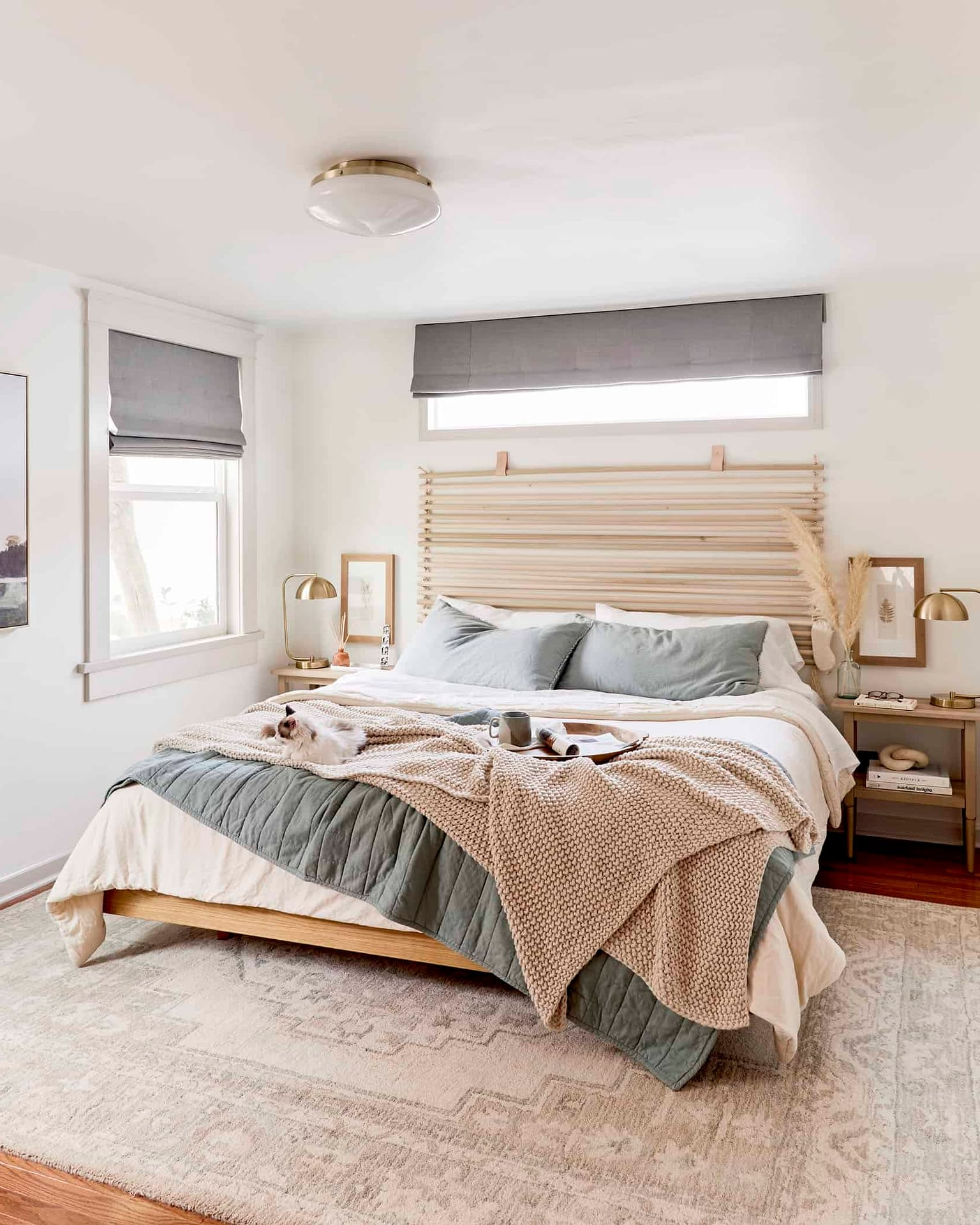
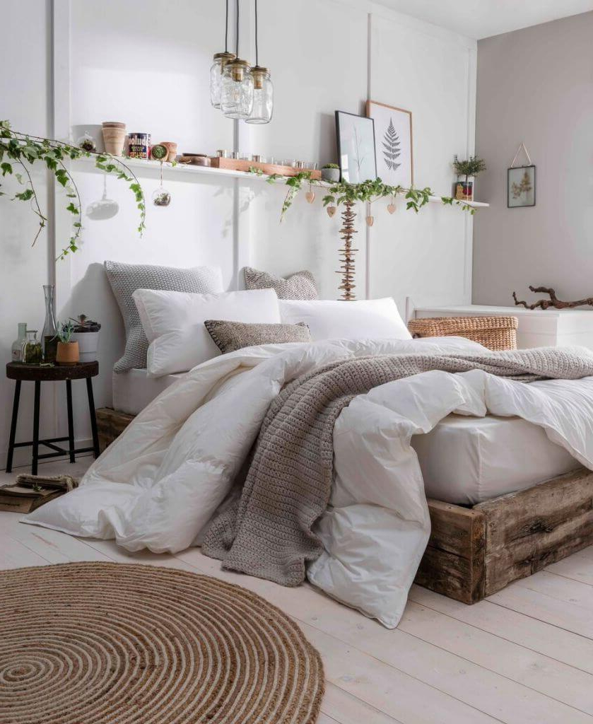
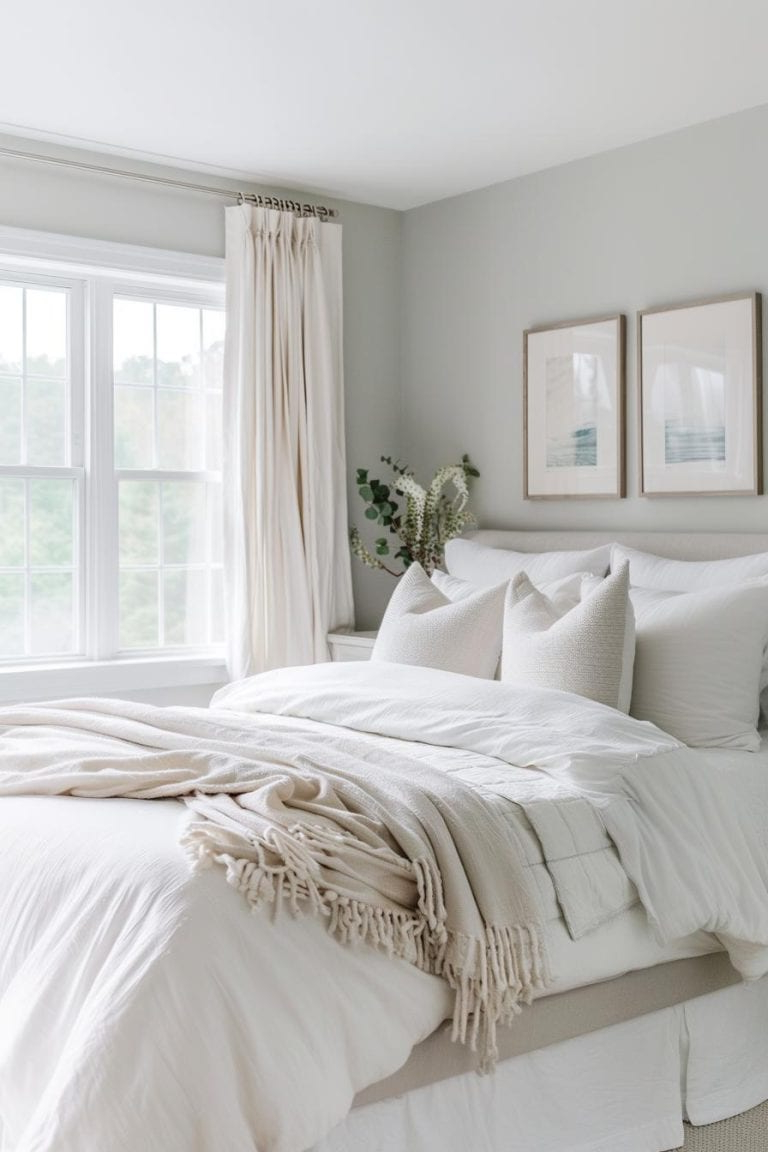
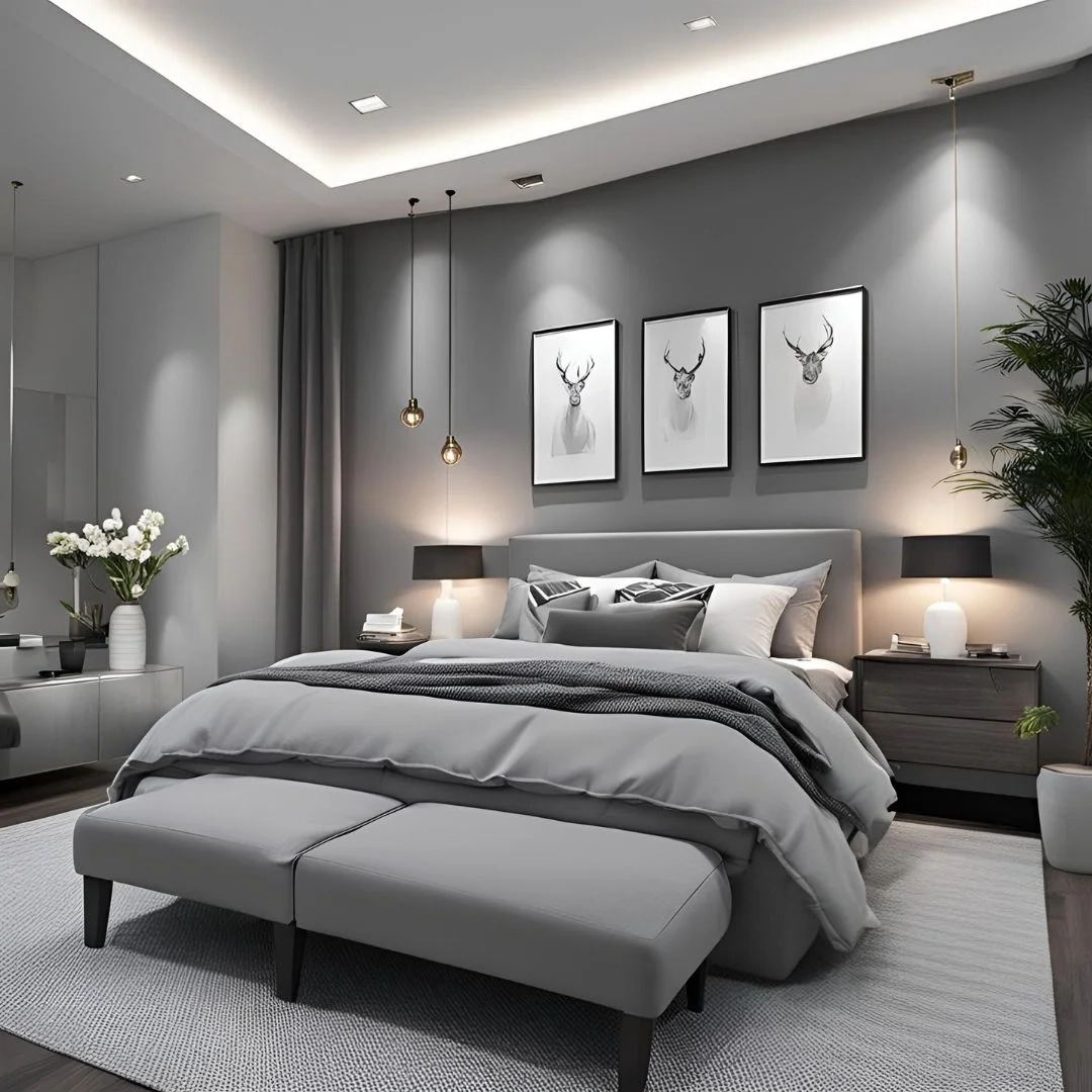
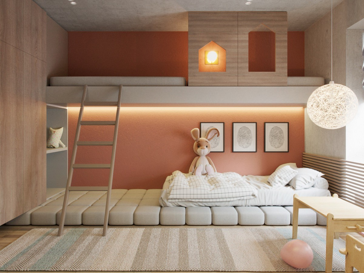
Muted colors are essentially desaturated hues – they’ve been softened and dulled to remove their intensity. Think of them as colors that whisper rather than shout. They’re not stark or overwhelming, but instead create a sense of calm and sophistication. These tones often appear in nature – the pale blue of a cloudy sky, the soft green of moss, the warm beige of sand. This connection to the natural world might explain why we find them so soothing. When you’re choosing muted colors for your bedroom, consider the psychological effects they create. Colors like sage green, dusty rose, soft blue, and warm gray don’t trigger our fight-or-flight response like bright reds or yellows might. Instead, they encourage relaxation and reflection. The key is finding the right balance between enough visual interest to keep the space feeling alive, and enough subtlety to maintain that peaceful atmosphere.
Choosing Your Foundation Colors
Every great bedroom needs a solid base, and that’s where your foundation colors come in. These are the dominant hues that will cover most of your walls, bedding, and large furniture pieces. For a balanced look, start with one primary muted color and build from there. Consider these options:
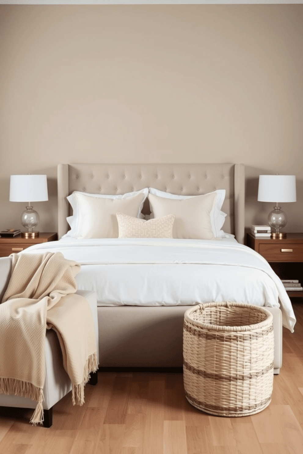
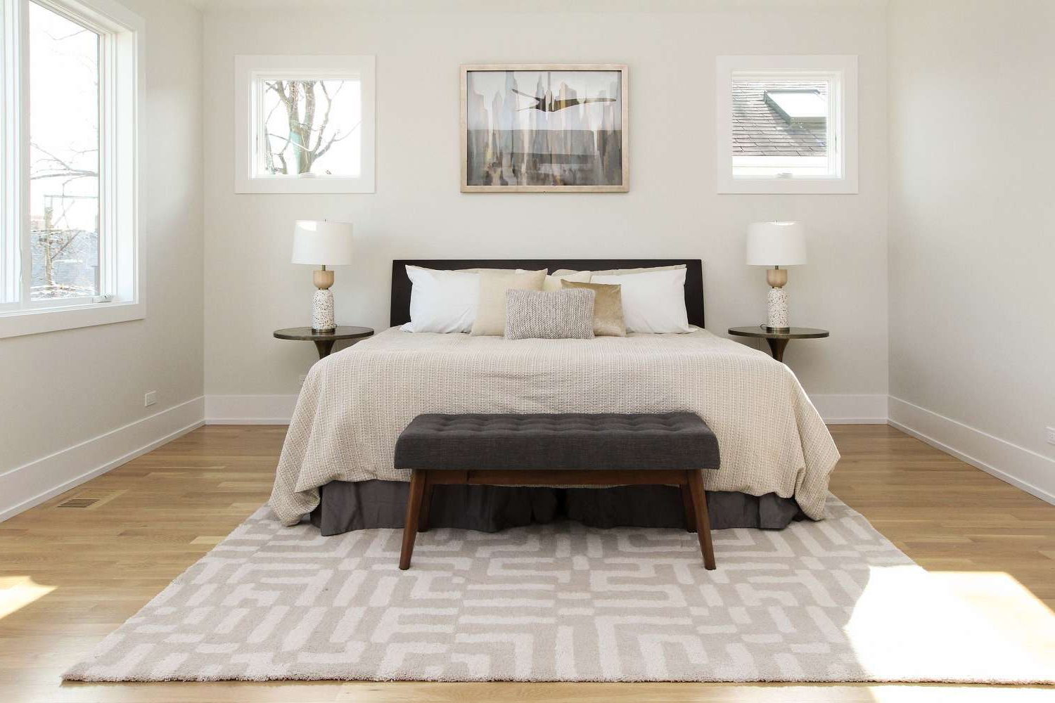
• Soft neutral tones: Cream, beige, warm gray, and off-white serve as excellent bases. They provide a clean canvas that allows other elements to pop while maintaining that serene vibe.
• Muted blues: These create a calming atmosphere perfect for sleep. Try soft navy, powder blue, or even pale aqua.
• Sage greens: They bring nature indoors and offer a fresh, clean feel without being too bold.
• Warm terracotta or burnt orange: These add warmth and richness without overwhelming the space.
The rule of thumb is to limit yourself to two to three main colors maximum. Too many competing tones can create visual chaos, defeating the purpose of achieving balance.
Creating Visual Interest Without Overdoing It
Balance doesn’t mean boring. A perfectly balanced bedroom still needs to feel interesting and lived-in. Here’s how to add visual intrigue without disrupting that calm feeling:
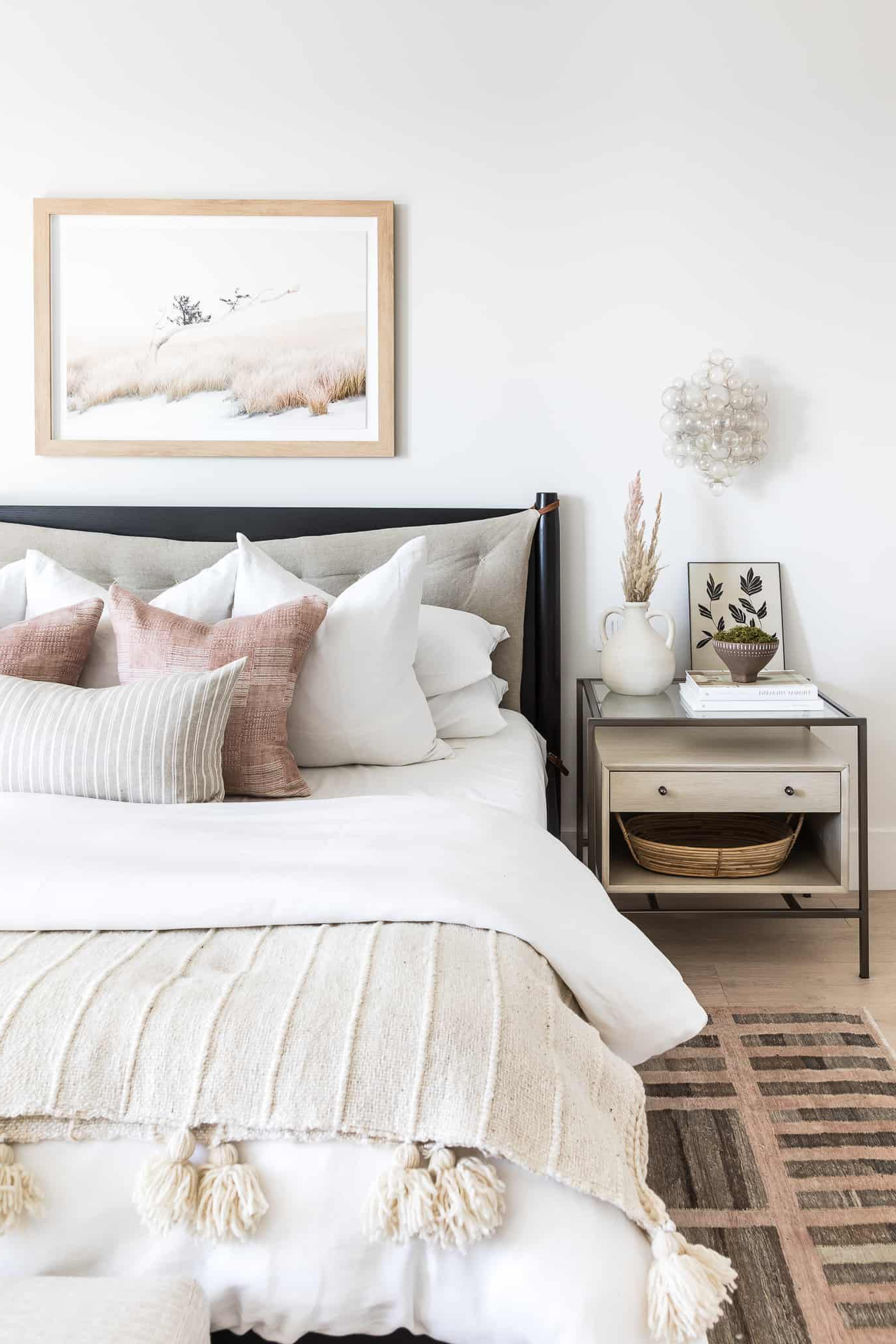
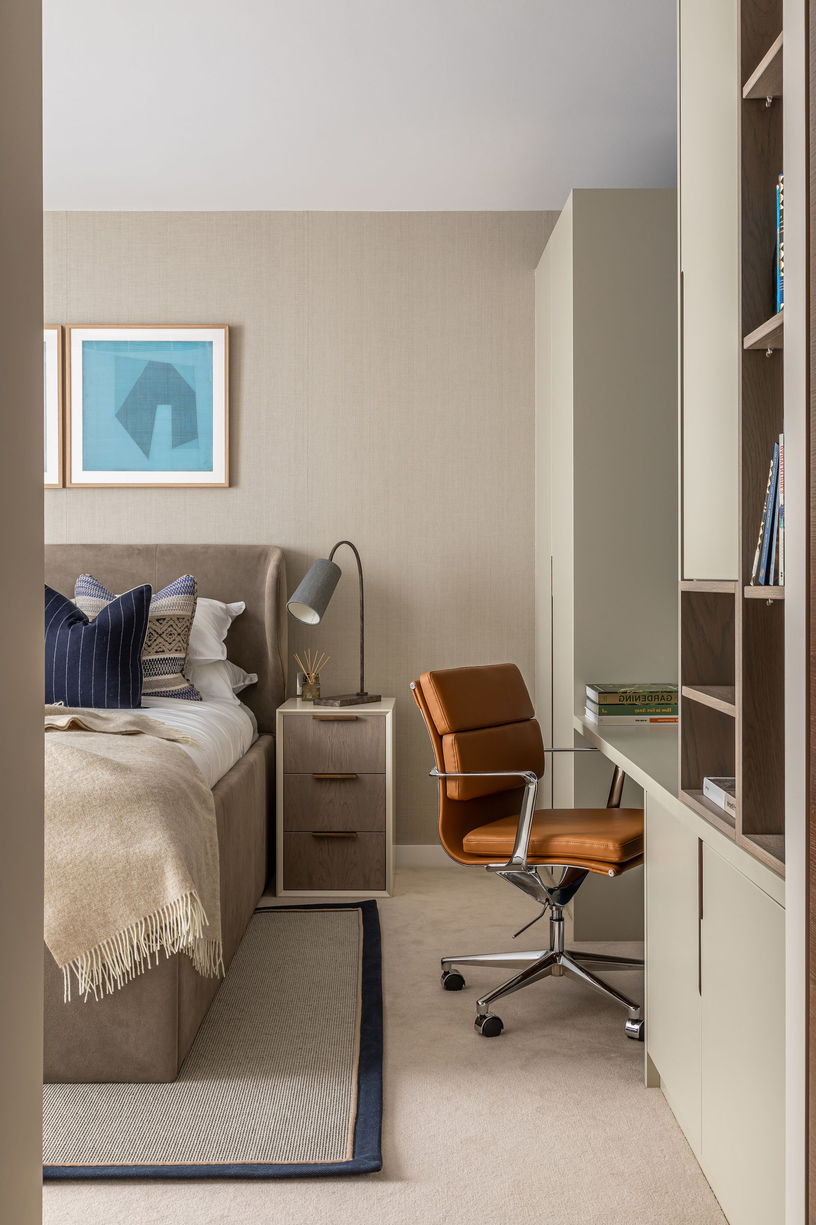
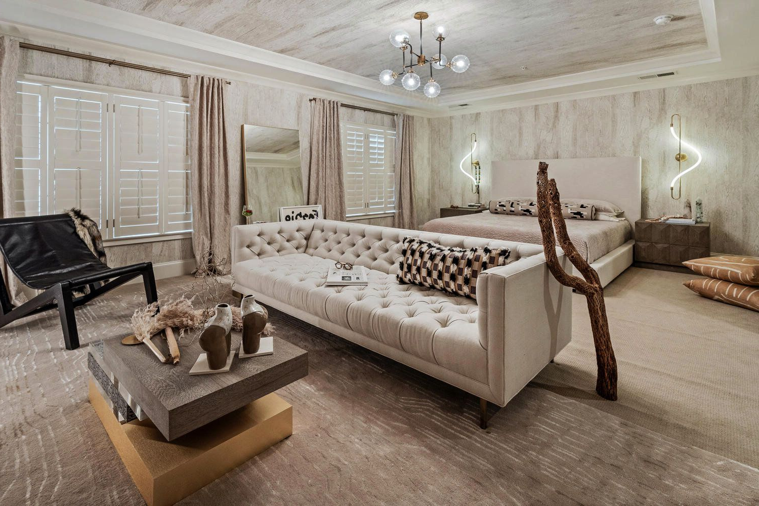
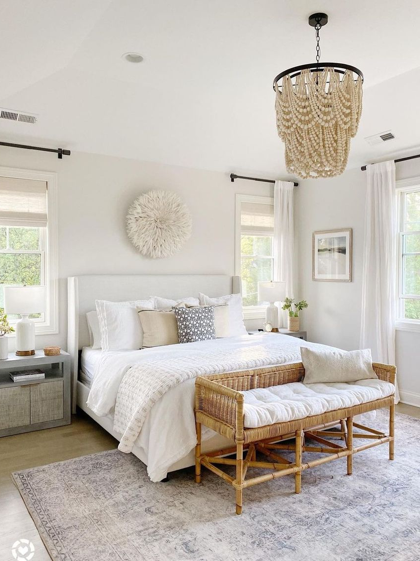
• Texture matters: Incorporate different textures through fabrics, rugs, and wall treatments. A soft linen bedspread in the same muted palette creates depth without adding harsh contrast.
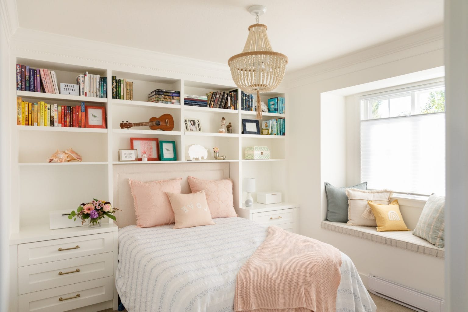
• Layering elements: Use items like throw pillows, blankets, and artwork to add subtle variations within your chosen color family. A deep sage green pillow against a cream wall creates interest while staying cohesive.
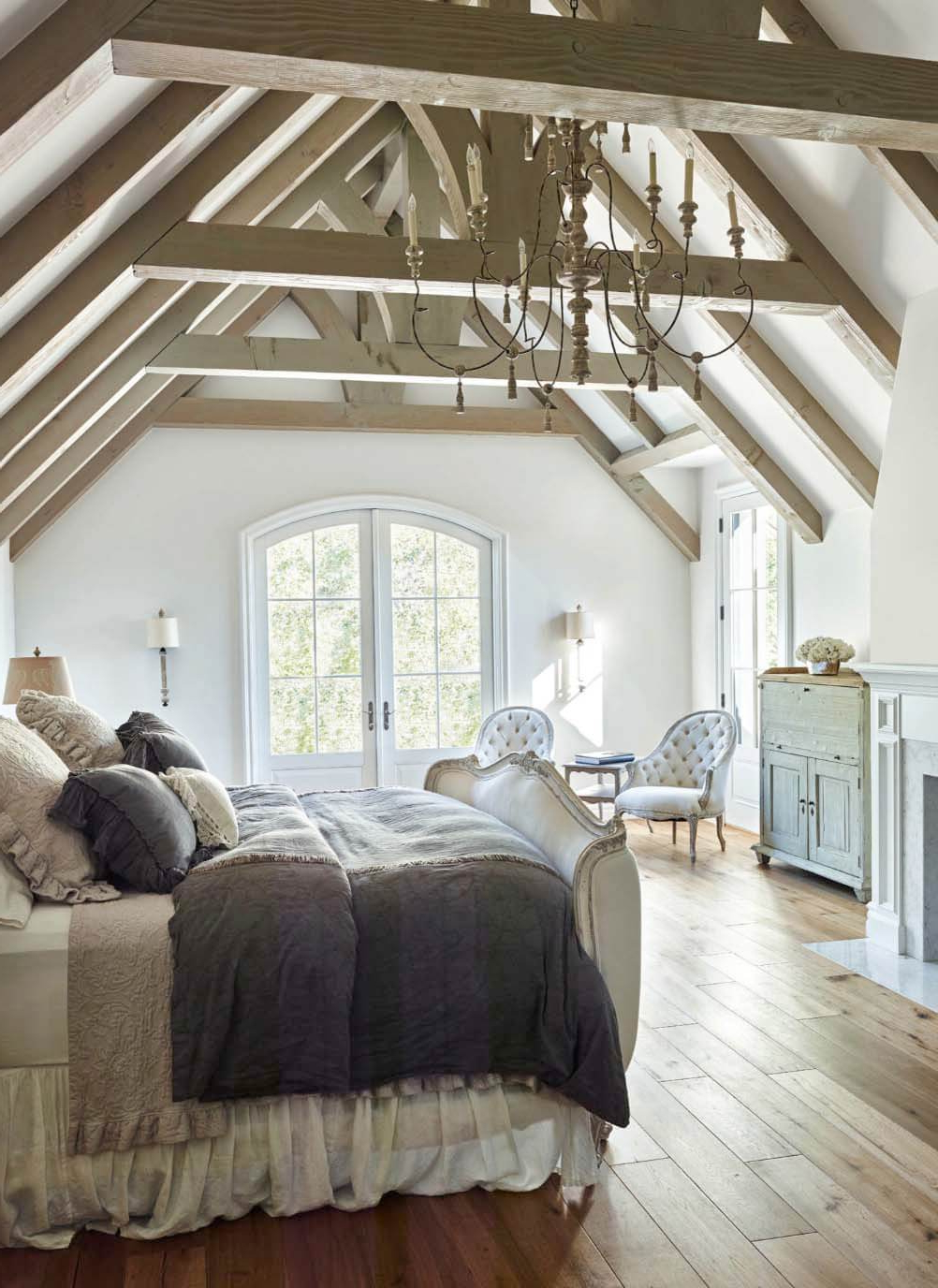
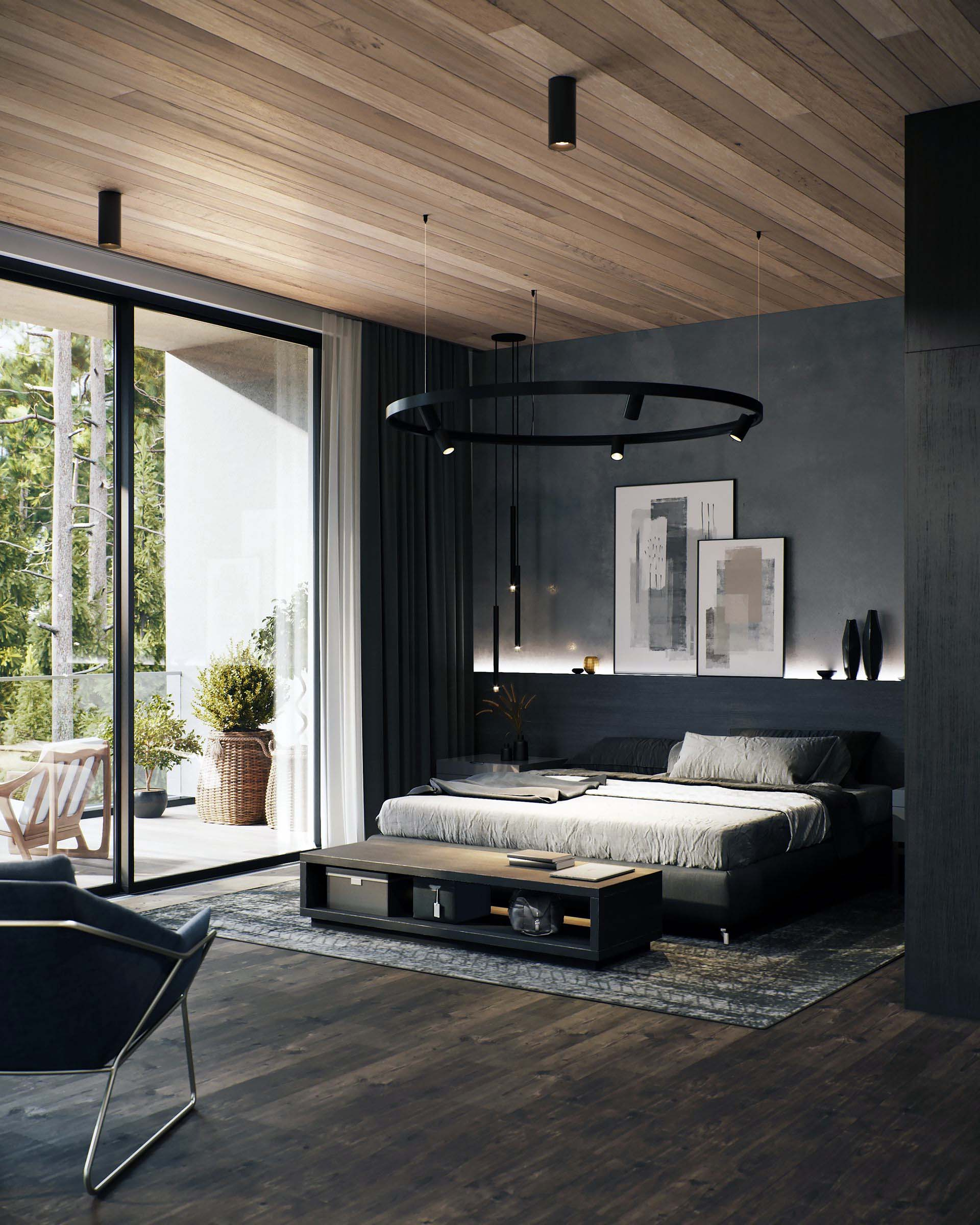
• Natural materials: Wood, stone, and plants bring organic elements that complement muted tones beautifully. A simple wooden nightstand or a small potted plant adds life to the space.
• Accents with purpose: Choose one accent color that’s slightly bolder than your main palette. This doesn’t have to be a bright color – maybe a deeper version of one of your muted tones works better than a completely new hue.
Remember, the goal is harmony, not perfection. Some variation is good, but too much can create visual tension that fights against the calm you’re trying to achieve.
The Role of Lighting in Muted Color Harmony
Lighting transforms how colors appear in a room, and this is especially true with muted tones. These subtle colors can look dramatically different under various lighting conditions. Natural light tends to make muted colors appear softer and more unified, while artificial lighting can either enhance or flatten these hues depending on the type and placement. During the day, let in as much natural light as possible. You’ll notice how the muted colors seem to glow with their own inner light when exposed to sunlight. At night, use warm, dimmable lighting to create a cozy atmosphere. Avoid harsh overhead lights that can make your muted palette look flat or uninviting. Consider:
• Table lamps with warm bulbs
• Wall sconces that provide gentle ambient light
• String lights or candles for a magical touch
• Layered lighting that gives you control over the mood throughout the day
The interplay between natural and artificial light creates a dynamic environment that changes with your daily rhythm, making your bedroom feel responsive rather than static.
Practical Tips for Implementation
Putting theory into practice requires some planning and patience. Here are some real-world strategies that work:
• Start small: If you’re nervous about committing to a full muted palette, begin with one element – perhaps a new bedspread or a few accent pillows. See how it looks before investing in larger changes.
• Test paint samples: Take small samples home and observe them in different lighting conditions throughout the day. Colors can surprise you.
• Use the 60-30-10 rule: Apply 60% of your dominant color, 30% of a secondary color, and 10% of an accent color. This formula helps maintain balance while adding variety.
• Consider the room size: Lighter muted tones can make small rooms feel bigger, while deeper muted colors can make large spaces feel cozier.
• Don’t forget the ceiling: Sometimes overlooked, the ceiling can be painted in a slightly lighter version of your main color to enhance the sense of openness.
It’s also worth noting that personal preference matters enormously. What feels balanced to one person might not feel the same to another. Trust your instincts and make adjustments based on how the space actually feels to you.
Common Mistakes to Avoid
Even with the best intentions, there are pitfalls that can derail your pursuit of bedroom balance. Here are some common missteps to watch out for:
• Overcomplicating the palette: Adding too many different muted colors can create confusion rather than harmony. Remember, less is often more.
• Ignoring the room’s existing features: Before painting, consider what furniture, flooring, and architectural elements already exist. These can either support or clash with your chosen palette.
• Neglecting the importance of contrast: While muted colors are subtle, some contrast is necessary for visual interest. Just make sure it’s gentle contrast, not jarring.
• Choosing colors that don’t suit your skin tone: Even if a color looks good on paper, it might not flatter you in person. Test how you look in the space before finalizing your choice.
• Forgetting about the practical aspects: Consider how the colors will hold up with daily wear and tear. Muted colors might fade differently than brighter ones, so factor this into your decision.
These mistakes are easy to make, especially when you’re excited about creating your dream bedroom. The key is to approach the process thoughtfully and with realistic expectations.
Achieving balance in your bedroom through muted color palettes isn’t just about following rules – it’s about creating a space that truly serves you. When done right, these soft, harmonious tones become a foundation for restful sleep, peaceful mornings, and a general sense of well-being. The beauty of muted colors lies in their ability to provide both comfort and sophistication. They don’t demand attention, but they do invite you to slow down and breathe deeply. Whether you’re starting fresh with a new bedroom or simply looking to refresh your current space, remember that balance comes from thoughtful choices rather than dramatic gestures. It’s the careful selection of a few well-chosen colors, combined with appropriate textures and lighting, that creates that perfect sanctuary. Your bedroom should feel like a gentle hug, and with the right muted palette, it can be exactly that. The journey toward this balance is as rewarding as the destination itself. Start small, pay attention to how each element affects the whole, and trust in the calming power of subtle beauty.
[sps_html tag=”img” src=”https://roofdrivein.com/wp-content/uploads/2026/01/20-neutral-bedroom-design-ideas-for-a-serene-and-stylish-space-inside-neutral-bedroom-design-ideas.png” alt=”20+ Neutral Bedroom Design Ideas For A Serene And Stylish Space … inside Neutral Bedroom Design Ideas” style=”width: 100%; height: auto;”]
[sps_html tag=”img” src=”https://roofdrivein.com/wp-content/uploads/2026/01/neutral-bedroom-decorating-ideas-expert-tips-tlc-interiors-within-how-to-achieve-balance-in-your-bedroom-using-muted-color-palettes.jpg” alt=”Neutral Bedroom Decorating Ideas & Expert Tips - Tlc Interiors within How to achieve balance in your bedroom using muted color palettes” style=”width: 100%; height: auto;”]
[sps_html tag=”img” src=”https://roofdrivein.com/wp-content/uploads/2026/01/23-beautiful-neutral-bedroom-design-ideas-with-regard-to-how-to-achieve-balance-in-your-bedroom-using-muted-color-palettes.jpg” alt=”23 Beautiful Neutral Bedroom Design Ideas with regard to How to achieve balance in your bedroom using muted color palettes” style=”width: 100%; height: auto;”]
[sps_html tag=”img” src=”https://roofdrivein.com/wp-content/uploads/2026/01/11-gorgeous-neutral-bedrooms-with-contemporary-design-throughout-how-to-achieve-balance-in-your-bedroom-using-muted-color-palettes.jpg” alt=”11 Gorgeous Neutral Bedrooms With Contemporary Design throughout How to achieve balance in your bedroom using muted color palettes” style=”width: 100%; height: auto;”]
[sps_html tag=”img” src=”https://roofdrivein.com/wp-content/uploads/2026/01/41-neutral-bedroom-ideas-to-create-a-chic-retreat-pertaining-to-neutral-bedroom-design-ideas.jpg” alt=”41 Neutral Bedroom Ideas To Create A Chic Retreat pertaining to Neutral Bedroom Design Ideas” style=”width: 100%; height: auto;”]